What's new
  • Most issues reported these days stem from users not enabling their emulators to use the required amount of RAM.
    We also tend not to use the search feature but post our issues within the texture pack release page.
    Failure to load a texture pack should not be posted in the release thread unless you have already patched the emulator.

    If you don't have the resources to use Large/HD texture packs please do not attempt to do so.
    Users should have a minimum amount of System RAM not less then 4GB's.
    If you have less then 4GB's of RAM do not post about how your emulator crashes,
    RAM is dirt cheap so invest some money into your PC.

    I would like to say thanks to squall_leonhart
    for posting this Solution.

Zelda Ocarina of time Community Retexture Project

OP
death--droid

death--droid

Active member
Moderator
Chieftain459 you're textures are amazing.
Keep up the good work!

Also you can't adjust the in game lighting without rom hacking(I think)
Oh yeah the Sun Song Grotto link is dead.
 
OP
death--droid

death--droid

Active member
Moderator
Yeah!
Thanks for fixing the link.
It works now, Just need to download all the packs of yours.
This pack might end up being more complete and better looking the Xenobonds :p
 

cerebus5

New member
but when for example you add new cloud effects or that sort of thing it does seem to change the ambient lighting - or am I spinning?
 

mode7

New member
No you never can adjust the lightning.
Image based lighnting, as cerebus pointed out, is a very recent feauture and I'm not even sure, if it's avaiable in recent games like crysis.

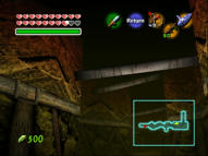
@ chieftain just as you wan't soem suggestions:

44490285c7550517d2acd63d1101d4385g.jpg

the top texture has to much shadow information and tiles bad. Thats the problem with textures: they look nice in photoshop, but when you see them tiled in game it might turn out quite different. I stilll make this mistake alot (especially with this texture) so don't worry about it.

Personally I wouldn't use the 'wood 4' texture for wood appliances. They are extremely well done and they are alright this was. But I always got better results with 'wood5' (Which is used almost everywhere in the game)

Again a decission of personal chioce: sometime when you combine two texture sources (e.g. the transition of stone to sand) , it looks unrealistic.
I would either blend them into each other, or when I use a shadow (which is sometimes to dark in your textures) I would try to add I would try to add a little bevel & emboss (just very little) on the top layer, which makes it stick out more.
Basically always ask yourself: Is this material ontop of the other or is there a transition from one material to the other, when you coose which way to go.

The rusty door is a great texture but the bad thing its flipped horizontally in game which creates sort of a pattern that makes it hard to recognitze the texture in game. I hate flipped textures because they are hard to screw up. Make sure the area where the flipping happend it completely clean so this pattern will not show up.

Last thing: The wood planks right when you enter the dungeon have to much burn on them. the look red in the middle. Again thats a problem with this base texture you used. You could try to desaturate it before you color edit it.

And now for some things I really liked!

The textures I didn't mention are well done and fit perfect into the cave

The wood works on the walls are nicely done especially tith the ropes around them.

The texture you used for the walls turns out nice (thats also one I would have been cautios of using but in this case it worked very well)

I especially liked how you added some lava shading on some ofthe textures - looks great!
 

Chieftain459

New member
the top texture has to much shadow information and tiles bad.

That was one of the areas I figured you would say something about... based on the original texture, I'm very uncertain what to do there... I totally agree that the texture I used is wrong (I've been thinking that for a while). Can you suggest some other direction I can go, based on the original?

Again a decission of personal chioce: sometime when you combine two texture sources (e.g. the transition of stone to sand) , it looks unrealistic.

Again, I agree. I think I was rushing some of those transition areas, because they were some of the last things I messed with. I'll fix those.

The rusty door is a great texture but the bad thing its flipped horizontally in game which creates sort of a pattern that makes it hard to recognitze the texture in game.

I'm a little annoyed by this one. That was the very first texture I had done, and I kept planning on fixing it. I just never got around to it... I'll fix it first thing.

Last thing: The wood planks right when you enter the dungeon have to much burn on them. the look red in the middle.

Honestly, I liked that about the wood--it's sitting very close to hot lava, so I figured it would be very singed, and that it should have a red cast to it. That's just me, though.

I'll start working on some fixes, and get a new version out shortly. I'm taking today off, though... I've got some car work that needs doing.

Thanks guys!
 

mode7

New member
That was one of the areas I figured you would say something about... based on the original texture, I'm very uncertain what to do there... I totally agree that the texture I used is wrong (I've been thinking that for a while). Can you suggest some other direction I can go, based on the original?
Could you post the original texture? I don't have it right now. Perhaps we can figutre it out together

Again, I agree. I think I was rushing some of those transition areas, because they were some of the last things I messed with. I'll fix those.
It's not a big deal. Do you still have the psds then you could just blur the layer masks

I'm a little annoyed by this one. That was the very first texture I had done, and I kept planning on fixing it. I just never got around to it... I'll fix it first thing.
These get very anoying. And there is no easy solution to fix this. It gets really hard with a detailed photo like this.

Honestly, I liked that about the wood--it's sitting very close to hot lava, so I figured it would be very singed, and that it should have a red cast to it. That's just me, though.

Hm you have a point here. It doesn't look bad ingame either - so you should keep it.
 

Chieftain459

New member
That texture...
http://www.mediafire.com/?dnbyzn2ok3d

It's like a cross between wood and stone, almost... I can't make out exactly what it is. Now that I think about it, that's why I used that particular stone texture, because it had *some* similarities to the original, but you're right, it was a bad choice.

Actually, I didn't save the PSD files (not sure why, now I regret it). But it won't be hard to redo... anyway, I'd rather start from scratch on a few of those textures. I always feel like I'm compromising when I try to fix an existing file. When I start over from scratch, I usually get a better result.

As far as the door texture, I found few images of rusted metal that aren't too detailed (they're hi-res, but they're more consistent across the image), so I'm going to try to make a better door with them. Hope it works.
 

Chieftain459

New member
Idea: what do you get when you cross wood with stone? In real life, it's called petrified wood... like fossils, but with wood instead of bone. A quick image search later, and I came up with something I rather like for that room. Screenshot below, tell me what you think.


Jupiter

Just a Jupi.
For some reason, I had dungeon music from Skies of Arcadia pop in my head while looking that screen over.

The way it tiles gives it more of an artisan's craft in appearance, rather than makeshift support structure as with the rest of the surroundings. I like the texture itself, but I'd only like it applied here if didn't make the symmetry so obvious.
 

mode7

New member
Much better! I like the way it tiles. again this is fliped which makes it hard.
It starts looking like an ornament or man made structure this way but i think thats ok with the original.
I also like your way of thinking (stone+wood)
Imagination is really an advantadge when dealing with this little blurry pieces of texture the original had.
 

tjwoosta

New member
Im trying to check out this project, but the link in the first post for high-res kokiri village is not working, is there a mirror?
 

Chieftain459

New member
I have another texture I worked on. Again, it needs refining, but maybe this is a good direction to go.

The process involved taking an image of cedar wood (originally from a piece of furniture in my house), grayscaling it, embossing it, then using a gradient based on the original texture to color it... Screenshot:


Is this a better direction, or do you like the other option, or should I keep looking for another alternative?
 

Chieftain459

New member
Sounds like we have a winner. I'll probably tweak it some more before putting a final in pack. Hopefully by tonight (East US time) or tomorrow afternoon, I'll have version 2 set. Will update again when that's ready.

Thanks for all your help, guys!
 

Top