-
Most issues reported these days stem from users not enabling their emulators to use the required amount of RAM.
We also tend not to use the search feature but post our issues within the texture pack release page.
Failure to load a texture pack should not be posted in the release thread unless you have already patched the emulator.
If you don't have the resources to use Large/HD texture packs please do not attempt to do so.
Users should have a minimum amount of System RAM not less then 4GB's.
If you have less then 4GB's of RAM do not post about how your emulator crashes,
RAM is dirt cheap so invest some money into your PC.
I would like to say thanks to squall_leonhart
for posting this Solution.
You are using an out of date browser. It may not display this or other websites correctly.
You should upgrade or use an alternative browser.
You should upgrade or use an alternative browser.
Zelda Ocarina of time Community Retexture Project
- Thread starter death--droid
- Start date
chaoszerox
hires_texture
Excellent! There's only 3 things I would change on this, the last being less important. The outlines/edges should have a thicker gold plate, and I think this partThanks for the constructive criticism chaoszerox (and also suggestion of photobucket). I may revisit Wolfos at a later date, but for now I'm moving on to the dungeon items.
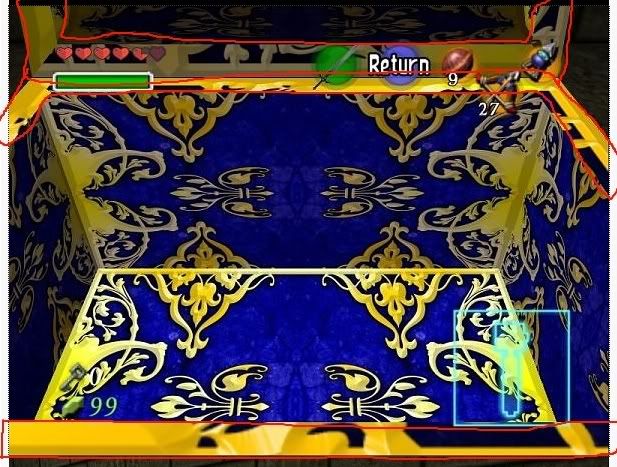
Should be solid gold like in the original.
I might change the design the the center on the keyhole to be more like the original. Other than that, perfect!
Do you think I should revise that last texture of mine?
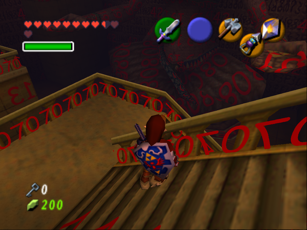
EDIT: I think I really need to reconsider the sand texture...I'm thinking it's not sand at all, but some kind of stone. It's used in a lot of other places like the floor on the platforms on ether side of the giant statue and some other floors that would seem strange to have sand on...like platforms around stairs...
Last edited:
Chieftain459
New member
Yeah, that's kinda what I was saying (only I said it poorly). Stone with sand on it... the way I'm thinking, this whole temple is in the desert, and has been for years and years... so by this point, sand has blown in to every part of the temple--it pervades EVERYTHING, much like the vines and vegetation in the Forest Temple. So while the temple was constructed from stone, things are going to be really dirty by this point--with sand in the cracks and crevices, but not covering anything entirely (except the sand pits--that's a different story).
chaoszerox
hires_texture
Never thought about it like that. You bring up a VERY good point! humm...Not sure exactly what to do about it though. Should I leave the sand texture the way it is?Yeah, that's kinda what I was saying (only I said it poorly). Stone with sand on it... the way I'm thinking, this whole temple is in the desert, and has been for years and years... so by this point, sand has blown in to every part of the temple--it pervades EVERYTHING, much like the vines and vegetation in the Forest Temple. So while the temple was constructed from stone, things are going to be really dirty by this point--with sand in the cracks and crevices, but not covering anything entirely (except the sand pits--that's a different story).
Stalchild textures
@Zeckron Love all your textures and your commitment to perfection. As for the treasure chest my opionion is that it looks to pristine. I imagine a chest to be weathered and aged. Then again, they are magical chests.
I've done a bit of work on the Stalchild. Not complete but as we all know the stretch points are going to be a challenge we may not fully overcome.
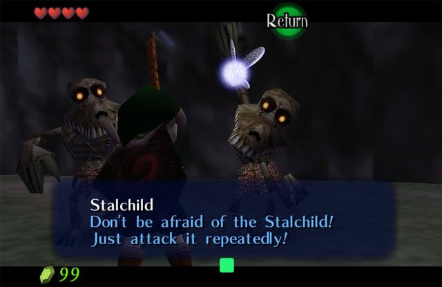
http://rapidshare.com/files/282777945/Stalchild.rar
@Zeckron Love all your textures and your commitment to perfection. As for the treasure chest my opionion is that it looks to pristine. I imagine a chest to be weathered and aged. Then again, they are magical chests.
I've done a bit of work on the Stalchild. Not complete but as we all know the stretch points are going to be a challenge we may not fully overcome.

http://rapidshare.com/files/282777945/Stalchild.rar
Chieftain459
New member
@Chaoszerox--I would try to find a good texture of slate or limestone or sandstone blocks, and a good sand texture, and combine the two: with the two images on different layers of the same file, start slowly erasing the sand texture so that it looks like the sand has settled in the low areas, while the stone shows through. If you're using photoshop, I would open the brush panel and set jitter controls for the opacity, size and hardness (I think you can change hardness/softness), so that there is plenty of variation throughout the texture--it should add to the realism.
Give that a shot and see how it works! It may take a couple of tries to get it right, but some patience and experimentation will really pay off.
@dcs78--yeah, the stretching is a real pain in the ass. It seems that the modus operandi for the pros at Nintendo was to apply a transparent-to-solid gradient at the ends of the texture where stretching was to occur (it helps that they were aware of the stretching and planned for it when developing textures)... the point I'm making is that if we do the same thing, it may affect the realism, but it will help us avoid the unsightly lines that are created when the texture is stretched.
Last edited:
WOW I missed a lotta stuff.
So I'll just comment where I think I have something worthwhile to say:
@Zeckron: The chest looks good. The metal shapes are extremely professional. My suggestion is to do another gradient map with a more..shiny...gradient. One like this:

Also, maybe roughen the blue surfaces. I agree that it looks too bright overall. Maybe burn it with some grunge brushes?
@Chieftan459: I'll start on that pack
EDIT: How's this look?

So I'll just comment where I think I have something worthwhile to say:
@Zeckron: The chest looks good. The metal shapes are extremely professional. My suggestion is to do another gradient map with a more..shiny...gradient. One like this:

Also, maybe roughen the blue surfaces. I agree that it looks too bright overall. Maybe burn it with some grunge brushes?
@Chieftan459: I'll start on that pack
EDIT: How's this look?

Last edited:
chaoszerox
hires_texture
Is that the one that goes on the Quest status start screen? Pretty good! Maybe a little shadows around were the Sapphires connect to the gold, and maybe a hook thing that holds the gem inplaceHow's this look?

Heres an update on my sandy texture
Original (from older post)
http://i239.photobucket.com/albums/ff70/num1narutofan/Original.jpg
Version 4 (from older post)
http://i239.photobucket.com/albums/ff70/num1narutofan/V4.jpg
Version 6 (new)
http://i239.photobucket.com/albums/ff70/num1narutofan/V6.jpg
Better or worse overall?
Last edited:
X-Fi6
New member
@chaoszerox
Definitely an improvement over the original, but it would be good if the colors weren't so sharp and you made the red and green blobs in the stone match more and be a little less visible.
Edit: After looking at it a second time, it actually looks perfect the way it is.
Definitely an improvement over the original, but it would be good if the colors weren't so sharp and you made the red and green blobs in the stone match more and be a little less visible.
Edit: After looking at it a second time, it actually looks perfect the way it is.
@chaoszerox, thanks for pointing out those borders. I've got them fixed now, and as per Lewa's suggestion, I've tweaked with the gold gradient too. Will post a screenie tomorrow.
I really like that new sand texture. Looks great! Best one yet.
@lewa, thanks for the tip. Honestly though, I just really seem to be missing the gradient thing. I played with it for the past several hours, and finally have something I can deem "better". I'll post a screenie tomorrow, but if it still doesn't make the grade then I'm going to need your help. Some very detailed step-by-step instructions would be awesome (maybe as a PM so as not to junk up the thread too much). Hopefully it won't be necessary, as my latest version actually uses a lot of techniques. So it may make the grade, we'll see.
@dcs78, Stalchild looks totally awesome! Now he really DOES look scary! I totally like it, and can't wait to see your final version. I've done some work on the skulltula, but your screenie of the Stalchild makes me want to go back and roughen it up even more than I already had.
Once the chest is done, I'll revisit the Skulltula, then get back on track. I apologize for my slow progress lately, but after retexturing the Forest Temple I'm really taking my time. Don't want to get burned out until after my 3rd dungeon retexutre at least
chaoszerox
hires_texture
I've made a Version 1 of my 4th texture! This texture is composed of 4 identical blocks, each 16x16 in size that add up to the original 32 x 32 texture. I took one of the 4 blocked and worked on it, then duplicated it and blured it a bit because the edges were too sharp. This version wasn't ever ment to be a final version, but give a better idea what the final should be.
Version 1 of stone blocks in 32x resolution
http://i239.photobucket.com/albums/ff70/num1narutofan/V1-1.jpg
I've found out some significant information regarding the Spirit Temple. Everything can be explained by examining this picture!
http://i239.photobucket.com/albums/ff70/num1narutofan/significantpicture.jpg
1. The textures in this room (1st room, main enterance) will overlap =/
3. The texture for the snakes head will include part of the sandy brick's texture
EDIT: I quickly made a new texture! It uses the same base picture and technique as the re-texture in the above picture!
http://i239.photobucket.com/albums/ff70/num1narutofan/V1-2.jpg
P.S. I'm getting really excited about this project now if you can't tell! ^_^ :bouncy: :happy: :bouncy:
Version 1 of stone blocks in 32x resolution
http://i239.photobucket.com/albums/ff70/num1narutofan/V1-1.jpg
I've found out some significant information regarding the Spirit Temple. Everything can be explained by examining this picture!
http://i239.photobucket.com/albums/ff70/num1narutofan/significantpicture.jpg
1. The textures in this room (1st room, main enterance) will overlap =/
3. The texture for the snakes head will include part of the sandy brick's texture
EDIT: I quickly made a new texture! It uses the same base picture and technique as the re-texture in the above picture!
http://i239.photobucket.com/albums/ff70/num1narutofan/V1-2.jpg
Thanks =) I can't want for the screenshot(s)!@chaoszerox I really like that new sand texture. Looks great! Best one yet.
I'll post a screenie tomorrow
P.S. I'm getting really excited about this project now if you can't tell! ^_^ :bouncy: :happy: :bouncy:
Last edited:
steftheserb
New member
ive been playing around with textures in the enemies folder that werent done.
i havent finished all of the textures but i wanted to see what you guys think http://www.mediafire.com/?sharekey=c8b50f64a633271890a82c7bb0fad7ade04e75f6e8ebb871
those are from the skelleton folder
edit: i think these textures are of a stalchild and i didnt realise that they were already being done
i havent finished all of the textures but i wanted to see what you guys think http://www.mediafire.com/?sharekey=c8b50f64a633271890a82c7bb0fad7ade04e75f6e8ebb871
those are from the skelleton folder
edit: i think these textures are of a stalchild and i didnt realise that they were already being done
Last edited:
- Thread Starter
- #1,253
@chaoszerox thats starting to looks really good!
@dcs78 stalchild looks awesome, I'll add it to the pack.
@Zeckron the texture on the chest seems to squished and to bright for more liking but then thats just me
@Lewa that jewl looks epic.
@dcs78 stalchild looks awesome, I'll add it to the pack.
@Zeckron the texture on the chest seems to squished and to bright for more liking but then thats just me
@Lewa that jewl looks epic.
Ok, let's try the dang box again 
Increased border, darkened gradient, increased detail and contrast on gradient, slightly tweaked the design (barely noticeable).
If the gradient passes, but DD thinks it's still a little too squished or too busy looking then I can start over from scratch. Should be easier to do the gradient (if it passes) now that I know what I'm doing
Let's try some links to full size pics instead of screenies (from photobucket as per Chaoszerox's suggestion) here in the forum. I hate to keep junking it up with re-dos. Hope my links work!
http://i977.photobucket.com/albums/ae258/zeckron00001/MasterTreasure5.jpg
http://i977.photobucket.com/albums/ae258/zeckron00001/MasterTreasure6.jpg
http://i977.photobucket.com/albums/ae258/zeckron00001/MasterTreasure7.jpg
http://i977.photobucket.com/albums/ae258/zeckron00001/MasterTreasure8.jpg
Chieftain459
New member
@Zeckron--me likey. BTW, was that a jab at me on the whole "don't want to get burned out until after my 3rd temple" thing? Lol.
@Lewa--few suggestons:
1. More bevel on the gold part
2. Any chance you could use an image of a round sapphire off google?
Otherwise, great!
@Chaoszerox--the second stone block texture didn't quite line up with the first (along that diagonal seam in the screenshot)... any chance it could be made to fit together better? Or is is a programming issue? Otherwise, looks good.
chaoszerox
hires_texture
I'm trying to decide whether to put a ruby where this red blob is. Thoughts?
Left Original 32x, flipped | right 32x with ruby(no flip)


This is a temporary image host due to the fact that my schools internet blocks photobucket >.<
What should I do about the eye? best thing I've come up with is use this
http://www.freewebs.com/doragon15/snake eyes.jpg
Left Original 32x, flipped | right 32x with ruby(no flip)


This is a temporary image host due to the fact that my schools internet blocks photobucket >.<
What should I do about the eye? best thing I've come up with is use this
http://www.freewebs.com/doragon15/snake eyes.jpg
Much better!!!!! =) Maybe tone it down a bit with the overall contrast(of the whole texture(s) between the gold and blue, other than that it's perfect!Ok, let's try the dang box again
Last edited:
Chieftain459
New member
I like the ruby. As for the eye, if you can trace the original, then use a smooth bevel and a little outer glow set to black, it should look close to the original.
Edit: Different process... trace the original shape with the pen tool or similar selection process--just be sure that you end up with a path or selection from the tool (not filled pixels)... if it's a path, convert the path to a selection in the path panel, then copy and paste that selection onto a new layer. From there, set the layer effects in bevel and emboss so that the layer has a "pillow emboss." Tweak the settings until it looks about right. Here's a rough example of the result (I just threw it together, so yeah, its rough):

Edit: Different process... trace the original shape with the pen tool or similar selection process--just be sure that you end up with a path or selection from the tool (not filled pixels)... if it's a path, convert the path to a selection in the path panel, then copy and paste that selection onto a new layer. From there, set the layer effects in bevel and emboss so that the layer has a "pillow emboss." Tweak the settings until it looks about right. Here's a rough example of the result (I just threw it together, so yeah, its rough):

Last edited:
@Chieftain - LOL! Oh dude, no that wasn't aimed at you  Retexturing the whole Forest Temple was a thrilling and very enjoyable experience. But it was also like a marathon. I was already a little weary after the Ice Cavern, so after finishing the Forest Temple I really felt like I needed to catch my breath.
Glad you like the chest, I'm actually very happy about it. Picked up a couple new techniques from working on it, so that's a very good thing.
@Chaoszerox - very glad you're having such a good time with this! It's very addicting
I think the ruby is one hell of an awesome idea! When you get a chance, load it up real quick and see how it looks (cuz you never know for sure until it's actually being used in-game). Just don't forget to add some inner shadow and maybe a touch of drop shadow? That's a toughie.
I think you have a good idea about the eye. However, in my opinion if you're not going to make them look as though they're carved stone, you'd definitely want to make them look like glass or perhaps a shaped gemstone or something. A realistic looking eye stuck in the middle of some rock would look dodgy. But I think with the proper care, making them look fake (like glass or something) could actually work with awesome results!
EDIT: Damn Cheiftain I didn't see that until after I had posted.... That's freaking awesome looking! Rough my ass! It's super sweet.....
steftheserb
New member

i had a quick go at what chaos was gonna try just to see how it would go and i'm fairly please with the results. i havent got the correct file name as this was just me testing out some things that i have learnt


