What's new
  • Most issues reported these days stem from users not enabling their emulators to use the required amount of RAM.
    We also tend not to use the search feature but post our issues within the texture pack release page.
    Failure to load a texture pack should not be posted in the release thread unless you have already patched the emulator.

    If you don't have the resources to use Large/HD texture packs please do not attempt to do so.
    Users should have a minimum amount of System RAM not less then 4GB's.
    If you have less then 4GB's of RAM do not post about how your emulator crashes,
    RAM is dirt cheap so invest some money into your PC.

    I would like to say thanks to squall_leonhart
    for posting this Solution.

Zelda Ocarina of time Community Retexture Project

Riddler119

New member
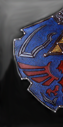
@Death-Roid The Current shield is an excellent shield no-doubt, but I feel that I can create one even better.

Also since Im new at this, its all I will be working on atm until its near perfect=]
 

Chieftain459

New member
@Zeckron--yeah, Illustrator is actually my strength. Most of my work is vector/line art... raster imaging is something I only deal with at work when I have to, but I leave most of that to the other folks in my creative team.

@Lewa--your stuff looks great! Like Zeckron said, definitely look into higher resolutions, but either way, stuff's turning out great!
 

lewa

New member
Glad y'all like the icons! Okay, I will definitely start using higher resolutions. Was just worried about some people's graphics card's not having enough ram.
..Now I feel like I should re-do some of them, but I really don't feel like it. If there are any glaringly bad ones, though, I will probably eventually do it.

I just beat Jabu! He looks much smaller on the outside O.O. Anway, I will now be able to work on graphics for the second two-thirds of the game :D

EDIT: For some reason, the textures starting at jabu are not being dumped :unsure: No boomerang, no disgusting phlegm textures, no enemies etc. Princess Ruto is there, though.
 
Last edited:

Riddler119

New member
*UPDATE*

The shield is looking EXCELLENT. I'm just tweeking a few things, especially the outside of the shield, trying to get a better contrast with the Dodge and Burn tool you guys told me about. The final version(for now) will be out later tonight, I will post it up when it is!

OK, the shield is FINAL for right now. I guess you could call it a final beta?

lol anyway, I will touch up on this another time. Probably the top outside, as its a little bright. It at least looks better than the other shield. For my first re-texture, I am VERY happy with it. Here you go ladies and gentlemen!

Here is the texture:

THELEGENDOFZELDA03F326D002_rgb-1.png


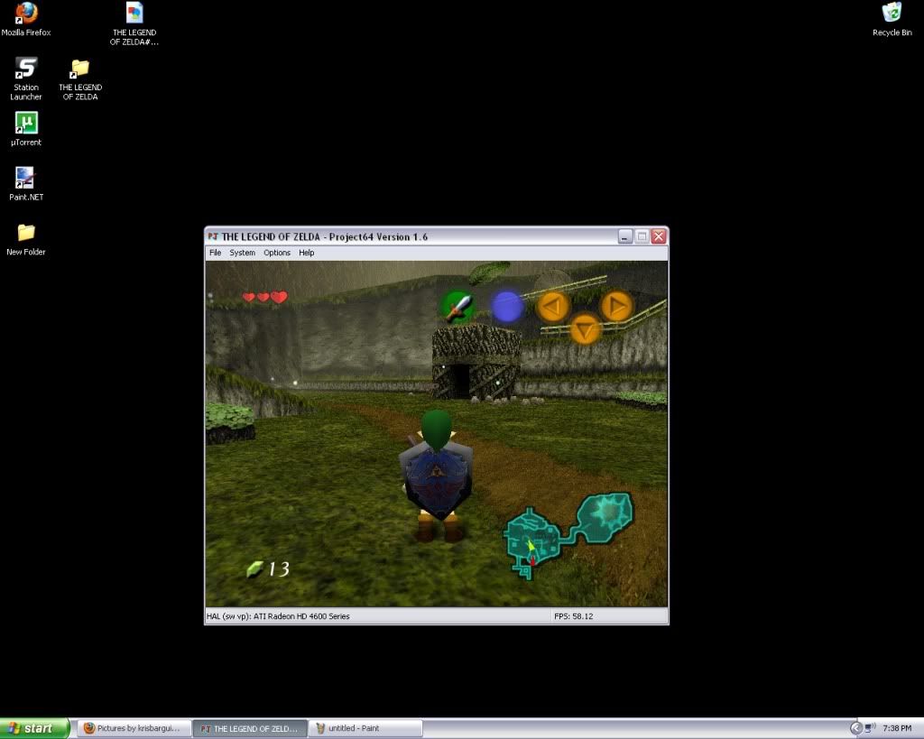
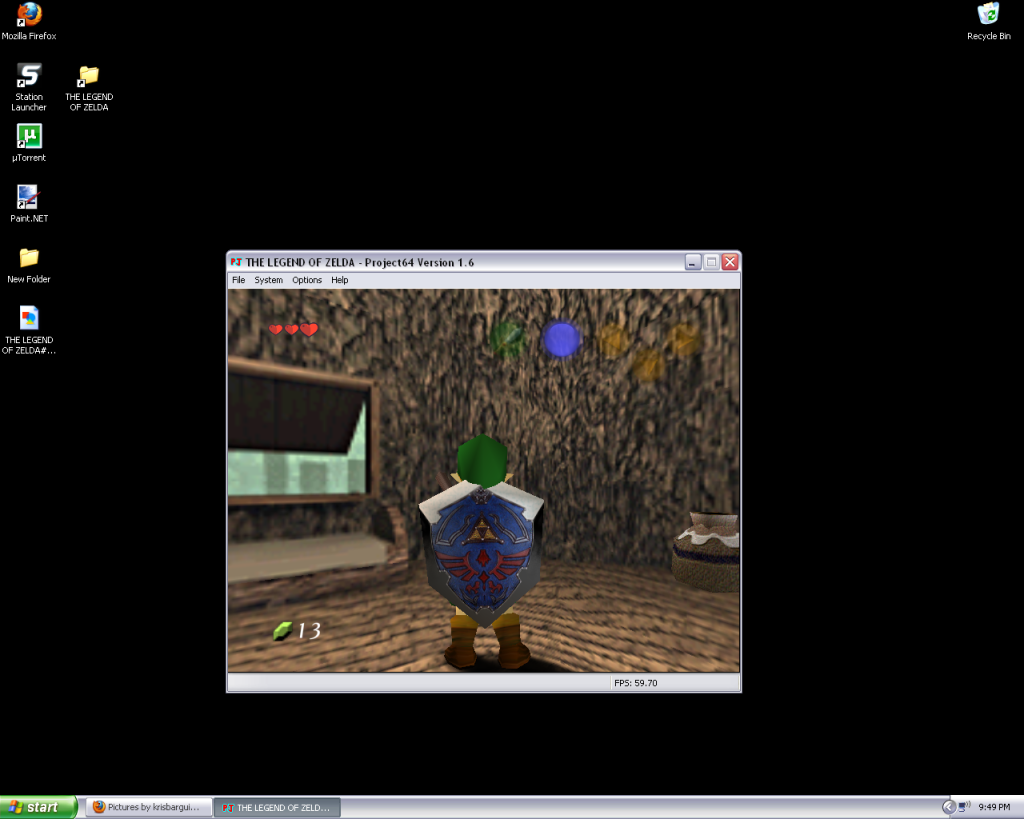
and here it is game:

Shieldpic.jpg


There you go, and remember I am going to touch up on it. I'm going to make the bottom less black, and try to make the top a little darker, and have it all fade in together.

Hope you like it(My first retex:bouncy: )

:party:

BTW try it out for yourself, I can tell you that the picture of the ingame shield on here doesn't look as good as it does when your actually using it. Cheers!
 
Last edited:

squall_leonhart

The Great Gunblade Wielder
uh... actually.... it doesn't look that good at all sorry. the colours are very flat, and dull compared to the shield already available in the pack.
 

Riddler119

New member
No problem man! Keep it up, I WANT people to tell me what they think, in order to improve!

I'll keep working at it squall, thanks for your opinion!
 

Zeckron

New member
@Riddler, trust me I'm probably one of the least qualified to give you advice here (Chieftain, Death--Droid, and Mode7 are the best!) but from my experience it's all about layers. Layers layers layers. You can do way too much with layers.

I forgot if you said you're using Paint.net or photoshop, but the principles are the same for what you're trying to do: minimum 2 layers fading into each other. Paint.net has an awesome gradient tool that makes transitions between textures way too easy. But it's all about how you blend those layers together.

Supposing you were using Paint.net, you'd create 2 layers. The first with your black layer, the second with either white or a lighter shade of grey. You'll blend the layers together with one of the blending methods (usually "Multiply" in Paint.net or sometimes "Overlay") but the magic is using the gradient tool. With the gradient tool you can either make a gradient of one texture slowly fading into pure transparency, or fading into whatever color you choose. I'm sure Photoshop has something similar, and most likely even more powerful.

Hey I gotta say, that last pic of the shield you're making is truly great. Death--Droid is currently leading the project, so really you have to impress him instead of me. But in my opinion that thing is awesome!! I love the edging. Looks like a highly polished mirror finish. I'm already impressed, but if you bumped up the lightness on it (may be as simple as increasing the gama by like 5 to 10%) it would be perfect imo.

Nice work!
 

Riddler119

New member
Thanks Zeckron! Great tips, going to give that a go after this!

I use both Paint.net and Photoshop, I mostly do the hard work in photoshop, then I change all the bit-depths and file types in paint.net, as it is way easier.

Thanks! I think the mirror finish looks way better than the pic before my last as well. I'll do the gamma trick and see what I can do.

Once again, thanks!
 

Riddler119

New member
Ok using paint.net, how do I use the Gradient tool? I will click on where I want the fade to happen, and the whole picture goes away and all i see is black and i can stretch it to get shades of grey. How do this work with pictures?

Also when I start a new layer, anything I do to that layer happens in my backround.

Sorry for the noobish questions!
 

squall_leonhart

The Great Gunblade Wielder
In using paint.net i also recommend grabbing some of the Additional plugins which add more features.

I haven't got the hand stability to really draw or do retexturing, but i do some image modification with PDN and its really good with the right plugins installed.
 

Zeckron

New member
@Riddler. About the layers, this took me a LOT of trial and error before I really understood what's happening. Nothing I read helped. Honestly, it's hard to explain and you'll just have to experiment.

Squal-Leonhart hit the nail on the head concerning the layers being stackable. And that in itself can be difficult to grasp sometimes. Just keep a very close eye on your Layers window box. If a layer has a checkmark on the right side of it, it's going to be viewable, if not then you won't see it. On the flip side of the coin, if you click on a layer in that layer window box the name of the layer will be highlighted in blue which means whatever you do next (drawing, color changes, blurs, effects, etc anything!) will be done on that layer and that layer only. Pay close attention to your layer stacking as Squal_L said, b/c when you're dealing with lots of layers (as often times you will) it can get a little hairy.

The Gradient tool defaults to a color gradient. There's color gradient (which you witnessed by making shades of black and gray fading into white and the icon for it in the top toolbar looks like a checkerboard of colors) and transparency gradients (icon looks like a checkboard of white and gray) that you'll need to manually select. Paint.NET's help section is actually pretty good here so take the time to read up on it and all their good tutorials. Just keep in mind that Paint.NET will always default to a primary color of black, and secondary of white. And that's why you see black fading into shades of gray when using the default settings of the gradient tool. You'll use the transparency mode of gradient tool most often when fading pieces of textures together.

I'd better quit here b/c this thread isn't for photo-editing, rather just the OOT community retexture project. So read up on Paint.NET's tutorials about layers and gradients (also some good videos on the web that can help), and if it doesn't make any sense after all that send me a PM so we don't junk up the thread anymore.

EDIT: Forgot to mention that you should always keep an eye on the bottom left corner of Paint.NET. It will always display a message down there about whatever tool you've currently selected and is actually very useful. Example: when using the gradient tool it tells you to hold down the SELECT key when clicking to make your gradient. This constrains the angle to multiples of 15 degrees, which is oh so helpful when you're trying to make a straight line gradient. There's a lot down in that corner, so pay attention.
 
Last edited:

KrazyTrumpeter

New member
Wow, I like the way your shield is turning out a lot.

Hopefully with the experience you are getting with this, you can help the team in general retexture work as you obviously have a pretty good eye for it.
 
OP
death--droid

death--droid

Active member
Moderator
@Riddler119 the middle of the shield texture is good Riddler119 but the rim is horrible it doesn't match the detail of the middle making it look out of place if you get the rim to have the same amount of detail as the middle then the texture is going to look amazing!.

Keep up the good work everyone!
 

squall_leonhart

The Great Gunblade Wielder
Was any of the logo textures removed in V3?
because im seeing both the HRT logo and the original logo appear on the title screen o_O

just noticed it when i upgraded to the latest glide64, but it also occurs with napalm.... so it must be changes to the pack
 

Top