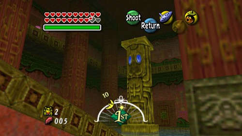
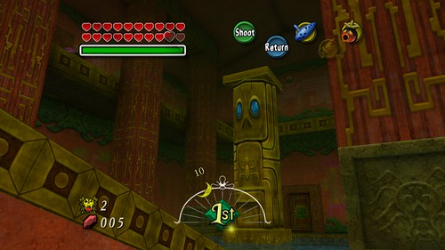
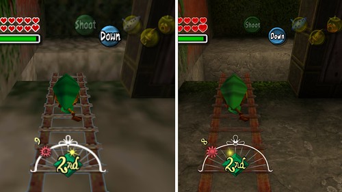
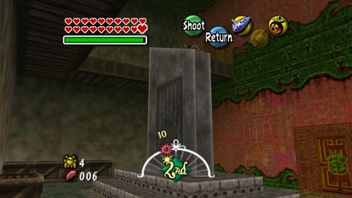
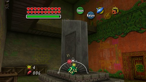
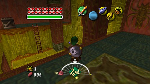
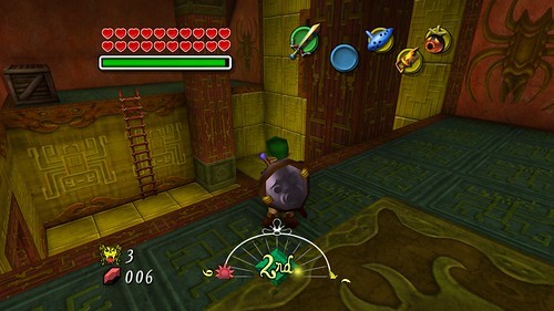
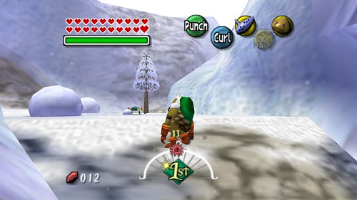
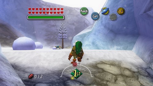
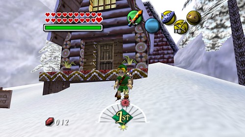
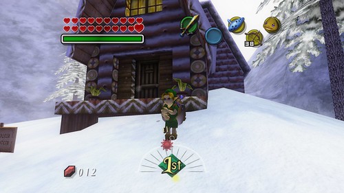
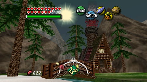
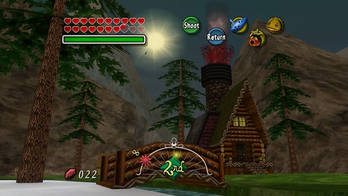
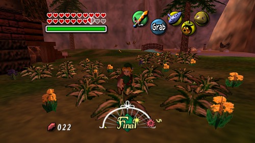
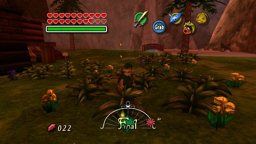
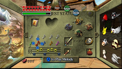
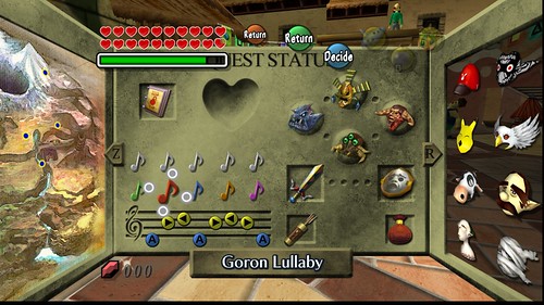
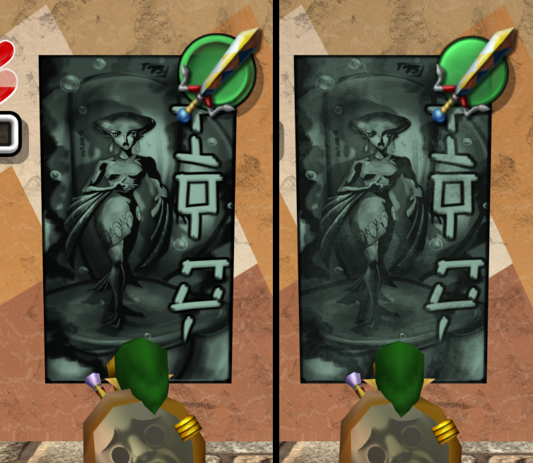
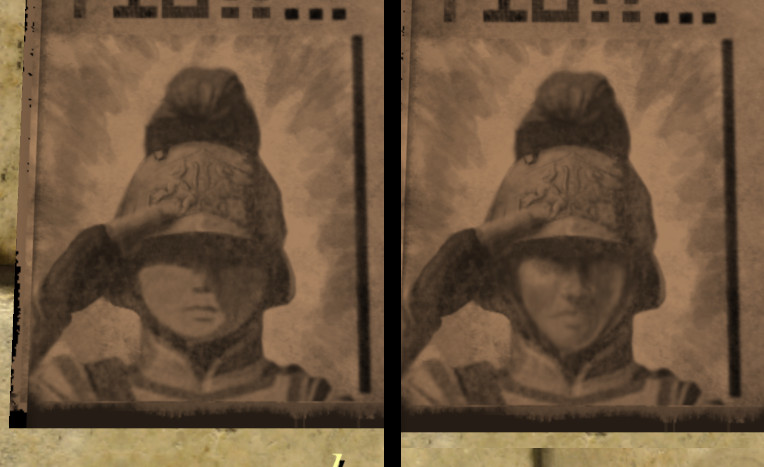
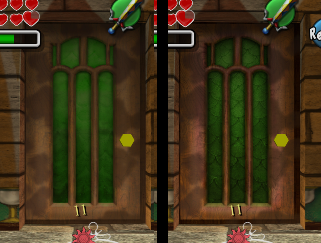
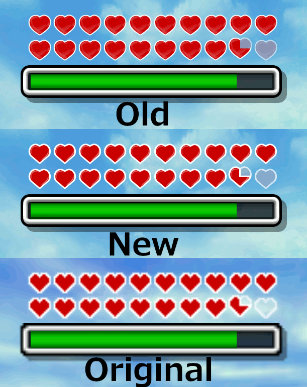
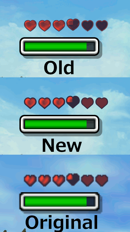
The past couple days, I've spent many hours revisiting Termina to come up with a more comprehensive list of feedback. I have to say, running around Clock Town, Termina Field, the Southern Swamp, and what's complete of Snowhead, I was impressed beyond measure! You've captured the essence of the original vision so well, it feels exactly like I remember it but so much clearer and prettier! Clock Town looks fantastic (I really love what you did with the posters and shop signs around town in particular), the Astral Observatory is stunning, Termina Field feels more magnificent and imposing than ever, the swamp scenery is gorgeous and fantastical, and you can almost feel the cold air at Snowhead. Everything looked gorgeous, but nothing stood out particularly because everything looks so close to the original. So much so, in fact, that turning off the pack to compare was actually quite jarring; the pack really started to feel more like the original than the original, in a sense! I also really love what you did with the HUD and menus in general; the pause screen looks amazing, and the use of official art gives it a very authentic, polished feel, and the in-game HUD follows the original very closely while feeling much cleaner. I found the use of the pixelated font for item quantity a really cool and fitting nod to the original, as well. I absolutely LOVE your work so far, and I can't wait until this is done! I really think this will become the definitive way to play the game!

Anyway, gushing aside, I do have a list of criticisms. Some of them are pretty nitpicky, but nostalgia is a strong force; anything off stands out like a sore thumb. In no particular order:
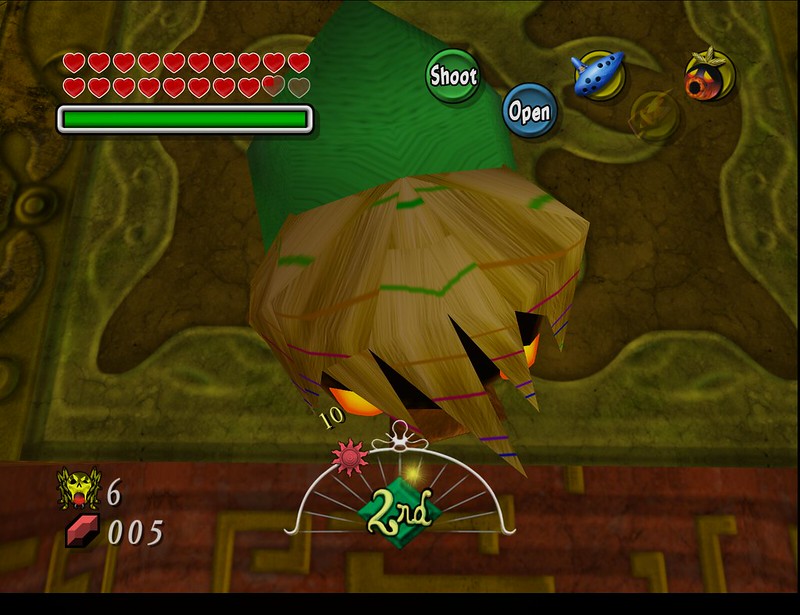
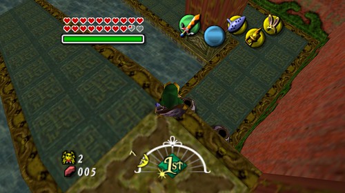
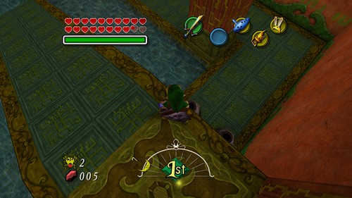
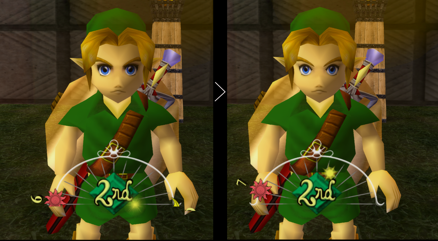
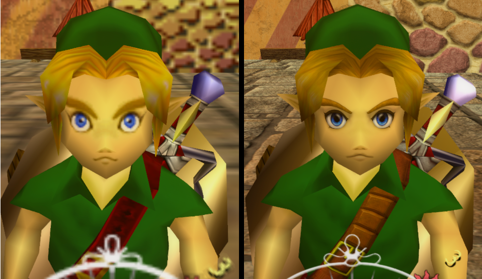
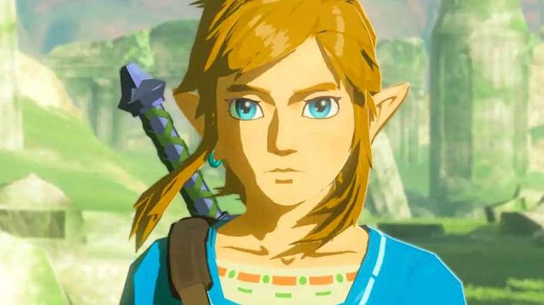
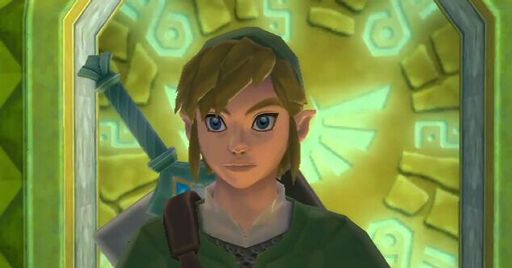
- Link's retexturing (as I mentioned before). I can definitely see that you're leaning towards the concept art. However, being honest, the concept art and in-game style are two very different directions in the first place, so personally, I don't see a need to follow the concept art (the original developers certainly didn't). The artwork link's face is extremely different, his tunic is a neon green, and there's a unique lighting style. Not only does this not fit well with the rest of the game in my opinion, but it's impossible to faithfully recreate anyway. I think I speak for many when I say I would really prefer a faithful recreation of the original in-game link. Even things like the changed belt, strap, and boot colors are jarring to those used to the original. Link's new eyes also look very out of place (though the redone ones look a bit better). I would personally prefer a recreation of the original eye textures (though his eyes are admittedly weird looking in the original) just because I am biased toward the original. Deku Link's boot and glove colors are also too shiny and bright in my opinion, and his new, wooden Deku Pipes look strange. I would again prefer the original, brass pipes.
- The new breakable pot texture gives an almost concrete-like impression.
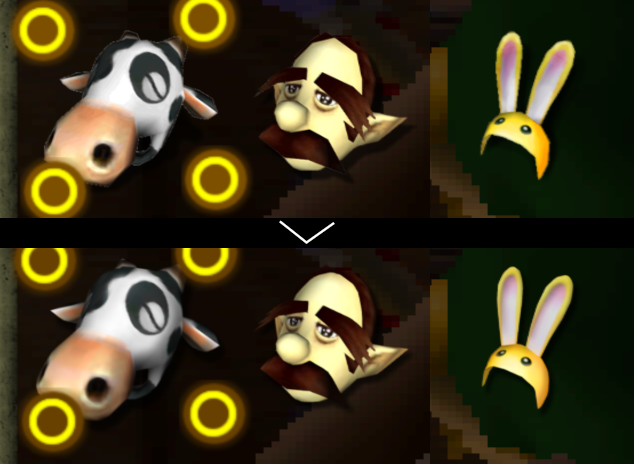
- The new bobblehead cow head texture looks really out of place with the body. The original gives an impression of being crafted out of paper or wood, resulting in its blocky shape. I think a blockier, bigger head would be more fitting.
- The newly drawn gilded sword icon looks great, but kind of gives the impression of being airbrushed; it's slightly blurry and lacks sharpness/cleanness compared to other icons.
- Some mask icons have
very slightly unclean edges (this could just be a product of the icons being higher-res than my 1080p screen can fully display), such as the Romani and Stone masks.
- The newly drawn Anju's grandmother icon is also very official looking, but looks a bit less sharp and clean than the other character artwork.
- Some select textures look a bit gritty and overdetailed (might look better on a 4K display), such as the some grass (laundry pool, outside area of Zora Cape, thawed mountain village), carpet in milk bar, jars on the milk bar counter
- Orange dots on map were originally square (like treasure chests)
- Cuttable grass looks lighter/more white in the original. Also, maybe it could be a little pointier(?)
- The vats of liquid in the milk bar look more like marble than liquid
- The Majora's Mask image on the balloons (i.e the one Jim tries to pop) looks too shiny and perfect, almost like it was printed out.
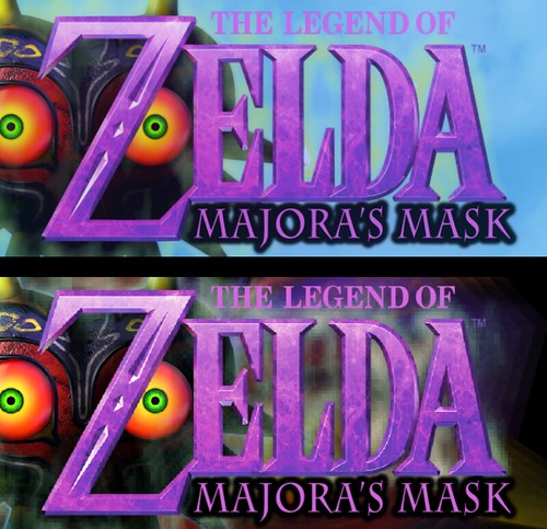
- The title screen logo, particularly the word "Zelda" looks jaggedy and distorted at 1080p.
- Some minor textures have slightly different color palettes than the original (i.e the tree in the swamp shooting gallery)
- The owl icons that appear when choosing a teleport location look very out of place.
- Font on the action icon (i.e "attack") looks off, though I admittedly got used to it fast
- The world map on the pause screen looks almost like the sharpness has been turned too high, chromatic aberration is visible (unsure if this is intentional)
- There is some stretching on the world map and a seam on the treble cleff on the pause screen (these were present originally, but is it possible to correct?)
- The font on the clock that tells what day it is looks a bit unclean, as does the clock in general
- Effects from hitting an enemy with a light arrow looks a bit like electricity; perhaps too many prongs?
- The pine/evergreen tree needles give a lighter impression in the original
- The dark part of the holes on the walls inside Clock Town looks possibly too light; gives the impression they were spray-painted onto the wall (I'm not sure what these holes are, honestly)
Again, these are pretty nitpicky, so I apologize, but I really love Majora's Mask and your project, so I can't help but give my harshest feedback in hopes of improving what looks like it will be the definitive edition.
Also, just as a very random side-note, is it possible to correct the lens of truth's screen overlay and button overlay for widescreen?
Thank you so much for remastering my favorite game of all time! It's a dream-come-true.


