What's new
  • Most issues reported these days stem from users not enabling their emulators to use the required amount of RAM.
    We also tend not to use the search feature but post our issues within the texture pack release page.
    Failure to load a texture pack should not be posted in the release thread unless you have already patched the emulator.

    If you don't have the resources to use Large/HD texture packs please do not attempt to do so.
    Users should have a minimum amount of System RAM not less then 4GB's.
    If you have less then 4GB's of RAM do not post about how your emulator crashes,
    RAM is dirt cheap so invest some money into your PC.

    I would like to say thanks to squall_leonhart
    for posting this Solution.

Zelda Ocarina of time Community Retexture Project

turpinator

Piledriver Program Advance!
No clue what the issue is, but remember that the file names should NEVER be changed, otherwise they will not load.
Also are you sure you have the textures your're trying to load in
"plugin\hires_texture\THE LEGEND OF ZELDA"

by no limited to your edits, do you mean the v4 pack isn't loading properly?
what emu (and version) and video plugin (and version) are you using?
Those are pretty newb level stuff, man. I wouldn't put it outside the folder it's designated for. :\ And you've asked me about the versions before. I switched over to the current community video plugin for my PJ64. And I know PJ64 isn't doing it.

EDIT: And when I say newb, I'm saying I wouldn't do silly things like that.
 
Last edited:

chaoszerox

hires_texture
Those are pretty newb level stuff, man. I wouldn't put it outside the folder it's designated for. :\ And you've asked me about the versions before. I switched over to the current community video plugin for my PJ64. And I know PJ64 isn't doing it.

EDIT: And when I say newb, I'm saying I wouldn't do silly things like that.
haha I was wondering, because your PC can run maya 2011, but you asked for some1 else to make screenshots. I thought somehow you might not know how. I underestimated :p

About the issue, I have no clue, only people that I think could answer any of your questions are the devs from 1964 emu and video, but it's likely they don't know, care, or have the time even if you could contact them....

Try 1964 emu for the heck of it
 
Last edited:

turpinator

Piledriver Program Advance!
Screenshots? When did I do that? I remember you offered to take screenshots for me, but I don't remember ever asking for any. :\
 

Fak

New member
I provide the host for the pack and I just tested it. The pack is maxing out my buddy's connection and expects to be done in 22 mins. That seems fine to me.

Everything I try to download from that host comes very slowly.
I tryed Djipi Final Cell MOD and is also very slow.
I think the file might has got corrupted because I had to pause the download some times because I can't leave the PC alone at home. :)

For files of that size, some times it is good to use torrent too. It realy helps.
 

turpinator

Piledriver Program Advance!
wow I mixed you and Datadayne up, my bad
lawl. Oh, btw I finally found the Magic Meter. Fixed and implemented in the hearts section.

EDIT: Also, I figured out what the problem is. Apparently some of the greyed-out icons have doubles. :\ Oh well, getting alot done.
 
Last edited:

turpinator

Piledriver Program Advance!
Whelp, I would assume an update is in order, but without revealing too much, I'd like to stick to screenshots on the images for now until I'm completely done.
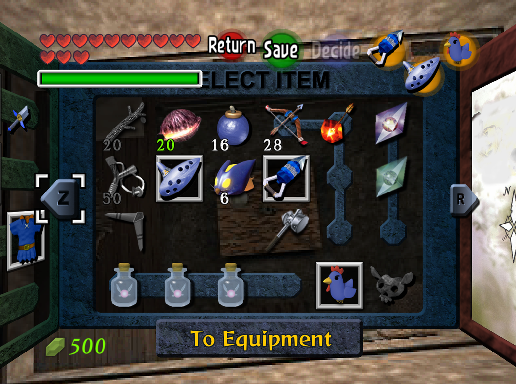
Example1.png

I've done about 75% of the cleaning I want to do with the icons, the bottle icons are all about done, I just have to add Green Potion to the list, since it wasn't there to begin with. I replaced the generic blue chicken with an actual image of Kojiro, messed with the arrows so they don't look like scans anymore. (I.E. no pale colours) Replaced the bomb image someone did, and routed the greyed-out image of the slingshot that was missing. Got new, sharper images for the boomerang, deku stick, bombchu, and longshot. I found the images pertaining to the square indicator showing what you currently have selected on your C-buttons as well as the Magic Meter bar. Before anyone asks, no, I didn't mess up on the opposite side of the magic meter, it mirrors the left side to make the right side's cap, but it does it poorly, thus the bad quality.

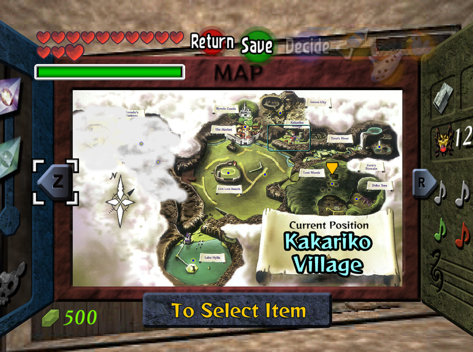
Example2.png

As you can see, I'm effectively done for the map screen.
 

chaoszerox

hires_texture
Can you also re-make the green potion bottle's link picks up to re-fill his magic meter? Even if the bottles they're in aren't the exact same, the contents should look the same I think. The bottles themselves could use a bit of tweaking. The originals aren't nearly as bright, but more gray. Looking at the pack I see you didn't make the empty bottle, but prehaps you can fix it :)
The blue dots with yellow glow on the map look much smaller than the originals.
Otherwise excellent work! keep it up :) The arrows are MUCH better (I'm assuming you did them all?), and the boomerang very cleaned

Here's a pic of the select menu from the v4 pack for comparison
http://i756.photobucket.com/albums/xx209/cahosanimex/2010 OoT work/v4packselectmenu.jpg

Also in the v4 pack the grayed out versions of the bow and longshot aren't done
 
Last edited:

mode7

New member
Whelp, I would assume an update is in order, but without revealing too much, I'd like to stick to screenshots on the images for now until I'm completely done.
Example1.png

I've done about 75% of the cleaning I want to do with the icons, the bottle icons are all about done, I just have to add Green Potion to the list, since it wasn't there to begin with. I replaced the generic blue chicken with an actual image of Kojiro, messed with the arrows so they don't look like scans anymore. (I.E. no pale colours) Replaced the bomb image someone did, and routed the greyed-out image of the slingshot that was missing. Got new, sharper images for the boomerang, deku stick, bombchu, and longshot. I found the images pertaining to the square indicator showing what you currently have selected on your C-buttons as well as the Magic Meter bar. Before anyone asks, no, I didn't mess up on the opposite side of the magic meter, it mirrors the left side to make the right side's cap, but it does it poorly, thus the bad quality.

Example2.png

As you can see, I'm effectively done for the map screen.

nice work. It's original artwork isn't it? I don't know if we're allowed to use it
 

turpinator

Piledriver Program Advance!
Can you also re-make the green potion bottle's link picks up to re-fill his magic meter? Even if the bottles they're in aren't the exact same, the contents should look the same I think. The bottles themselves could use a bit of tweaking. The originals aren't nearly as bright, but more gray. Looking at the pack I see you didn't make the empty bottle, but prehaps you can fix it :)
The blue dots with yellow glow on the map look much smaller than the originals.
Otherwise excellent work! keep it up :) The arrows are MUCH better (I'm assuming you did them all?), and the boomerang very cleaned

Here's a pic of the select menu from the v4 pack for comparison
http://i756.photobucket.com/albums/xx209/cahosanimex/2010 OoT work/v4packselectmenu.jpg

Also in the v4 pack the grayed out versions of the bow and longshot aren't done
I plan on remaking the green pot, it's not that hard to do either. On the note that the bottles aren't grey, I never really liked the grey bottles, they weren't altogether in style with the rest of the game that way. Either way, this is the only bottle image I can get from searching, and I had to tweak it ALOT. Anyways, I'll leave it up to general opinion for the colour. As for not making the empty bottle, this is not entirely true. I was not happy with any of the bottles since they were either not transparent enough, or the bottle layer was not covering the contents layer. *coughpoescough* So I decided to redo the entire set, once I'm done I'll post 'em and I can tweak 'em from there. I do well on criticism, as long as it's objective and not made to insult.

I know the dots are smaller, I had had it at the same size with aliasing, but it looked way too large, and I was tweaking around with it 'till I got it to this size, believe me, it looks better this size than others. Though I could make it abit bigger if people share this opinion...

I redid all the arrows, I still have to clean up the bows, and I did the greyed out versions of the longshot and bow.

nice work. It's original artwork isn't it? I don't know if we're allowed to use it
Dude, it's official art from the game itself. The original sprites were based off these. I'm just using them to make it nice and neat. Betcha OoT for the 3DS does the same thing when it comes out. ;P
 

Craig R.

New member
K guys, im running into a bit of problems. Rendering the side view of links house (or any other side view background) is giving me a hard time. Here is a comparison between the original and my rendered version:
1hsh.png

I used a panorama lens for my camera in maya but its not rendering correctly. Rendering out individual sides manually and then stitching it in photoshop would probably work,, but wouldnt be very accurate. If anyone has a solution, please tell me. I will upload the maya scene files or export it to an obj is anyone wants to try it in another software.

Anyways, this is close to the final version:
295pc3q.png
Looks great but the colors need to be matched up.
 

turpinator

Piledriver Program Advance!
I kinda like the new colours better. :/ Looks more like wood than the original. Not to mention the light source and colour looks natural and not man-made.
 
OP
death--droid

death--droid

Active member
Moderator
Yeah I agree with turpinator that the new colours look a lot more natural and not man made, also reflects the light source better.
Have you had any luck Datadune fixing the panorama rendering mode??
 

mode7

New member
Dude, it's official art from the game itself. The original sprites were based off these. I'm just using them to make it nice and neat. Betcha OoT for the 3DS does the same thing when it comes out. ;P

Not trying to offend you. I'm sure they will use them in the remake. But they're nintendo they own the rights.
The problem is if we distribute the pack containing these images, basically we're distributing copyrighted material.
We're already doing it with the Zelda logo in the startup screen. It hasn't been a problem yet, though (one of my videos got deleted on dailymotion).

I don't want to scare anybody nor wan't to critisize you for your nice implenation of these images but rather point out the issue.

The worst thing that could happen is a so called cease-and-desist letter from nintendo. Which could stop the whole pack putting legal pressure on artist and distributers. Though I would say the risk is very low at the moment.

I think we should be aware of this anyway and develop a policy on using possibly copyrighted material.
Well I'd rather keep them in actually as they are original and we're going for original. But everbody should know there might be risks involved.
 

mode7

New member
Yeah I agree with turpinator that the new colours look a lot more natural and not man made, also reflects the light source better.
Have you had any luck Datadune fixing the panorama rendering mode??

Sorry for double posting but I want to keep these issues seperate.

I like the lights better too. but be awere that link is still rendered by the game engine and he will be bright, alot brighter than the render.

@Datadayne:
I don't know anything about maya. But I used to do this for the sky panoramas:
Place the camera right.
In the camera setting set the FoV to 90° at an 1:1 image aspect ratio.
Then make a 4 frame animation rotating the camera in 90° steps (make sure to turn of motion blur or multi frame antialiasing)

Eventually stich the 4frames together in PS and you have a nice box render.
 

chaoszerox

hires_texture
cease-and-desist letter from nintendo. Which could stop the whole pack putting legal pressure on artist and distributers. Though I would say the risk is very low at the moment.
prehaps you din't realize the chances of something happening from something this silly is ridiculously low.
Gaming companies aren't going to spend their effort to try to shut down someone using their pictures from games they don't make or fix anymore, they're going to do it to shut down fantastic, super illegal sites like emuparadise.org, which has 4 TB of illegal roms both hosted in the US and Europe, with games for most of the new systems, as well as a lot of other illegal stuff.
emuparadise.org must get thousands of letters a day from nintendo :)
Besides where exactly would they send a letter or who would they contact? I would guess theirs less than a handfull of mods/admins that ever check this forum anymore, and that's a generous number.
odds we would get 1 is non-existent in comparison.

I also think we really should move the project from emutalk.net
face it, if us high resolution texture projecters weren't here, this forum would have died entirely a long time ago, as it's the only section that gets ANY posts. Remember not long ago we were having issues with the site being accessible at all?!?!

If we moved the project else-where we would be freed from the silly rules of emutalk.net and maybe be allowed to post and talk about roms without a piano hovering over our heads.

I have 1 question for everyone here working on the project:
Did you dump the rom you use yourself, using your own OoT game and N64?
I didn't, but I'm justified in that I own OoT + master quest for gamecube.
 
Last edited:

mode7

New member
I agree chances are low. But not ridiculously. Just google for chrono trigger ressurection. A great creative project that has been shut down.

But it's true we still stay relatively anonymous. A good thing.

We tried to move the board several times. This is why N64redux was established. But the people didn't accept it. We would have to close the thread to do it seriously.
Personally, I think this project would need a whole board of it's own.

I would like to know what others think about this.

PS: I didn't dump the rom myself. I don't know how to do that. I own it for N64 as well as for the Gamecube.
 
Last edited:

MasterGunz2345

New member
I agree, but I doubt theres any chance of Nintendo finding out about this project. If you want to be on the safe side, i guess moving the project somewhere else would be a good idea. But, moving the project somewhere else would kill emutalk since nothing else really goes on here besides this project. I mean remember, this project has been around for like 2 years or more maybe? I first found out about this stuff when I heard about these Hi Res Texture packs and games and Coolroms happened to have a topic that sends the users to the links. So yeah, maybe the this project should be moved for safety.
 
Last edited:

turpinator

Piledriver Program Advance!
Guys, you fail to realize something else. We're remaking a game for it to be popular again. Why would they fault us for it when they themselves will be doing as well soon? The very same game even. All we are doing as fans are generating our interest to the series by showing that we want it to be recognized by others who may or may not have heard about it before. It's the same as artists making fan-art from games they like, it isn't illegal, and just generates more attention. 'twould be a silly thing to waste resources to shut down a site that respects the companies this much, it would only serve to negate this viewpoint.

EDIT: And I own my own copy of OoT on the Wii. With a recent purchase I have made recently of an N64, I may even buy an original copy of it as well. Hell, I know the legal implications more than anyone here, since I delve into Warez constantly to run my webshow on youtube. >_> I just seek to record at a medium that I can be happy the quality is at its finest. ;P
 
Last edited:

Top