What's new
  • Most issues reported these days stem from users not enabling their emulators to use the required amount of RAM.
    We also tend not to use the search feature but post our issues within the texture pack release page.
    Failure to load a texture pack should not be posted in the release thread unless you have already patched the emulator.

    If you don't have the resources to use Large/HD texture packs please do not attempt to do so.
    Users should have a minimum amount of System RAM not less then 4GB's.
    If you have less then 4GB's of RAM do not post about how your emulator crashes,
    RAM is dirt cheap so invest some money into your PC.

    I would like to say thanks to squall_leonhart
    for posting this Solution.

Zelda Ocarina of time Community Retexture Project

kristian826

New member
yeh I was working on 2 versions - 1 with stones on purpose done like that and other with those smaller stones which I wanted to make linear in both perspectives...

and nah I didn't make those better just because stonework is smaller... I checked on default and with closer examining I noticed that big walkway has smaller stones than the one leading in town which has larger ones... that is why I continued working on that 2nd version...


EDIT : here are fully fixed version that have correct angles and everything like you've mentioned above...

Day child


Uploaded with ImageShack.us

Night child


Uploaded with ImageShack.us

Now I will get on working day and night of grown up versions...
 
Last edited:

kristian826

New member
how can it look out of place when nothing of those is done ?

I checked from outside of Castle - bridge is same coloured and stones have same colour as the ones I used...

inside of Castle on market nothing is done... at least not in this version of pack...
 
Last edited:

chaoszerox

hires_texture
looks entirely out of place with the rest of the pack.
I kind of agree. The modeling is very nice, but everything else has a lot of work to be done. Remember we're not making texture that appeal to certian people, we're making the BE LIKE THE ORIGINALS.
One more thing, sometimes the originals themselves are occasionally don't make sence, and you have to use you head to think what SHOULD have been there and will keep most the original feel of the place.

Now this particular texture actually has to be done with several more, an made to match them, if you do one you must do the others.
This includes not only the adult and young link, dark and night versions of that texture, but also the market, and the views into the area from hyrule field on the bridge and hyrule castle on the way to the market.

Just throwing this out there incase no1 has thought of it. Not all of the work has to be done in the modeling. Some parts, particularly places that get cut off due to where link is standing, could be fine tuned in photoshop.

That said I don't think I person could possibly do it alone and I think it should be a big community project!
This would mean anyone working on the project would have to deal with their work possibly being replaced or modified like the community texture pack is as a whole.
They would also have to release all their work, and the sources (in this case the models as well as the textures, ect ect.)

I furthermore name this mini-project the 'Hyrule city project'

I'm going to start working on it by dumping ALL the textures needed

@kristian826 all of the bricks should look the same. And the same bricks need to be used in the market. Everything needs to have the original source available for this because it may help a TON making the other 7 year older and burned out, dead version.
 
Last edited:

kristian826

New member
as I said I made sure bridge and stones are same coloured and textures are very similar...

I'd be glad to continue on working on market but I cannot dump the textures from there (dunno exactly why...)

I've made all 3 versions of this part that is shown above (adult version uses only 1 file for both day and night... because it's pretty dark even when outside is day, looks similar to winter...)

if you manage to dump files from market pls upload them here or send me link on msn so I can continue working... I am at least glad that I've done pretty good job at retexturing :) ( tried to make it as real as possible...)

if anyone has anything to say on this stuff I made so far like for example turpinator had, pls say them cause I would be glad to improve them in any aspect...
game like this truly deserves to have only the best possible textures in it and I am glad I am one of the crew who can make it happen...

@chaos if you mean on those floor bricks I'm using this one (it's from some pack I've downloaded from tutorial page on here - http://www.n64redux.com/content/ocarina-time-retexturing-sdk-also-other-games)

if someone needs it, here it is...


Uploaded with ImageShack.us
 
Last edited:

squall_leonhart

The Great Gunblade Wielder
take a look at other textures in the pack, you'll notice that they all fit a certain design direction, those images are broaching on realism, rather then the hi def cartoony feel that much of the rest of the pack gives off.
 

The Dave

New member
I don't think it's a complete waste, I just think the lighting is the biggest problem. The trees look really pasted in, the windows also really contrast against the building and I'm not even sure they're all straight.

I took the image in Photoshop and very quickly tried messing with colors and not make things look so uniform. Maybe just putting up the source image would let people tweak it.

This could look a million times better but I just threw some brush strokes on it.

2vwtp9g.jpg
 

chaoszerox

hires_texture
originalpanoramicFINISHED.jpg

After over 4 hours of solid, hard, non-stop work in which very little time was spent correcting things I messed up on, I completely dumped Hyrule market night-time young link version.
It's all very organized inside a PSD, ready to be re-textured, and should be easy to export into the 128 textures it is composed of, by following the layer names (each layer is a texture).

Hyrule city project dumps 0.6 by ChaosZeroX
http://www.mediafire.com/?cf27fbfyxdth6xe

which also contains a lot more dumps for this mini-project.

@kristian Can you release your models so we can help you more easily?
I'd also like to stress this a bit more
I kind of agree. The modeling is very nice, but everything else has a lot of work to be done. We're making the BE LIKE THE ORIGINALS.
One more thing, sometimes the originals themselves are occasionally don't make sense, and you have to use you head to think what SHOULD have been there and will keep most the original feel of the place.
Stuff like the sand really doesn't make any sense to me. I think it would be better if there were some green grass there.
Also the black stuff that foundations the building near the market entrance don't make sense to me here...Try to be a bit creative here.
For the bridge, it needs to match the current one the in the v4 pack, which is fantastic BTW.
I think the widnows on the building need to be more simple, it will look bad (aliased) ingame
Speaking of texture aliasing, your render needs to have 3D anti-aliasing!
Also I think the night version should have less saturation than the day version, as it would in real life lighting.
All the floor patch bricks need to be the same size

P.S. Can't for for DD to release the v5 pack, which he said he needed reminding that he said he was going to release it on the 31st of July 2010 :)
Also I really think we need some kind of statement of the project's style and goal and goals. I think I've said this before, but I don't remember getting any response. Might I suggest this, which I spent some time writing:

Code:
This Retexture Project has a style that everyone should follow if they wish to contribute here.
This project does not seek to add a wildly different art style to the game, but to refine the original,
keeping the original 'feel' of the game, and adding to what the original developers could not produce due to technical limitations (and money).
Not making major changes to what everything is interpreted as, and trying to refine the original into a new, upgraded version of the original is our goal.
Sometimes there are exceptions were the originals, or parts of them just don't fit, or make sense for where they are, or what they appear to be.
These are the only exceptions, and can be improvised and creatively worked upon, changing the original or part of it to something that makes sense, fits and keeps with the original 'feel'.
In the end it's the project management that determines if the texture makes it into the pack.
 
Last edited:

xZabuzax

Member

I don't think it's a complete waste...

2vwtp9g.jpg

Agree, is not waste at all. I can see that with a little retouch the texture looks better. If you think about it, the dirt merge well in the brick-floor because of the sandlike-street outside.

In my opinion that little retouch Dave gave it looks on par on quality with the rest of the pack. But that's just me...

Anyway, that deserve a kudos for both kristian826 and The Dave.
 

kristian826

New member
The Dave - here is game's default...


Uploaded with ImageShack.us

when you compare it to mine you'll see that shadowing is the same (only thing I forgot is to add some shadow on that house near market entrance, will be fixed tho)... even though I thought about changing it to make it a bit better I remembered that stuff death droid said about making retexturing that suits default... maybe a bit mud would look fine on walkway, but this shadowing what you've added is too much... default really does look that bright...

@chaos that dark stuff near entrance is also on default... I think it's some kind of stones, I tried to make it look as near as possible to default but with higher res... I can work some more on it tho...
I agree on grass I also think it would look nicer - grass with some patches of mud (btw that's not sand what I used xD it's dried out land...stuff that looks most similar to that of default :/ )
also I tested files in game nothing is bad aliased as you said it all looks like I have done it...
also it's easy to match that walkway that leads into market, I'll get on it right away xD

but if everyone feels like I've done so much errors then I'll upload you both materials I've used and psd files so you can work on it...

EDIT : also is this the texture that is used as bridge ?

 
Last edited:

turpinator

Piledriver Program Advance!
Moving away from the Castle Town foyer...

I'm almost effectively done.

ICONS
Items - 100%

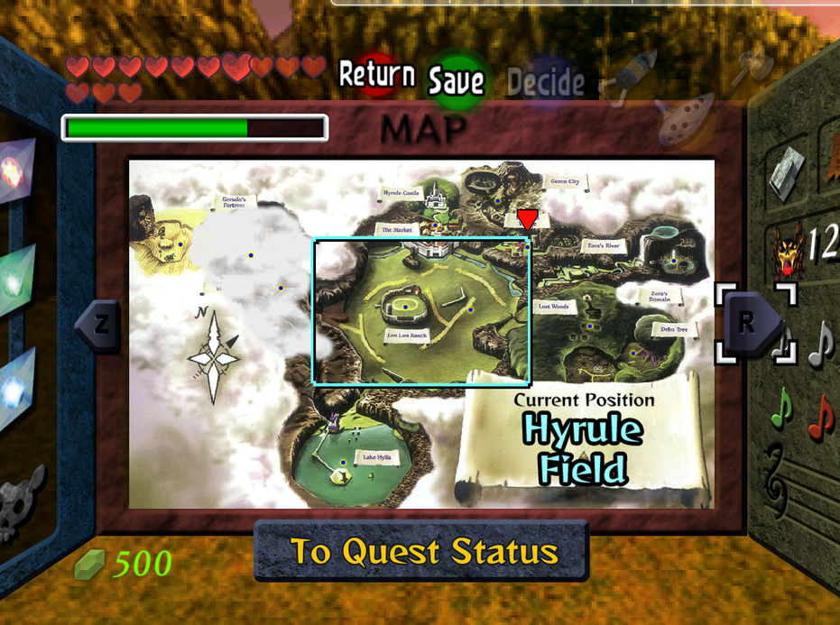
Map
- Dungeon - 100%
- Overworld - 50%

Equipment - 100%

Quest Status - 90%

Other - ?

I have one little issue needing to be addressed. I was wondering if someone could help me with this:
MapTroubles.png

As you can see, the rectangle showing the current location of Link has not been changed yet; This is because it won't rip for me. I was wondering if someone could rip all of the tiles those rectangles show up on so that I may finish the map screen and move on to more important rips.

The other section refers to rips I have yet to do that are still icons, and generally fall under the HUD section. I'll be making new folders for these icons as I got along. Another thing I feel the great need to do is go over other's texture with a fine-toothed comb, as I'm seeing here and there certain examples of bad cleaning, like white outlines on certain textures. BI

Oh and my opinion on the foyer? It needs work and everyone who has given it criticism that makes the creator actually have to get back off their ass and try again are right. That is all. ;\
 

Hey! Listen!

New member
Turnipnator if you're doing HUD icons and things like that I have a small request.

As you can see in the pics posted above the heart/health display. All the hearts are dark in the northwest quarter. This bugs the hell out of me in game because it always looks like my hearts are 3/4 full. If you could consider making them not necessarily all a solid color but at least evenly colored so that there's not such a dark spot on them that would be great.

Here's a pic if I wasn't very clear

2yvqoaq.jpg


I'm also very impressed with the castle foyer area above. It obviously needs a little touching up but not much and I can't wait to see it in the pack!
 
Last edited:

turpinator

Piledriver Program Advance!
I only edit work previously made/create stuff for things that have no icons. I neither needed to edit the hearts nor did I make them myself, so you would have to ask the person who made them, sorry. I'm not messing with something that nice, besides, why would you be confused in the first place? The hearts deplete clockwise, not counter-clockwise. :\

Oh, and don't call me Turnipator, the name's either turp or turpinator.
 

Hey! Listen!

New member
I only edit work previously made
Safe to say they are previously made since they're previously made.

so you would have to ask the person who made them, sorry.
You don't have a problem editing other previously made work though.

I'm not messing with something that nice, besides, why would you be confused in the first place? The hearts deplete clockwise, not counter-clockwise. :\
Because they look wrong. Nothing I can't fix on my own for my own use but thought you guys might want to fix it in the pack since it just looks bad.

Oh, and don't call me Turnipator, the name's either turp or turpinator.

I don't why but when I read your name I see Turnipnator. Weird. Like a destroyer of turnips. :borg:
 

turpinator

Piledriver Program Advance!
I get that alot, BUT there's a reason behind the username. 'tis my RL nickname it 'tis. And the editting thing? It's for things I can see that are clearly wrong, like bad cleaning and stuff, and they are minor edits at best.

I'll see what I can do though. :I I may have a spare heart skin I dug out somewhere around here for another purpose... aha! There it is. *Falls dead*

Wrong heart. XD
 

squall_leonhart

The Great Gunblade Wielder
so basically what you're saying is that mine retexturing reminds you more of a hi def cartoon than something realistic ?

no, in reverse actually, the original game was cartoonish and the other retexturers have managed to capture that in their work, while yours appears more realistic.
 

turpinator

Piledriver Program Advance!
I believe the correct term isn't cartoonish, but Anime style. Still maintains a level of detail, but has a very specific style that is commonly (and mistakenly) associated with cartoons.

Should I drop a zip of what I have so far since I need external help to continue the rest?

EDIT: @Hey! Listen!: Eeep... erm... won't be able to do your hearts, they are harder than they seem. Sorry about that. T.T
 
Last edited:

Top