What's new

Project64 site redesign

A.I.

Banned
http://www.downstreamband.com/pj64logo2-cog.jpg

Best. Icon. Ever. Except...damn you, JPEG format, and your evil ways (despite the 'lossless' compression). I could make a GIF/PNG of that that'd be a tenth of that file size without any quality loss.

Best icon ever? I don't think so. Most inventive? Certainly. But it doesn't even remotely scrub up to the quality of jahra!n's logo which has layers (like an onion, donkey!) of subtle design quality that represents what PJ64 is all about. Not to mentioned it looks polished, professional and damn sexy.
 

squall_leonhart

The Great Gunblade Wielder
the design doesn't look rushed, just the spelling... i like the design... it doesn't totally fit zilmar wants to do though i think.... so it'd need to be heavily modified....


Best icon ever? I don't think so. Most inventive? Certainly. But it doesn't even remotely scrub up to the quality of jahra!n's logo which has layers (like an onion, donkey!) of subtle design quality that represents what PJ64 is all about. Not to mentioned it looks polished, professional and damn sexy.

that and if you look at the n64 booklet regarding the controllers...
 

Iconoclast

New member
Best icon ever? I don't think so. Most inventive? Certainly. But it doesn't even remotely scrub up to the quality of jahra!n's logo which has layers (like an onion, donkey!) of subtle design quality that represents what PJ64 is all about. Not to mentioned it looks polished, professional and damn sexy.
I'm talking about the PJ64 application icon; the best icon suggested in this thread. I wasn't referring to the website's.

I can fix spelling and grammar, but I think the spelling should just be left for zilmar to fix later on after what's important is first taken care of. And grammar...I doubt anyone here on this whole site except me cares about having perfect grammar on your site, so I think he's best by himself with the mechanics. It's true: It doesn't matter that much, but it makes site information appear more professional in prejudice and easier to read.
 

Iconoclast

New member
I didn't say he wouldn't. That's why, I don't think he needs to be bothered about spelling. ;) What's important is the information and its legibility.
 

highcog

New member
I've cleaned up, color corrected, and revised the #2 logo since it got the most feedback. Any more suggestions would be great, and opinions on whether it's an improvement or not are also appreciated.

Here it is, with MUCH more nuance and character:

pj64logo2cog-rev2.jpg
 
Last edited:

highcog

New member
Updated slightly and fixed some outline colors to improve contrast... Sorry for posting so many of these.. This should do it for now -- I'll wait at least a day or two before posting any more revisions. :)

Here's revision 3:

pj64logo2cog-rev3.jpg

And here's a couple examples with the sample webpage layout posted earlier:

1.
pj64rev3-web.jpg


2. (with a plastic effect to match the text)
pj64rev3-web-plast.jpg
 
Last edited:

loopsider

New member
You could try lowering the saturation on the controller to not make it so toyish.

I do kinda like that better than the other one. The "PJ" logo was NICE except I don't know why the fact that is so angled (I understand it does that to show the colors, but it does this much to obviously) and it just kinda looks awkward.

Just my thoughts though :p
 

highcog

New member
I think also if I tone down the highlights on the controller buttons it'd help it look less toy-ish.. right now the buttons kinda look like Skittles. :)
 

Iconoclast

New member
pj64icons-cog.jpg

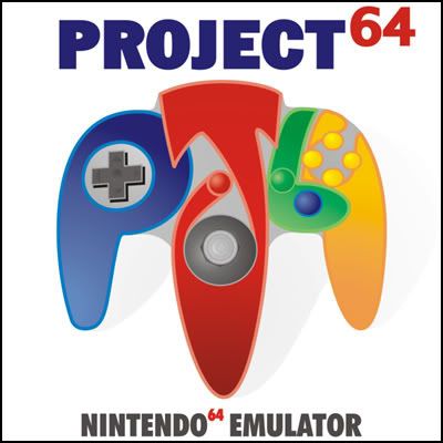
I'm not so sure about using this for the website header image, but I think it would make a perfect new icon for the .exe. Despite excuses and complaints some skepticism can try to show, I think it is the icon to use. Toyish? Haven't you ever seen a Nintendo 64 console before? :p I like the brightness and the saturation. Even if you are blind from the creativity, do any of you really think the current 4 bit "PJ64" text is really a successor of this image? We need forever to determine a 'perfect' icon for Project64, and none of us in our positions would have forever, an eternity, to work on Project64. I think this icon should be settled with as the next application icon for now at least.

I hope the Inquisition doesn't hear about this....
 

highcog

New member
Just did an update on my proposed logo again.. some little detail work here and there and the 'plastic-y' effect is new.

As a side note, this logo is fully vector drawn, so it's completely scalable.

Let's see what you think:

pj64logo2cog-rev4.jpg
 
Last edited:

A.I.

Banned
pj64icons-cog.jpg

I'm not so sure about using this for the website header image, but I think it would make a perfect new icon for the .exe. Despite excuses and complaints some skepticism can try to show, I think it is the icon to use. Toyish? Haven't you ever seen a Nintendo 64 console before? :p I like the brightness and the saturation. Even if you are blind from the creativity, do any of you really think the current 4 bit "PJ64" text is really a successor of this image? We need forever to determine a 'perfect' icon for Project64, and none of us in our positions would have forever, an eternity, to work on Project64. I think this icon should be settled with as the next application icon for now at least.

I hope the Inquisition doesn't hear about this....

Dude, you just said it yourself - you wouldn't use this icon for the website but as a shortcut it would do. Hmm...I wonder why? Is it because it's totally inapropiate as PJ64's official icon?

Why have two icons, one for the web header and one for the .exe? That's just stupid. If it's not good enough in the first place then it's not good enough period.
 

highcog

New member
What's so inappropriate about it? I think it's fairly appropriate for a N64 emulator, and the immediate impression a person would get from looking at it is "Nintendo 64". It's shaped like a n64 controller, and says "PJ64" in big ol' bright letters.. :)

Not to dismiss the other one since it's definitely had work put into it and looks good, but I find it isn't immediately apparent what it says or represents at first glance..

What would you change/add/revise on my logo if you were in my shoes? Just curious what I could improve on it, and looking for more input from all...!
 
Last edited:

GE Master

New member
Highcog, don't bother wasting effort responding to that type of commentary. You have a good design going on there and the colours are great. It's a good design. Nobody should be coming on here cutting up somebody elses work. That's really bad taste especiallly when this guy isn't even the one picking!!
 

highcog

New member
Heh, yeah good point.. I take it in stride. :)

Still though, A.I., if you think it's absolutely abysmal I'd like to know what it is that stands out to you that way. Any feedback, as long as it's constructive, can be helpful.
 

A.I.

Banned
I regret using the word 'inappropriate', as if suggesting it had no place to be. Only Zilmar has the right to make that kind of assesment. Maybe jahra!n's logo set such a high standard that it clouded my judgement but it still doesn't excuse my blind prejudice against your logo. Maybe I was annoyed with Iconoclast's pronouncement your logo was the best one to pick but that is what I've been saying about jahra!n's so maybe I was being hypocritical without even knowing it.

On a constuctive note, how to improve your logo, I'm not really sure. Yes, it looks bright and colorful, well textured...um...the plastic effect is good. Look, I have no experience in graphic design or texturing, only an eye for detail...if that counts.

All I can say is the only thing that grates me is the 'J', it just doesn't look right somehow. It takes your focus away from the whole design. Maybe because it overlaps the 'P' and doesn't look like part of the controller - rather a big 'J' on top.

Other than that I got no idea. Maybe I just can't put my finger on it. :p
 
Last edited:

Top