Risio's Retro Mario 64. Enjoy!

 Spoiler:
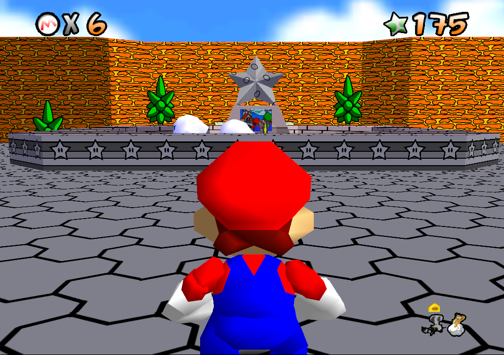
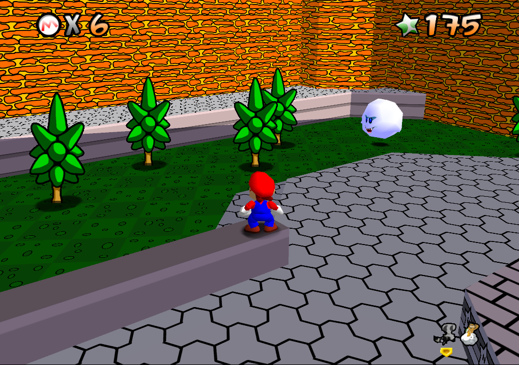
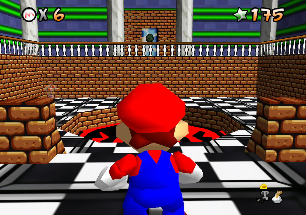
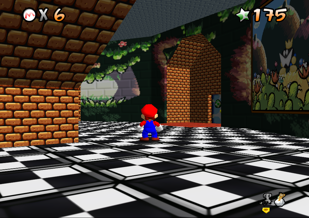
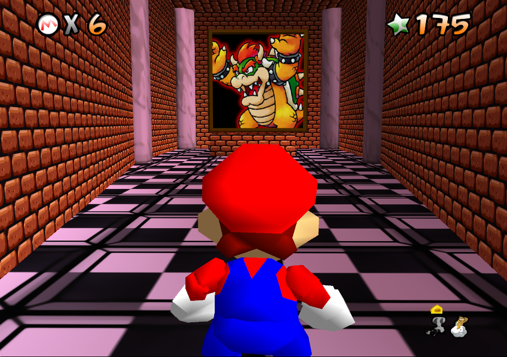
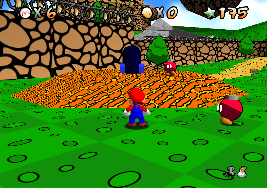
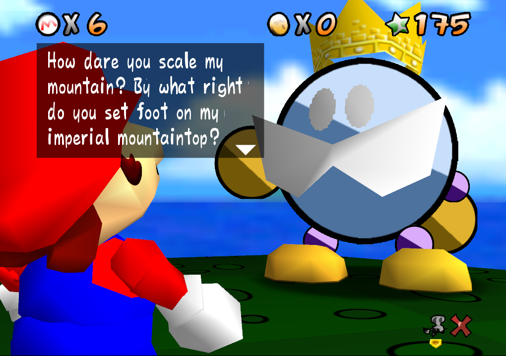
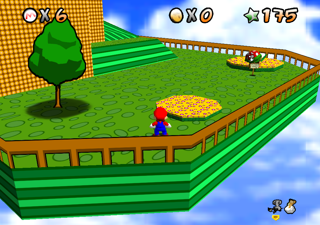
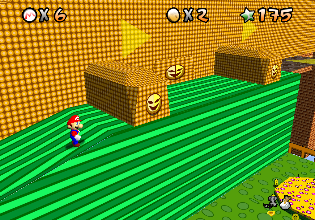
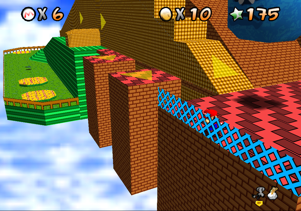
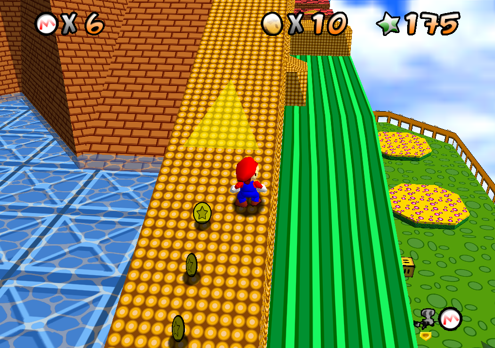
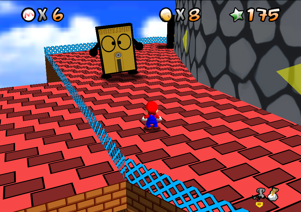
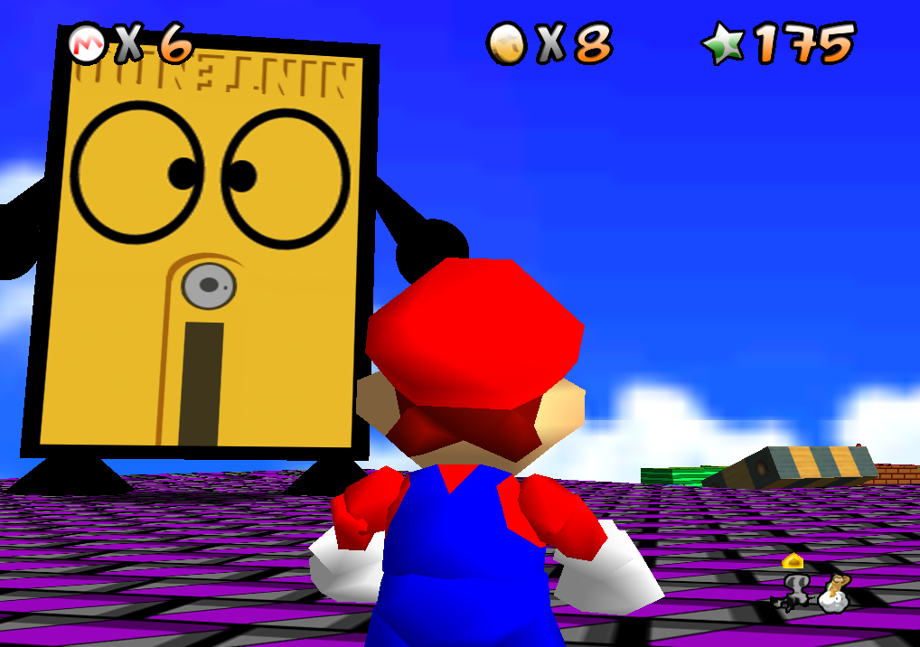
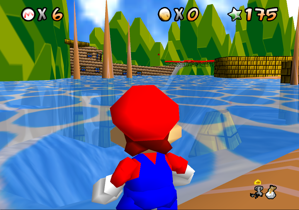
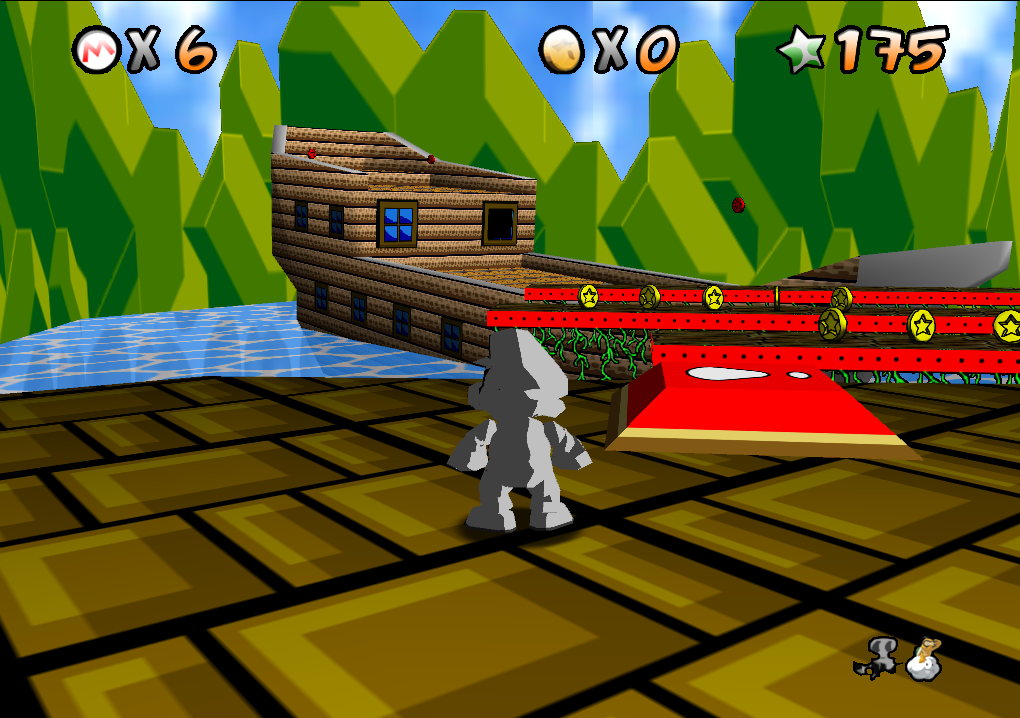
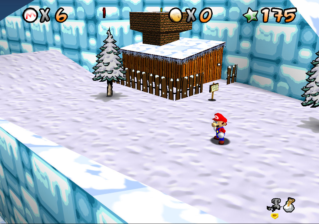
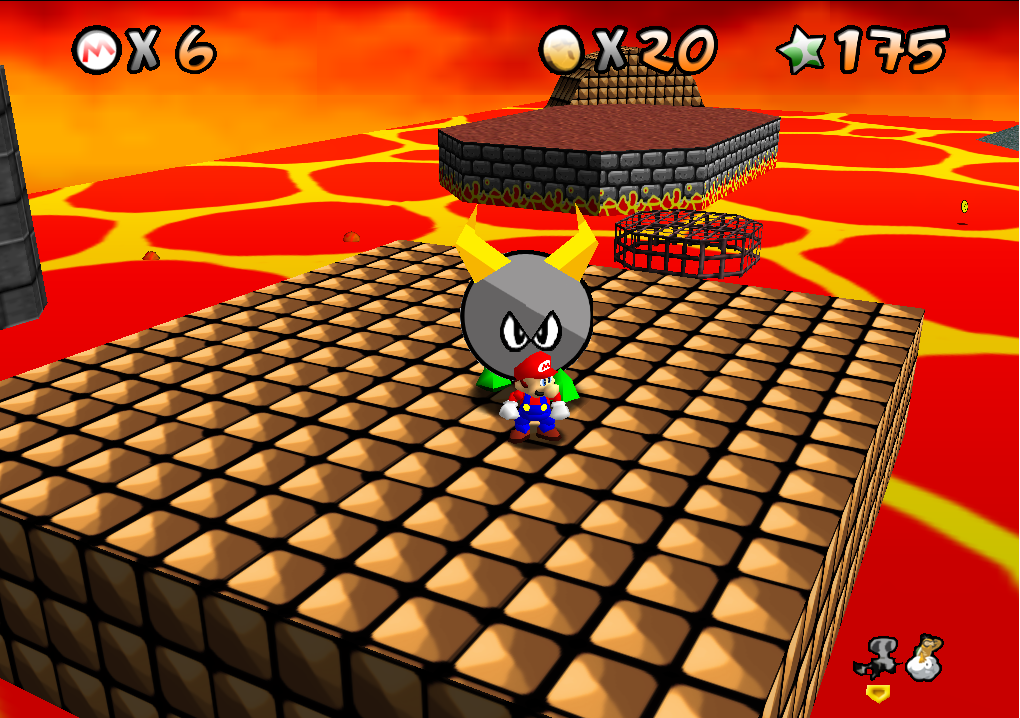
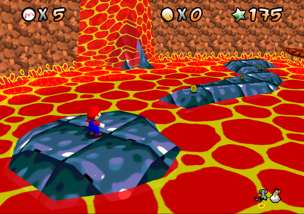
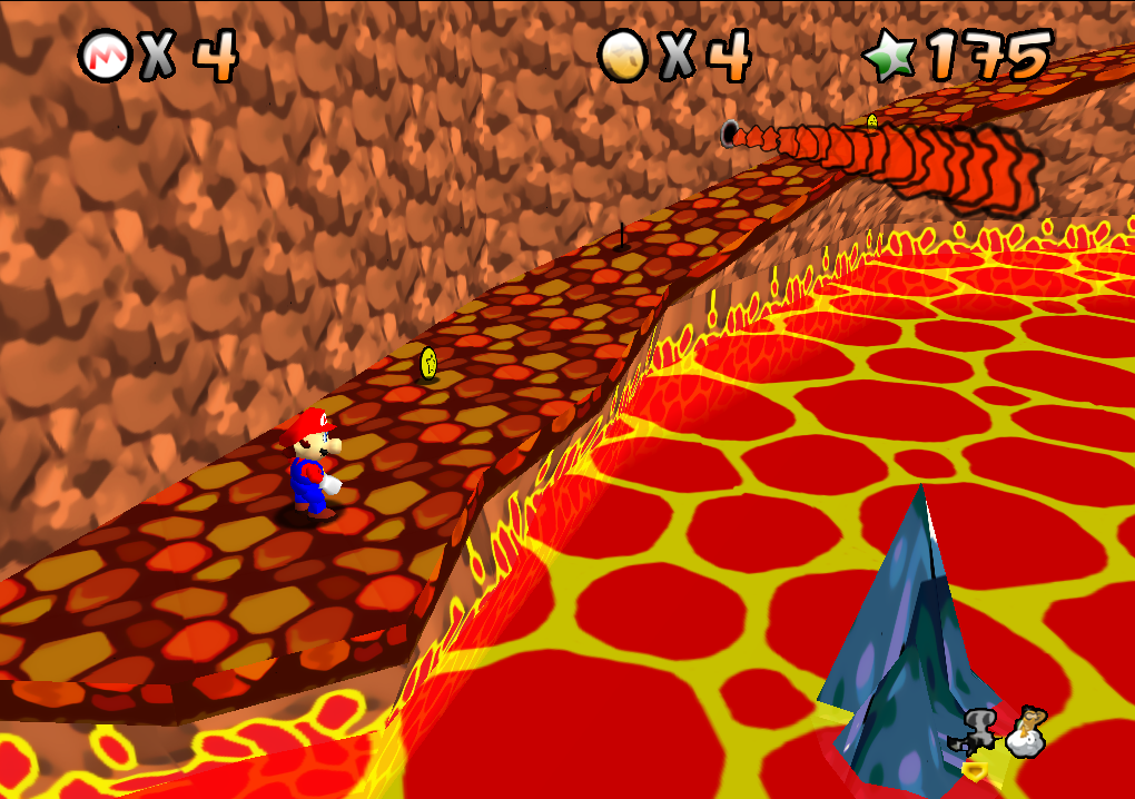
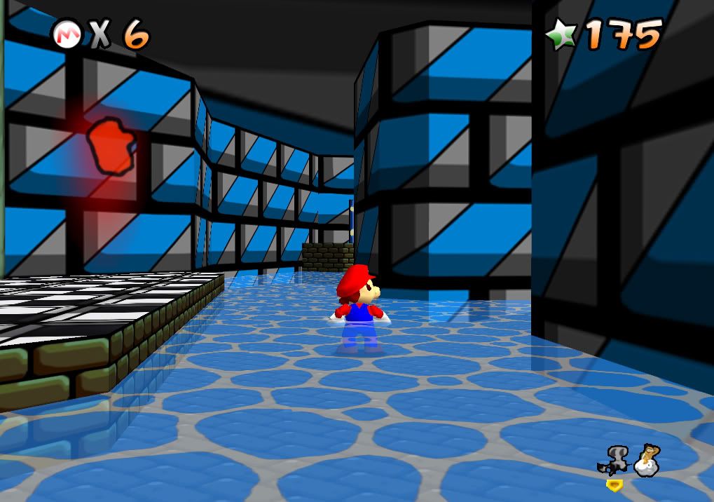
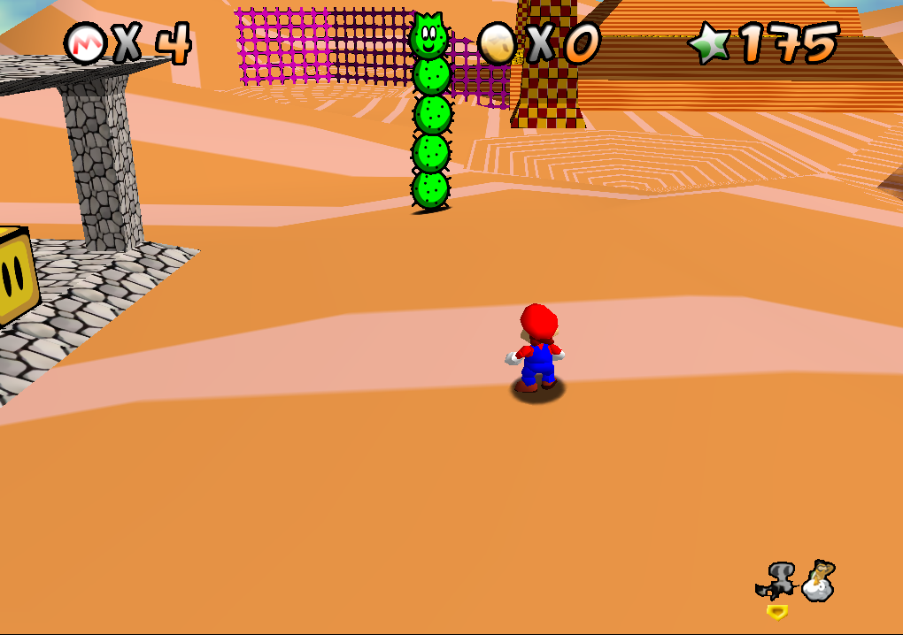
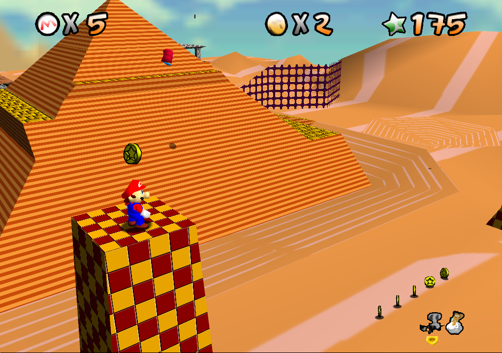
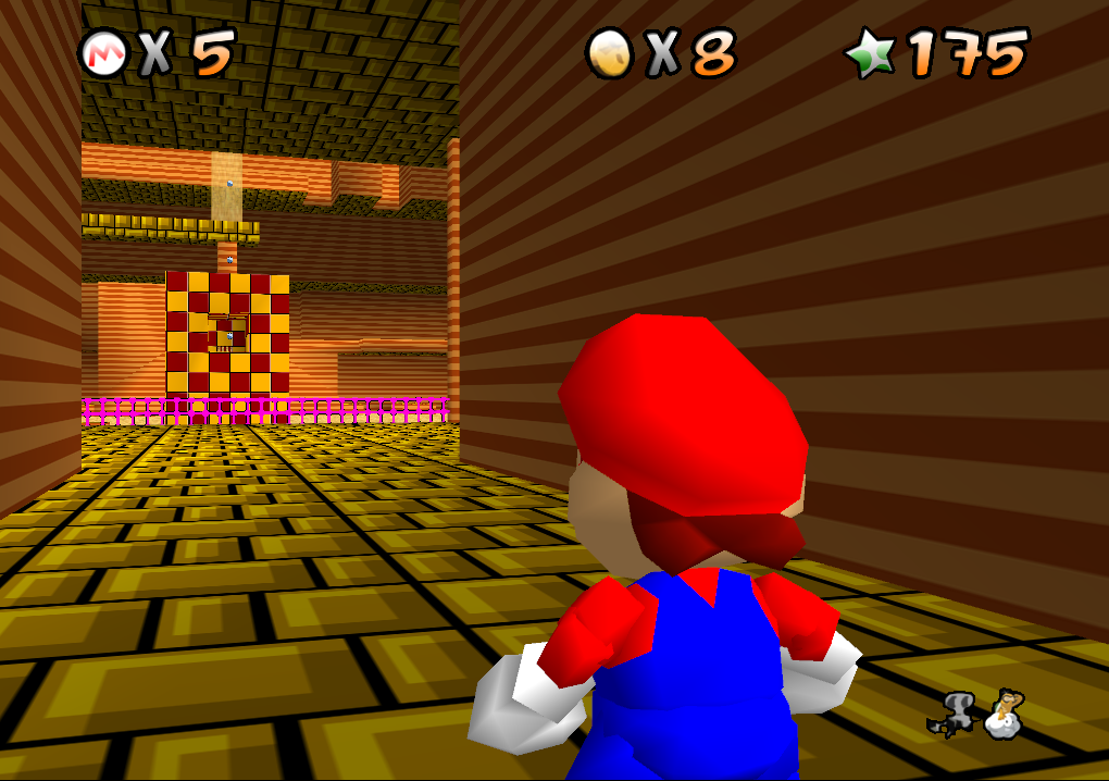
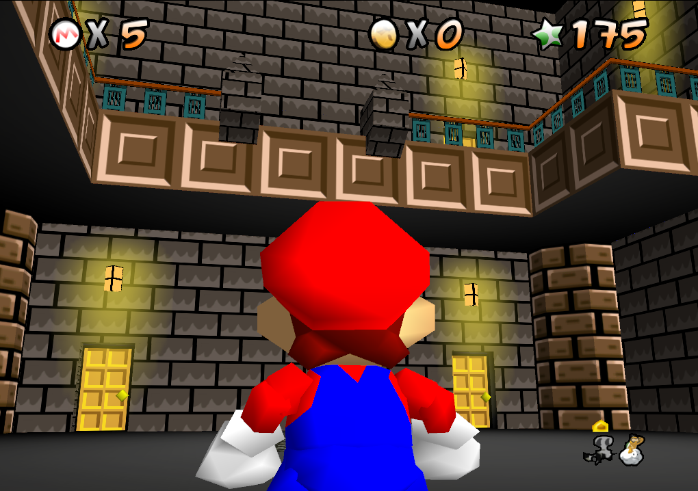
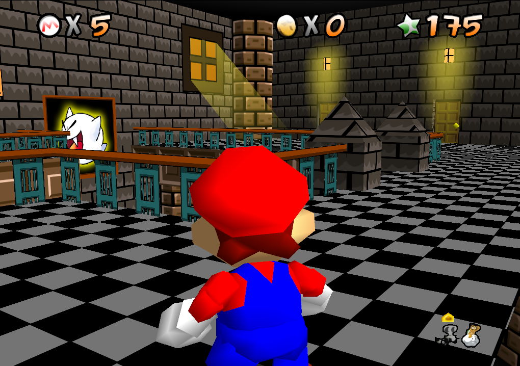
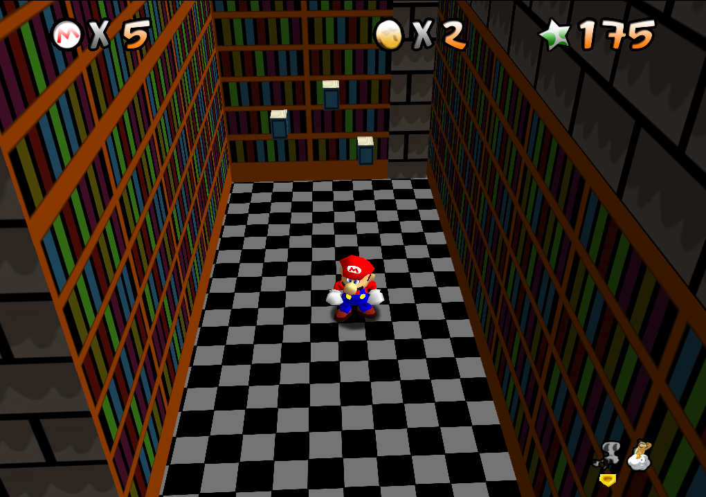
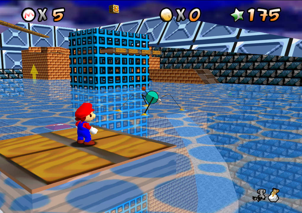
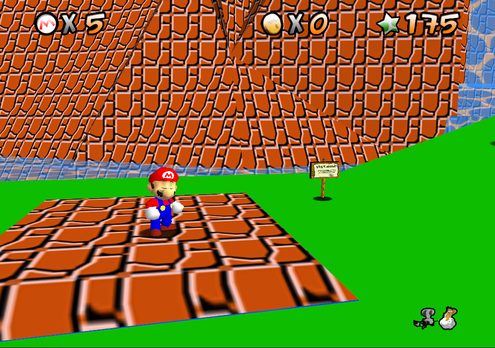
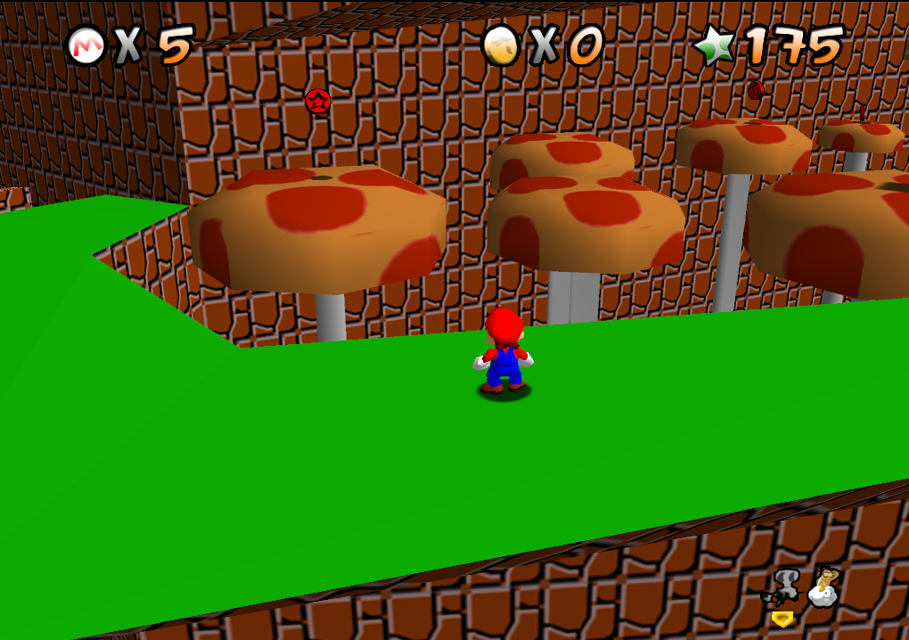
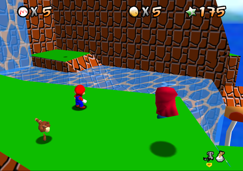
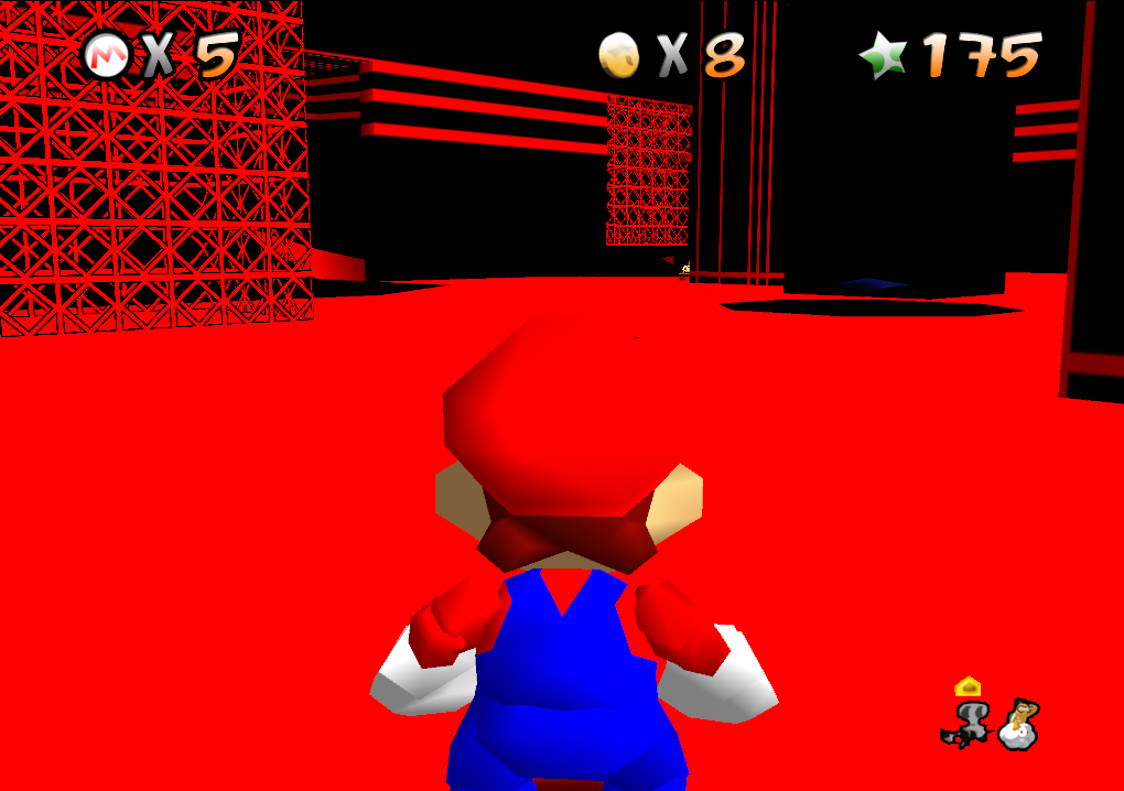
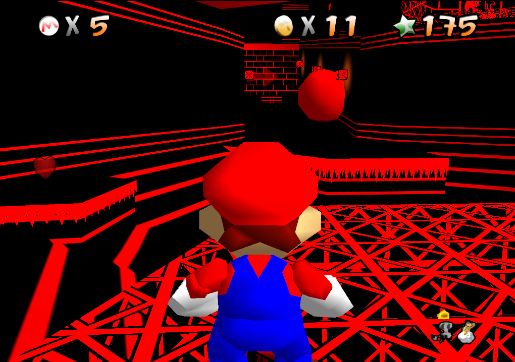
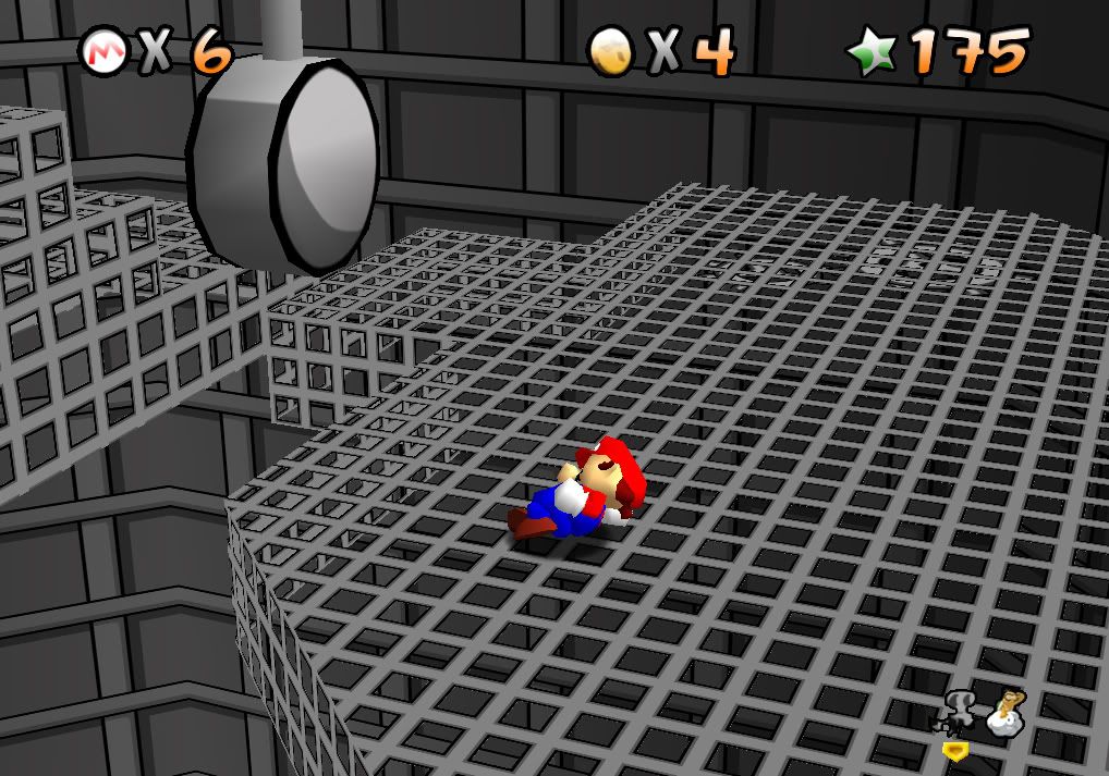
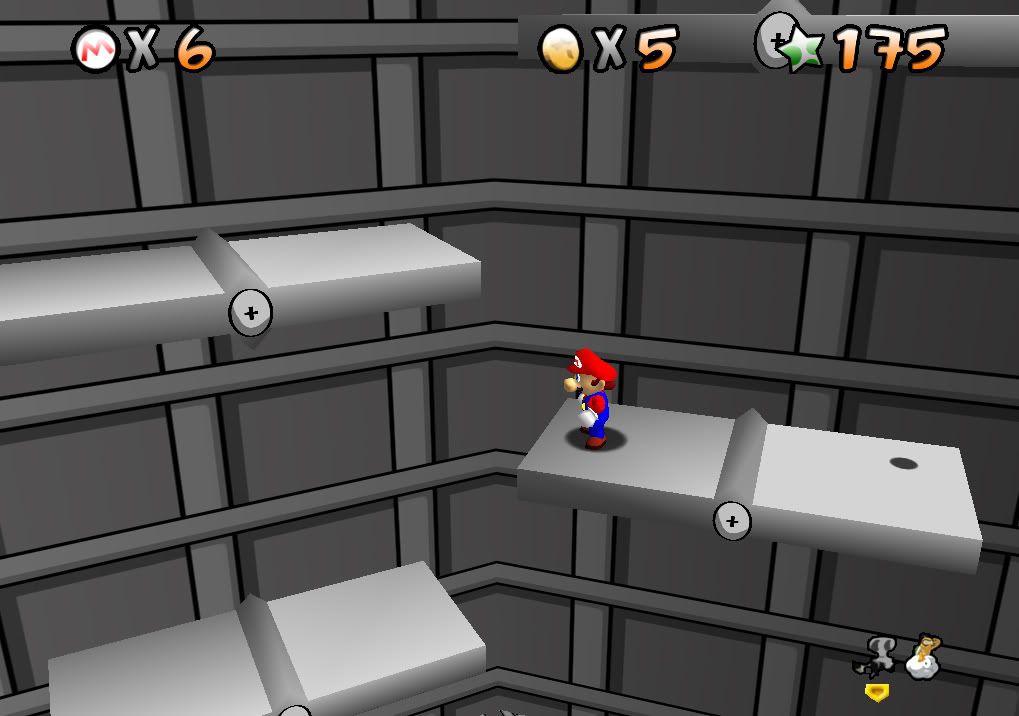
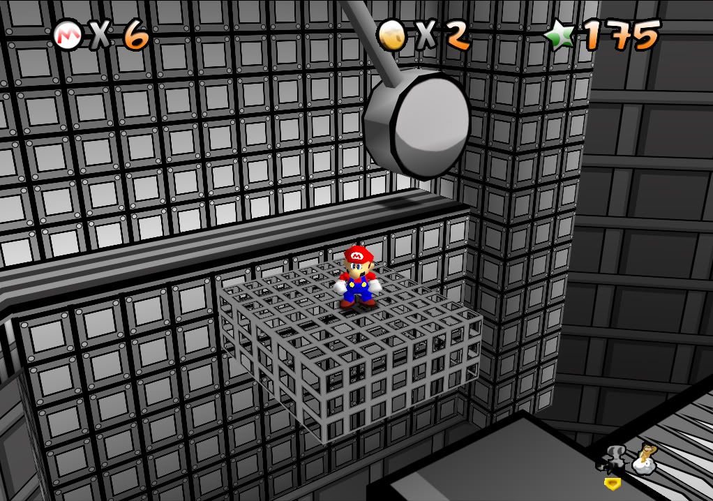
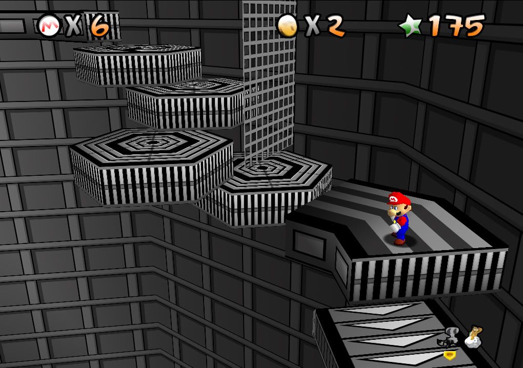
Check out the rest of the thread for a step by step look at this packs progress over the years!
Updated Mirrors by MasterPhW (include Starfix and removed thumbs.db):
Direct download
http://adf.ly/Di9EP


Check out the rest of the thread for a step by step look at this packs progress over the years!
Updated Mirrors by MasterPhW (include Starfix and removed thumbs.db):
Direct download
http://adf.ly/Di9EP
Last edited by a moderator:
Weatherton
New member
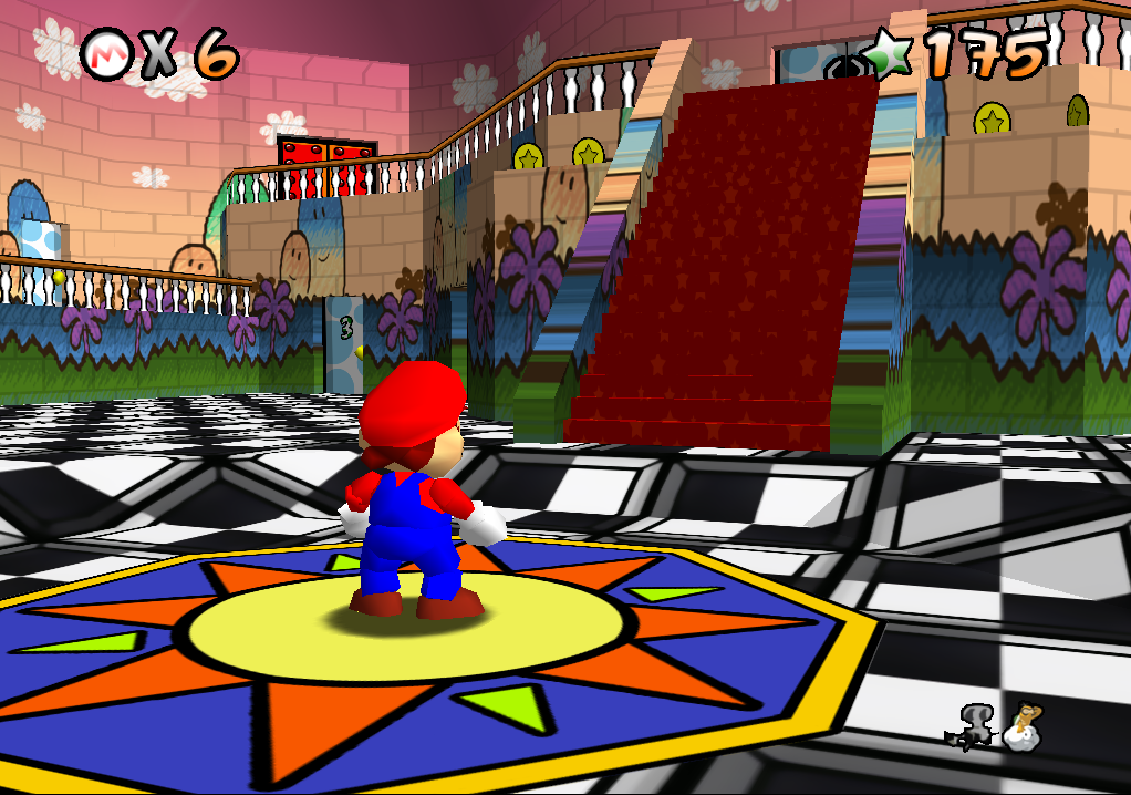
I like parts of it a lot, other parts are, I hope, just experimentation on a WIP. The castle roof, for example, needs something less busy. My favorite part is the side of the wall going down to the water in picture two 
mongo51983
Zelda Maniac!!!
Sweet, looking good so far, too bad you can't do Mario in the same style as well.
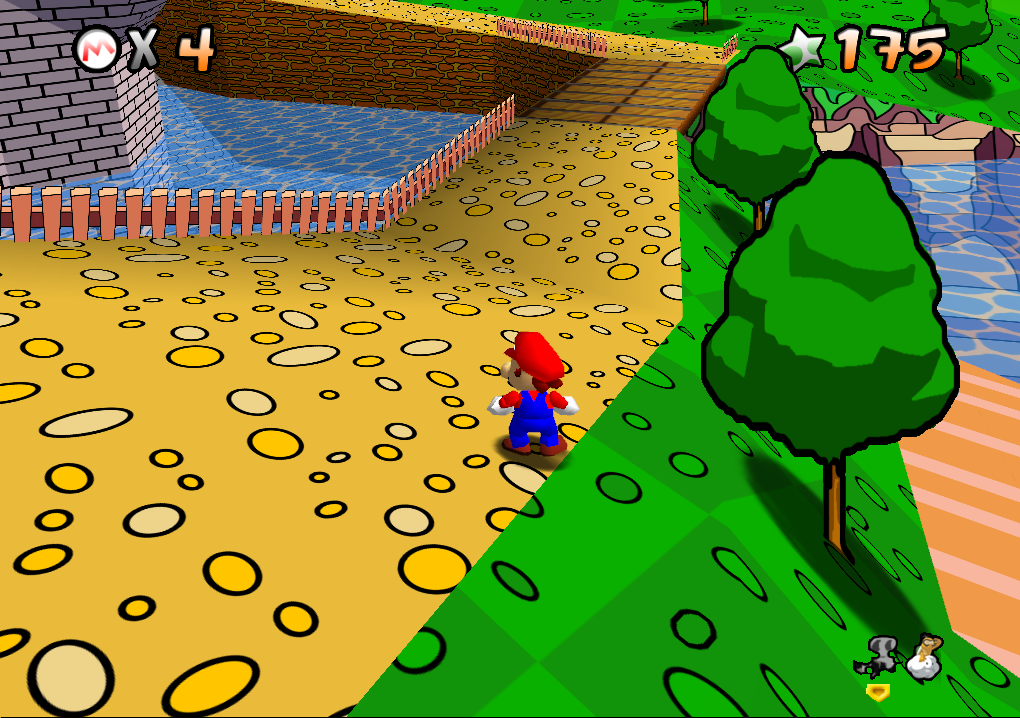
I like it, but there's too much contrast in some places. The trees for example might look less harsh with dark green and/or thinner outlines, and the path outside the castle could do with the darker squares being less bright, and slighty closer to the colour of the lighter squares.
aibrubusfosusej
Yes that's my shoulder
Yeah this is sweet! although the trees and coins look like you drew over the originals in MS paint with a black paintbrush lol...
Anchel
The Xpaniard
EmuFan said:I think what you mean is a more cel-shading style Anchel, but this is cartoony style, it is supposed to look like that. There is a big difference between cel-shading and cartoony you know...
I know that. I never said that I want this pack cell-shaded, there's already a cell-shading pack being created.
But I DO like a lot of things in this pack: the square pattern in the field textures and path textures look really great. They give the game an old school feeling like the Sonic Green Hill stages. But I think that those circles in them make the grass look weird. That's what I said before. The path could also use a little touch.
There are some really neat touches as well, like the big blocks from Super Mario World and the coin blocks from Super Mario Bros. I even like the castle inside walls much better than the sky themed ones from the original. The coins and trees also look impressive. But it's just that some of the textures somehow don't look right.
I might try myself to do my own attempt at this and see what I get (mind you, I'm not an expert at all at graphic arts, so it WILL end up much worse than any other texture pack around)
- Thread Starter
- #18
Thanks for the comments, especially the Sonic old school feeling one, when I put the textures in for the first time that was my first thought. Oh and the comment about outlineing trees and coins in Paint, it would be pixilated for one, and secondly, I am aiming for the cartoony handrawn Yoshi's Island look, so if you look at some YI screens, you'll notice the same outlines. Lord knows when the first release will be, I am currently working on level 3, just to see what I can do with the snow. I'll have pics up soon!
-risio
oh and Anchel please do something different with Mario 64 than what I am doing, innovation is super dee duper!
-risio
oh and Anchel please do something different with Mario 64 than what I am doing, innovation is super dee duper!
Last edited:
- Thread Starter
- #20
And also with the extreme contrast in colors, especially on the yellow/orange paths, thats what I am aiming for. Hearing that being pointed out is a Job Well Done for me! Im going for the abstract/SNES/Sonic/Mario/Cartoon look, so why go with realistic color choices? And with the grass circles, same thing, the only problem is though is that I need to up the resolution a tad bit, as they bothered me too. -Risio:icecream:
