View Full Version : Project64 site redesign
zilmar
February 2nd, 2007, 01:37
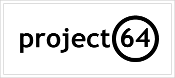
We are redesigning this site with a new layout/logo/color scheme. The current logo, I designed very early in the life of the emulator and was the basis of the current color scheme for the site. I would like to go with a color scheme that is similar to the n64 logo, green, red, blue and yellow. I am looking at having a small logo that will sit to the left or behind s.ome text. There would have to be matching set of icons to go with the logo. The main focus would be more on the text then on the image. The logo will appear on the site, as well as the logo and icons will be in the next version of project64.
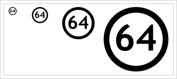
Here are some samples of the type of thing I am looking at. These are modifications of the work sick_deal and jahra!n have done.
If you want to submit any images please post them to this thread. We assume that anything you post you are giving us permission to use it freely, and that they are yours to give! If we use any of your work we will add you to the credits list of the emulator
Alizaid
February 2nd, 2007, 02:05
When are you going to replace the logo?
Miretank
February 2nd, 2007, 02:25
Whoa, one word: awesome! :)
Iconoclast
February 2nd, 2007, 04:20
It would be disrespectful for me to not match one's hard work with my own, at least in a feeble attempt. After about 1.5 hours of screwing around, I made this image file. It is attached to this post (duh).
It's an ICO icon file because maybe, it would also make a good Project64 icon. I made the 32 bit images within the icon by stealing the graphics from either Zelda OOT or Zelda MM. If you use the Direct64 plugin, the way the N logo is shaded in much differently, a way I found to look intriguing as the possible new Project64 icon. The 4 bit icons were made by dumping a 2-D N logo from Pokemon Snap, converting the image to 4 bit and removing grey pixels that messed the image up, bunch of resizings and repititions that took longer than it did for me to make the 32 bit icons.
Original 4 Bit:
http://i78.photobucket.com/albums/j112/rswedlo/Logged%20N64%20Textures/NLogo.gif
Original 24 Bit:
http://i78.photobucket.com/albums/j112/rswedlo/Logged%20N64%20Textures/NLogo32Bit.png
Personally, I think it'd make a better new Project64 icon, but I post this here as it could also make a good logo for your website.
rprsplitter9
February 2nd, 2007, 05:27
@Iconoclast
Those logos don't say anything about PJ64 at all, other than it is related to N64. I'm sure the PJ64 team is looking for a little more uniqueness.
zilmar
February 2nd, 2007, 05:41
Not to mention, the N logo I am sure is copyrighted :P
Exodeity
February 2nd, 2007, 06:06
hey i posted a link to some logos i made on the member forum i guess no one saw it, but whatever, here are some i did;
http://img131.imageshack.us/img131/8962/pj64logo5ve8.png
http://img131.imageshack.us/img131/1291/pj64logo6oq3.png
http://img389.imageshack.us/img389/3877/pj64logo3ya3.png
http://img131.imageshack.us/img131/4916/pj64logo4lg8.png
i did all these in like 10 mins in PSP 9 so... dont expect perfection ( i think the second one looks the best :p )
A.I.
February 2nd, 2007, 07:30
I can see in the future and i know who won, he he he... ;)
flowrent
February 2nd, 2007, 09:00
I guess something like this would be copyrighted too ?
Miretank
February 2nd, 2007, 15:54
Jahrain's logo is the best. If you guys dont use it as main icon, I'd reshack project64 and place Jahra!n's icon. ;)
sick_deal's is very good too. But a bit too monochromatic. ;\
squall_leonhart
February 2nd, 2007, 17:28
i don't really like any of em....... any chance of getting some colour added to them?
Mr.Garrison
February 2nd, 2007, 19:25
http://web.telia.com/~u15107478/project64_text_suggestion_build01.png
Suggestion for the text. Will probably up a logo later.
(Might show up weird if your browser doesn't support transparency.)
SWAT_Marc
February 2nd, 2007, 20:09
Well, I may be out of the contest because my logo doesn't meet the requirementes completely.
Even though, I'll give a try...
http://farm1.static.flickr.com/29/101646644_9b557c50b4_o.png
http://farm1.static.flickr.com/41/101646648_186c9f15a5_o.png
You will say...
zilmar
February 2nd, 2007, 20:28
Well, I may be out of the contest because my logo doesn't meet the requirementes completely.
Yours is fits great, it is more just against the massive full on gfx when you can not read the thing well that I am against. As long as the text is the main focus that is what counts.
Exodeity
February 2nd, 2007, 20:30
so i guess mine are outa the picture huh? lol i could try again...
carbon900
February 2nd, 2007, 21:21
Exodeity, ok, but I don't think the team wants it to look like cracktro art
squall_leonhart
February 2nd, 2007, 21:46
carbon, watch your tongue, we are generally a supportive community, and don't tend to criticise others work,
http://img.photobucket.com/albums/v253/squall_leonhart69r/project64.png
something colourful like this.. but not....
Mr.Garrison
February 2nd, 2007, 23:01
And the logo...
http://web.telia.com/~u15107478/project64_suggestion_build02.png
(Might show up weird if your browser doesn't support transparency.)
Iconoclast
February 2nd, 2007, 23:10
@Iconoclast
Those logos don't say anything about PJ64 at all, other than it is related to N64. I'm sure the PJ64 team is looking for a little more uniqueness.So? Look at the program icon for Nemu64. It's just Mario's head. Does that say anything about Nemu64? No, but it's still a good icon for it. Same thing applies to UltraHLE.
And the image I gave was unique, compared to just the text PJ64 as an icon. It isn't the same old N64 logo; it's differently colored and shaped than all the other emulator icons. It's like making an icon for Microsoft Word, a mere image saying, MS-Word. It's stupid. It needs a picture, which it's got, of course.
As for zilmar's point, yeah, I can't believe I was so blind as to completely forget about the fact that these images are copyrighted. That one occured to me overnight. I guess you got me there. I mean, unless this "Fair Use" law doesn't say that copying images from games is illegal. I know it says modifying the image content is illegal, but what if it's only for background removal...I'ma do some research.
squall_leonhart
February 2nd, 2007, 23:37
change the colours of the N and i don't think they can touch you.....
Iconoclast
February 2nd, 2007, 23:43
change the colours of the N and i don't think they can touch you.....You mean, nobody will recognize it? Or did you mean something else?
As for nobody recognizing it, that's the point! That N logo is not colored like the one from the Zelda ROM; it's coloration was changed greatly by using the Direct64 plugin.
If you meant the 4 bit version I made...hmm, I don't think they can tell I stole it from the ROM either way (forgetting my confussion, of course:P). I mean, Google Images for: n64 OR "nintendo 64" logo, and see all the results you get. They're all in JPEG format, which has bad quality, so that's why I stole it from the ROM, but still looks similar.
squall_leonhart
February 3rd, 2007, 00:03
no i mean,... if you change the colour, for all they know, you made it yourself,.. but... i also have heard that Shiggy has no problem with Emulation and high res projects as long as you own the original cartridge, he is a gamer himself after all ;) he probably plays project 64 at home with the high res projects :D
SWAT_Marc
February 3rd, 2007, 00:14
Yours is fits great, it is more just against the massive full on gfx when you can not read the thing well that I am against. As long as the text is the main focus that is what counts.
Thank you! I said that because you asked to have the same colour scheme than the BigN Logo.
Ok, then I'll wait for the results!
Samurai Snack
February 3rd, 2007, 01:02
change the colours of the N and i don't think they can touch you.....
I tried editing the 4 bit N64 logo in MSPaint but it's 4 bit so you really don't have many colours you can use without it becoming gray...I was going to use red, cyan and black in it but cyan just shows up as blue.
squall_leonhart
February 3rd, 2007, 01:13
go and download Paint.Net (http://www.getpaint.net/index2.html), you'll find it better to work with then MsPaint.
Iconoclast
February 3rd, 2007, 01:36
I tried editing the 4 bit N64 logo in MSPaint but it's 4 bit so you really don't have many colours you can use without it becoming gray...I was going to use red, cyan and black in it but cyan just shows up as blue.That happens because I optimized the GIF with a palette containing only five colors: Red, Dark Blue, Green and Yellow. The fifth 'color' is the transparent color, a magenta color (#FF00FF).
If you try to use any color not in the palette, that will always happen. Instead, try this. Open the image with MS Paint, save it as a 24 bit Bitmap (.bmp), refresh the image by opening the BMP version, and now try. This will destroy the palette optimization method.
Smiff
February 3rd, 2007, 03:11
i have some ideas that i think could make a great logo, but no time to do it properly until end of next week or so.. hopefully this can be kept open for a couple more weeks :p
i have a question about fonts aswell.. seeing as the text will be very important part of this, is it ok to use a copyright font or does that have to be free or self-made? can it be a problem, is basically what im saying... im guessing corporate logos cant just use copyright fonts :/
squall_leonhart
February 3rd, 2007, 03:50
i've never heard of anyone getting sued over a Font smiff.
and i think if that day ever came, it would be the start of my rebellion.
Alizaid
February 3rd, 2007, 03:54
Here's a logo I made using MS paint. It's based on the Nintendo 64's old logo, Ultra 64.
35370
Iconoclast
February 3rd, 2007, 04:24
i have a question about fonts aswell.. seeing as the text will be very important part of this, is it ok to use a copyright font or does that have to be free or self-made? can it be a problem, is basically what im saying... im guessing corporate logos cant just use copyright fonts :/Yes, it could be a problem. If you're talking about a font you have to download yourself to use or something like that (and if it came with your system, then it should be legal to use, or else, why would they put it there?), then it can be a problem if the users viewing the site don't have that font installed.
If you don't want your site's font to be substituted for Times New Roman for those who can't view the font, you might pick what I like to call a universal font. When I use this phrase, I mean a font that every computer comes with.
Examples of these fonts are:
Arial
Courier New
fixedsys
Lucida Sans Unicode
Monotype Corsiva
MS Sans Serif
Times New Roman
zilmar
February 3rd, 2007, 04:46
Yes, it could be a problem. If you're talking about a font you have to download yourself to use or something like that (and if it came with your system, then it should be legal to use, or else, why would they put it there?), then it can be a problem if the users viewing the site don't have that font installed.
If you don't want your site's font to be substituted for Times New Roman for those who can't view the font, you might pick what I like to call a universal font. When I use this phrase, I mean a font that every computer comes with.
Examples of these fonts are:
Arial
Courier New
fixedsys
Lucida Sans Unicode
Monotype Corsiva
MS Sans Serif
Times New Roman
The font used for the logo will probaly not be used for the text, since it will end up being an image at the end it does not rquire the end user to have it installed so it will get around that issue. But if the font is not a standard font it might still be copyrighted and not have permission to use it.
Iconoclast
February 3rd, 2007, 05:00
Oh, I see what you mean, now.
If it's copyrighted, then I don't think it'll be illegal to have it in an image. I mean, I'm not an expert on copyright laws, but the font was designed for that sort of thing. It would be illegal for the programs to use them in that way if it were bad.
apzrman1
February 3rd, 2007, 15:19
i got some. very basic, just made with paintshop (i'm a n00b at paintshop).
(this 1 was for fun)
http://i86.photobucket.com/albums/k112/apzrman/pj64/controller1.jpg
http://i86.photobucket.com/albums/k112/apzrman/pj64/PJ64warpedcontrollers3.jpg
(alt)
http://i86.photobucket.com/albums/k112/apzrman/pj64/PJ64warpedcontrollers4.jpg
(1 icon so far)
http://i86.photobucket.com/albums/k112/apzrman/pj64/PJ64warpedcontrollersicon1.jpg
Falcon4ever
February 3rd, 2007, 15:36
ouch my eyes x_X anti-alias plzzz
Miretank
February 3rd, 2007, 16:08
I'd better leave the logo as it is then. ;\
OuT
February 3rd, 2007, 16:53
hi everybody! new comer here, 1st post!
I quickly made one, take it as it ;) very simple and clean, but not enough customized, I know!
http://img152.imageshack.us/img152/1174/test60xg3.png
font is Segoe UI (included in both Vista and Office 2007), I adjusted a bit characters spacing, and finally adjusted elements positioning with Paint
icon preview: http://img211.imageshack.us/img211/8214/48hy3.pnghttp://img126.imageshack.us/img126/4932/32tk8.pnghttp://img152.imageshack.us/img152/6184/16he4.png
all files, including sources (http://www.yourfilelink.com/get.php?fid=277714)
credits: Office 2007, Paint, IrfanView, Paint.NET with ico/cur plugin (http://www.evanolds.com/pdnicocur.html)
Samurai Snack
February 3rd, 2007, 17:55
Here's a modified N64 logo I made, I tried to make the colours in the style of how the PJ64 site looks right now.
Iconoclast
February 3rd, 2007, 17:59
ouch my eyes x_X anti-alias plzzzIt's probably the method he saved the image in.
JPEG image format sucks. Why do you all see blurry/off-color pixels in your image? It's the format, and almost everywhere I go, people either use JPEG or GIF. Anyone ever tried PNG (some people, I see)? Try saving this image in JPEG or GIF without screwing it up, and I'll be amazed.
http://i78.photobucket.com/albums/j112/rswedlo/Logged%20N64%20Textures/TitleShadowAlpha.png
I know some old I.E. browsers don't support PNG, but any computer that does come with those, probably is completely incapable of N64 emulation.
OuT
February 3rd, 2007, 18:38
IE 7 supports PNG transparency quite well, but that's not the case for previous IE versions...
this aliasing can also be due to a not-so-good outline selection... simply try the "magic wand" of Paint.NET, you'll be amazed! and the most important, save in a format that support alpha channel (transparency) ;)
Iconoclast
February 3rd, 2007, 19:36
IE 7 supports PNG transparency quite well, but that's not the case for previous IE versions...
this aliasing can also be due to a not-so-good outline selection... simply try the "magic wand" of Paint.NET, you'll be amazed! and the most important, save in a format that support alpha channel (transparency) ;)PNG is the only image format that supports the alpha color channel that is optimized to be used in a web page. Many tools have this Magic Wand feature, including but not limited to Jasc software. No magic wand tool is perfect, and the one on paint.net doesn't let you remove backgrounds with an advanced pixel Tolerance feature.
I.E. also has problems with proper GIF animation speed, for those using frames with speeds faster than 10 jiffies (0.1 seconds) per frame. Take my avatar as an example. Try it out with I.E. 6 or lower and then FireFox. Notice the difference? As for I.E. 7, I know alpha transparency is fixed, but I'm not sure about the GIF animation speed.
OuT
February 3rd, 2007, 21:00
here's my tweaked N64 logo (click on the image for full size) :
http://img152.imageshack.us/img152/3006/5resize50bs1.png (http://img211.imageshack.us/my.php?image=4swapgamma18gaussian1pxnk2. png)
icon preview:
http://img506.imageshack.us/img506/6291/48uc1.png http://img152.imageshack.us/img152/4610/32wc0.png http://img211.imageshack.us/img211/594/16lu6.png
... files! (http://www.yourfilelink.com/get.php?fid=277866)
@Iconoclast: your avatar is also displayed too slowly with IE7...
Iconoclast
February 3rd, 2007, 21:32
Now that looks awesome.
Doesn't surprise me. Microsoft's programming is usually bloated when it comes to file size, and they STILL forget some implementations. FireFox and possibly Opera should view my avatar at the correct speed.
OuT
February 3rd, 2007, 23:29
another idea, based on SWAT_Marc's work (link (http://www.emutalk.net/showpost.php?p=372318&postcount=13))
http://img211.imageshack.us/img211/8026/48tg5.png http://img152.imageshack.us/img152/9973/32ve4.png http://img211.imageshack.us/img211/5812/16ha3.png
very, very quickly done... and I don't like this one much, because it's too similar with Windows Media Player icon...
anyway, files (http://www.yourfilelink.com/get.php?fid=277934) as usual!
Arkay
February 4th, 2007, 00:10
http://img.photobucket.com/albums/v286/Arkay/pj64.png
http://img.photobucket.com/albums/v286/Arkay/64x64.png
http://img.photobucket.com/albums/v286/Arkay/48x48.png
http://img.photobucket.com/albums/v286/Arkay/32x32.png
Iconoclast
February 4th, 2007, 00:21
I think we need a poll for these images. Preferrably one that doesn't close.
Mr.Garrison
February 4th, 2007, 01:01
Hm I think it's hard for us to judge which of the logos will fit best in their upcoming design, so no, I don't think that's such a good idea.
Iconoclast
February 4th, 2007, 01:09
Well, why is it a bad idea to start a poll on a bunch of ideas tough to choose between? That's the purpose of a poll. Now, if the decision was very easy to agree on, then a poll wouldn't make sense.
Mr.Garrison
February 4th, 2007, 02:07
What I was trying to say was that it's hard for us to know what logo is going to fit in with the design because only zilmar or whoever is designing the site knows how the site is going to look.
Samurai Snack
February 4th, 2007, 02:27
here's my tweaked N64 logo (click on the image for full size) :
http://img152.imageshack.us/img152/3006/5resize50bs1.png (http://img211.imageshack.us/my.php?image=4swapgamma18gaussian1pxnk2. png)
icon preview:
http://img506.imageshack.us/img506/6291/48uc1.png http://img152.imageshack.us/img152/4610/32wc0.png http://img211.imageshack.us/img211/594/16lu6.png
... files! (http://www.yourfilelink.com/get.php?fid=277866)
@Iconoclast: your avatar is also displayed too slowly with IE7...
Now thats a nice image. I'd vote for that definitely.
I think a poll would be good for this, once we get a couple more good quality logos.
Iconoclast
February 4th, 2007, 02:48
Even better, it's not copyrighted!
*waits for skepticism*
Well, if he used the 4 bit one I made to make that, then, yes, it is, but he didn't have to use mine. There are non-copyrighted versions of the N logo image on Google images; they can't tell if he used that or ripped it from the ROM/got it from someone (me) who did.
What's more; I can't imagine a Project64 logo that would look any better than that. It just looks so awesome for a logo...what does the team think?
The ONLY downfall to using that as Project64's icon is that it doesn't really say anything about Project64 in contrast to the other N64 emulators, but hey, not all programs out there have a icon with their name/acronym in it. I think the simple recolorized N idea is as good as it gets, here.
Mr.Garrison
February 4th, 2007, 03:06
Stole OuT's Yoshi icon and made this:
http://web.telia.com/~u15107478/project64_suggestion02_build01.png
The font is a Wii-logo lookalike called Continuum.
XdaywalkerX
February 4th, 2007, 03:24
http://img256.imageshack.us/img256/5215/project64symboq9.jpg
made with photoshop...
Arkay
February 4th, 2007, 06:47
http://img.photobucket.com/albums/v286/Arkay/640x640.png
http://img.photobucket.com/albums/v286/Arkay/64x64-1.png
http://img.photobucket.com/albums/v286/Arkay/48x48-1.png
http://img.photobucket.com/albums/v286/Arkay/32x32-1.png
squall_leonhart
February 4th, 2007, 08:48
IE 7 supports PNG transparency quite well, but that's not the case for previous IE versions...
this aliasing can also be due to a not-so-good outline selection... simply try the "magic wand" of Paint.NET, you'll be amazed! and the most important, save in a format that support alpha channel (transparency) ;)
actually, IE6 can use PNG alpha, but you have to add a heckload of scripting.
Tullmann1
February 4th, 2007, 10:06
I vote for this :bouncy:
http://www.pj64.net/main/images/stories/20070202_site_redesign/Logo2.gif, I think it is perfect for Project 64 :)
A.I.
February 4th, 2007, 11:27
Sorry, but I have to disagree with you, Iconclast. Yes, it's a nice icon and it is preferable in appearance to the old one but it is really just another Nintendo logo; albeit different colours.
If I had to choose this or the old one I would take the old one again and again not because I like it it but because it represents the concept of this great emulator: that it was made by the fans for the fans, not Nintendo. Yes it needs a major spruik up and I don't deny it doesn't look old and a little dated, but not to the extent Project's 64 identity is changed forever.
As you said most sites don't have a icon with their name on it and this is one of the many thousands of reasons why PJ64 stands alone from other emulators. It already has an identity, a reputation and performance to match. As reverant as I am to Nintendo, Project 64 is so much more than the original N64.
To change it to the default 'N' would be an insult to Zilmar and all the people who have made PJ64 what it is today. PJ64 deserves it's own icon, not a carbon copy of Nintendo's. And this means the logo DOES have to have 'Project 64' or 'PJ64' in it. Even 'PJ' would suffice. Take away PJ64's identity and Project 64 loses it's soul and I don't think it's makers would want that, do you?
And I know what you're going to say: does a emulator has a soul? Well religious discussion aside (I think we had enough of that lately!) what I'm trying to say is: they can take away Project 64's logo but they can't take away Project 64!
Actually, I think I may have contradicted myself here but you know what I'm trying to say... :P
Mr.Garrison
February 4th, 2007, 13:28
actually, IE6 can use PNG alpha, but you have to add a heckload of scripting.
Yeah that's why you don't count in IE6 among transparency supporting browsers.
XdaywalkerX
February 4th, 2007, 14:08
another try :bouncy:
http://img58.imageshack.us/img58/127/p64no2yy7.png
Trotterwatch
February 4th, 2007, 14:37
XdaywalkerX, the app is called PJ64, so you may want to put a J into your designs (if it has one already I apologise, but I can't see it).
OuT
February 4th, 2007, 14:48
3 last submits are amazing!
mine are not really good: they're not enough custom
XdaywalkerX
February 4th, 2007, 15:53
that's a p and a j :D - but i'll make another one...
http://img62.imageshack.us/img62/6867/xxx2ap8.jpg
Iconoclast
February 4th, 2007, 16:02
Sorry, but I have to disagree with you, Iconclast. Yes, it's a nice icon and it is preferable in appearance to the old one but it is really just another Nintendo logo; albeit different colours.
If I had to choose this or the old one I would take the old one again and again not because I like it it but because it represents the concept of this great emulator: that it was made by the fans for the fans, not Nintendo. Yes it needs a major spruik up and I don't deny it doesn't look old and a little dated, but not to the extent Project's 64 identity is changed forever.
As you said most sites don't have a icon with their name on it and this is one of the many thousands of reasons why PJ64 stands alone from other emulators. It already has an identity, a reputation and performance to match. As reverant as I am to Nintendo, Project 64 is so much more than the original N64.
To change it to the default 'N' would be an insult to Zilmar and all the people who have made PJ64 what it is today. PJ64 deserves it's own icon, not a carbon copy of Nintendo's. And this means the logo DOES have to have 'Project 64' or 'PJ64' in it. Even 'PJ' would suffice. Take away PJ64's identity and Project 64 loses it's soul and I don't think it's makers would want that, do you?
And I know what you're going to say: does a emulator has a soul? Well religious discussion aside (I think we had enough of that lately!) what I'm trying to say is: they can take away Project 64's logo but they can't take away Project 64!Okay, first, why does everyone here forget both 'O's when typing my name?
Second, you don't have to have PJ in the program icon. It could be a simple picture of the logo for the console it emulates, say, the N logo usually works. There is no 'soul' with having simple text in a program icon. The natural N just looks better.
Third, my image is not a 'carbon' copy; it is a much transformed copy. It is not 'solidly' colored on its edges and is 3-dimensional instead of 2-dimensional as an image. An insult to zilmar? Idk, maybe if you're like, "Are you saying Project64 is supposed to have a good-looking icon? We can't have that!" But, no, I think he's just concerned that it's copyrighted.
zilmar: move comment to http://www.emutalk.net/showthread.php?t=39962
Arkay
February 4th, 2007, 17:22
http://img.photobucket.com/albums/v286/Arkay/1.png
http://img.photobucket.com/albums/v286/Arkay/2.png
ShadowFX
February 4th, 2007, 22:18
I took the time to make my own and contribute to this thread:
http://www.xs4all.nl/~vdnoort/misc/pj64_logo.jpg
A.I.
February 5th, 2007, 01:27
Apologies for forgetting the 'o' in your name, IconOclast, but I really don't think it's such a big deal. Most people tend to abrievate or use SMS text, anyway. Though, to be fair, if I got a dollar for everytime someone forgot to dot the dots in my initials of my user name I would probably be only ten dollars richer...
Anyway, all I'm saying is apart from the issue of copyright, Nintendo's logo, whether it is 2D, 3D or viewed in the 4th dimension and has every colour in the rainbow is NOT, in my opinion, original but merely a enchanced copy that would almost certainly be a carbon copy if one was colour blind and dimensionally challanged.
squall_leonhart
February 5th, 2007, 01:32
A.I., you definitely have a point.
Project 64, should have its own icon, using just a coloured 3d-afied N doesn't really make the emu stand out.
OuT
February 5th, 2007, 11:02
i like Arkay design, particularly the colors are well chosen, but perhaps it'll be hard to include into emulator/website's design
i like EMu-LoRd's one too, however I think it'll be better if the "6" and the "4" had the same height
finally, I think actual colors look quite sad, we should take advantage of the redesign to change them
Iconoclast
February 5th, 2007, 15:22
Aw, forget it people. Obviously, I can teach my point of view, I can teach the reason behind what I think, but I can never change people's opinions on which graphics look better than others. Point being, the N I posted just plain goddamn looks good for the icon. That's all I had in mind. I wasn't asking for excuses or anything.
Apologies for forgetting the 'o' in your name, IconOclast, but I really don't think it's such a big deal.Nah, that's okay; I've seen worse instances. I was only saying, it's just so common. If my name were 'Iconclast'...well, that would be a compound word, there.
Afterburn
February 6th, 2007, 19:37
Hey guys, im new here, here is my try, not great but hey, its something.
Jabo
February 6th, 2007, 19:51
Hey guys, im new here, here is my try, not great but hey, its something.
Good use of colors, I like the depth and glow combination
Mr.Garrison
February 6th, 2007, 21:17
Hey guys, im new here, here is my try, not great but hey, its something.
That one would be really nice without the big N in the background.
protofz
February 7th, 2007, 04:29
Hey, speaking of redesigns, check this out: \:D/
.................Well, what do you think of my design????
Arkay
February 7th, 2007, 07:24
http://img.photobucket.com/albums/v286/Arkay/project64d.jpg
http://img.photobucket.com/albums/v286/Arkay/project64c.jpg
http://img.photobucket.com/albums/v286/Arkay/project64b.jpg
Rapidgorgon
February 7th, 2007, 13:11
@ Arkay: now that's more what I prefer :D
Edit: Especially the last one. Great thing to vectorize.
A.I.
February 9th, 2007, 13:41
Ya know, I can't help thinking my patrotic PJ64 banter ignited the barrel of forum rage brewing so I just gonna say I love every logo submitted and God bless yer all! :D
protofz
February 9th, 2007, 22:06
I wanna hear from the PJ64 creators. Dudes, how are the logos, uhh? Come on, don't be shy!
Vynce
February 10th, 2007, 07:55
I like this logo for pSX. Maybe it'll give you guys some more ideas.
http://hostfile.org/psxxga.png
http://psxemulator.proboards54.com/index.cgi?board=general&action=display&thread=1168387310
protofz
February 11th, 2007, 02:09
Here's another design I made:
Iconoclast
February 11th, 2007, 02:16
I wanna hear from the PJ64 creators. Dudes, how are the logos, uhh? Come on, don't be shy!XD...don't worry; they're plotting down what to say.
But no...I think they're all nice.
chokolatte
February 12th, 2007, 03:32
http://webmail.prodigy.net.mx/cgi-bin/xubiems/01.jpg?FUID=R3.1&ID=ILEwd1CTzksMfpofQq8lXQ4Zvg0ZXcarbNFQ1 BuzfFsI9Fo&ACT_FIL_DL=1
http://webmail.prodigy.net.mx/cgi-bin/xubiems/02.jpg?FUID=R3.2&ID=ILEwd1CTzksMfpofQq8lXQ4Zvg0ZXcarbNFQ1 BuzfFsI9Fo&ACT_FIL_DL=1
http://webmail.prodigy.net.mx/cgi-bin/xubiems/03.jpg?FUID=R3.3&ID=ILEwd1CTzksMfpofQq8lXQ4Zvg0ZXcarbNFQ1 BuzfFsI9Fo&ACT_FIL_DL=1
http://webmail.prodigy.net.mx/cgi-bin/xubiems/05.jpg?FUID=R3.5&ID=ILEwd1CTzksMfpofQq8lXQ4Zvg0ZXcarbNFQ1 BuzfFsI9Fo&ACT_FIL_DL=1
http://webmail.prodigy.net.mx/cgi-bin/xubiems/04.jpg?FUID=R3.4&ID=ILEwd1CTzksMfpofQq8lXQ4Zvg0ZXcarbNFQ1 BuzfFsI9Fo&ACT_FIL_DL=1
Ok, here some ideas.... maybe this last one is kind of copyrighted.... but who cares?!... i liked, in fact... i like them all. see ya!
Mr.Garrison
February 12th, 2007, 14:10
I think those links are only meant to be accessed by you.
chokolatte
February 13th, 2007, 03:44
Sorry... i´ll fix that!!
see ya!!!
Raulin
February 13th, 2007, 23:05
my contribution:
http://img77.imageshack.us/img77/2924/project64zt9.jpg
Raulin
February 14th, 2007, 18:43
and another:
by me n_n
http://img413.imageshack.us/img413/3936/oobm9.jpg
squall_leonhart
February 16th, 2007, 14:02
it has already been established that the N or Cube shape cannot be used as its breach of copyright,.. and licensed imaging...
gandalf
February 17th, 2007, 17:35
Raulin logo it´s nice :)
jahra!n
February 18th, 2007, 03:13
http://img20.imageshack.us/img20/886/pagetopcopyzh3.jpg
Mr.Garrison
February 18th, 2007, 03:55
Yeah the second one Raulin posted is f-ing awesome!
Mr.Light
February 18th, 2007, 04:28
How 'bout these?
35481
(this one is not a "cube")
35482
squall_leonhart
February 18th, 2007, 04:30
i think the one jahra!n (http://www.emutalk.net/member.php?u=24334) posted is the best!
it totally represents PJ64 and it can be made into a sweet icon as well
http://img.photobucket.com/albums/v253/squall_leonhart69r/PJ64icon3.png
the above one sucked.. so i went back and did it again and got
http://img.photobucket.com/albums/v253/squall_leonhart69r/PJ64icon4.png
which is much better :P
http://img.photobucket.com/albums/v253/squall_leonhart69r/th_PJ64icon2.png (http://img.photobucket.com/albums/v253/squall_leonhart69r/PJ64icon2.png)
http://img.photobucket.com/albums/v253/squall_leonhart69r/th_PJ64icon.png (http://img.photobucket.com/albums/v253/squall_leonhart69r/PJ64icon.png)
hope you don't mind jahra!n (http://www.emutalk.net/member.php?u=24334)
all credits go to him.. i just made it smaller and added alpha :P
GE Master
February 18th, 2007, 07:12
http://www.goldeneyeforever.com/pj64.png
Mr.Garrison
February 18th, 2007, 17:44
Layout/coding suggestions:
1. Make site centered (of course) but only make it 1000px wide
2. All menu items on top of page with only most visited menu items listed. Other will be "inside" those items. Don't ask me how to group them though
3. Move Jnes to links instead of a menu item (?!?)
4. Simple design. Don't use flash
5. Please make the site XHTML 1.1 compliant. No validation errors.
6. Don't do any "IE hacks" or such. IE7 is replacing IE6 right now and hacks are no longer needed (in most cases)
That's all I can think of for now.
Rapidgorgon
February 18th, 2007, 19:23
1. Make site centered (of course) but only make it 1000px wide
[removed bash] (1024 is the width, not the height :doh: )
But I like the part you suggest about being XHTML1.1 compliant and not using those dirty IE hacks :D .
zilmar
February 18th, 2007, 20:44
1. Make site centered (of course) but only make it 1000px wide
Will make it a fixed width designed for min screen res of 1024x768
2. All menu items on top of page with only most visited menu items listed. Other will be "inside" those items. Don't ask me how to group them though
menus will move to the top, and will be a drop down menu for things like support, and when users log in the menu will then get extra options for all the beta development options.
3. Move Jnes to links instead of a menu item (?!?)
Will be doing it.
4. Simple design. Don't use flash
No Flash, will use javascript for some stuff tho, like menu and comments.
5. Please make the site XHTML 1.1 compliant. No validation errors.
This will be one of the last things I will look at .. if I can do it I will. Depends on what are the errors and needs to be changed.
6. Don't do any "IE hacks" or such. IE7 is replacing IE6 right now and hacks are no longer needed (in most cases)
I do not like hacks.. so it is something I will avoid .. the site should not need that much special for css so it should work fairly standard on both firefox and IE with out hacks.
Thank you for your suggestions
Mr.Garrison
February 18th, 2007, 23:05
What are you talking about Rapidgorgon? :S
1000px fixed width is what I use for 1024x768 compatibility. Fits great with the versions of Opera, FF and IE versions that I use.
Sounds nice, zilmar.
Rapidgorgon
February 19th, 2007, 13:31
I was a bit confused about 768x1024... thought that 768 was the width :blush: .
Great ideas though, that's how I make my websites too: no validation errors. I'm a perfectionist and I only do small things in my spare time. http://users.telenet.be/rapidgorgon/new for example. (beware, It's in Dutch)
smcd
February 19th, 2007, 13:59
Very nice site Rapidgorgon and I like the VCR mod - does it act as a DVR (digital video recorder) as well as having a drive? :)
(sorry for drifting topic)
Rapidgorgon
February 19th, 2007, 15:06
I'll start a topic about my VCR-mod in Techtalk :) .
Mr.Garrison
February 19th, 2007, 17:11
I was a bit confused about 768x1024... thought that 768 was the width :blush: .
Great ideas though, that's how I make my websites too: no validation errors. I'm a perfectionist and I only do small things in my spare time. http://users.telenet.be/rapidgorgon/new for example. (beware, It's in Dutch)
FYI monitor resolution is always listed in the following order: Width x Height.
A.I.
February 20th, 2007, 01:35
Male/Female option in Profiles. Would make it alot easier to identify cross dressing freaks. Bust size optional. :P
Rapidgorgon
February 20th, 2007, 17:31
Okay, okay, I got the point.
Now let's get back on-topic.
Topcat
February 21st, 2007, 08:26
Hi im new around here, i want to share these logos:
http://img100.imageshack.us/img100/6938/banner1jpuv1.jpg
http://img100.imageshack.us/img100/770/pj64icon148lz8.jpg
http://img152.imageshack.us/img152/802/banner2jpvt8.jpg
http://img100.imageshack.us/img100/3125/pj64icon248yh1.jpg
http://img152.imageshack.us/img152/4898/banner4jpvx7.jpg
http://img100.imageshack.us/img100/3851/pj64icon548as7.jpg
http://img152.imageshack.us/img152/8762/banner5jpcy1.jpg
http://img100.imageshack.us/img100/471/pj64icon648ta1.jpg
New one:
http://img405.imageshack.us/img405/2474/try2jpelq3.jpg
http://img405.imageshack.us/img405/1624/pj64iconjpend1.jpg
Cheezyphil
February 21st, 2007, 20:55
I think thar last one looks pretty tight.
GE Master
February 22nd, 2007, 01:59
I had a tough time incorporating the gold colour in the main logo, so I've decided to post it up with gold colour text.
http://www.goldeneyeforever.com/pj64_2.jpg
jahra!n
February 22nd, 2007, 06:36
http://img102.imageshack.us/img102/7784/pj64iconscl3.png
Icons.
Rapidgorgon
February 22nd, 2007, 11:24
Icons, banner coming soon.
squall_leonhart
February 23rd, 2007, 11:29
wtf :|
A.I.
February 23rd, 2007, 13:24
Welcome to funniest home logos! :evil:
mudlord
February 24th, 2007, 11:36
wtf
Quite a original logo..It seems to just be in reverse though....
Rapidgorgon
February 24th, 2007, 11:52
Thank you! I glued the P and J together and tilted it 45°. Still have find where to put the '64' though... and a nice font to write Project 64 next to it.
Iconoclast
February 24th, 2007, 17:25
Thank you! I glued the P and J together and tilted it 45°. Still have find where to put the '64' though... and a nice font to write Project 64 next to it.Looks more like the nazi symbol than the PJ text to me, but it did take some creative transformation work, I'll comment on that.
Yes, zilmar should use the nazi symbol for the Project64 website image....
smcd
February 24th, 2007, 18:55
Looks more like the nazi symbol than the PJ text to me, but it did take some creative transformation work, I'll comment on that.
Yes, zilmar should use the nazi symbol for the Project64 website image....
First of all, it is called a swastika. Secondly, it is not a "Nazi symbol" - before the Nazi party began using it, it was used across the globe in various forms in relation to religion/spirituality/mythology/etc for decades (centuries even). Anyhow, the Nazi rendition has no curves in the symbol itself and this one does. About the only thing the two are sharing is a + shape rotated around 45 degrees, no colors or anything else is even vaguely similar. EDIT: And looking at it again, the + isn't even really similar given that an "arm" or "branch" of it isn't even there. :plain:
protofz
February 24th, 2007, 21:51
First of all, it is called a swastika. Secondly, it is not a "Nazi symbol" - before the Nazi party began using it, it was used across the globe in various forms in relation to religion/spirituality/mythology/etc for decades (centuries even). Anyhow, the Nazi rendition has no curves in the symbol itself and this one does. About the only thing the two are sharing is a + shape rotated around 45 degrees, no colors or anything else is even vaguely similar. EDIT: And looking at it again, the + isn't even really similar given that an "arm" or "branch" of it isn't even there. :plain:
Yeah! Thanks for the history lesson! (sarcastic)
Rapidgorgon
February 24th, 2007, 21:54
Here's the banner (and even if it looks like a swastika, swastikas are used everywhere, the Nazis just made it famous and gave it a bad reputation).
Iconoclast
February 24th, 2007, 23:14
First of all, it is called a swastika. Secondly, it is not a "Nazi symbol" - before the Nazi party began using it, it was used across the globe in various forms in relation to religion/spirituality/mythology/etc for decades (centuries even). Anyhow, the Nazi rendition has no curves in the symbol itself and this one does. About the only thing the two are sharing is a + shape rotated around 45 degrees, no colors or anything else is even vaguely similar. EDIT: And looking at it again, the + isn't even really similar given that an "arm" or "branch" of it isn't even there. :plain:Did I say it looks like the nazi symbol?? No, I said it looks more like a nazi symbol than the PJ text. Also, nazi symbol = swastika, so by the Reflexive Property of Equality, I can say whichever I want. :P
But really, I can just imagine zilmar putting a 'swastika' instead of the current logo on the top of his site...it would just look freaking hilarious, like somebody hacked it or something. The judgement the site would get would be so fucked up....
(at least to some)
A.I.
February 25th, 2007, 00:11
What's wrong with Nazi's? They were pretty cool in Indianna Jones. :P
squall_leonhart
February 25th, 2007, 01:21
Nazi's are bad mmk
COMING SOON!
KILL A NAZI DAY!.
*I hereby declare myself free from all litigation as to the fact that i myself am of german descent.. among other descents......
Samurai Snack
February 25th, 2007, 05:43
I think the only problem with that logo is the "P" is backwards. The Nazi symbol is cool although the Nazi's were not. Too bad, a symbol in that shape would be very unique but in these realistic circumstances, most members would take it the wrong way.
EDIT: The symbol also looks kinda like the Macromedia symbol.
Rapidgorgon
February 25th, 2007, 13:45
What's with you people and Nazi's... Anyway, de-swastika'ed my logo a bit and added an extra colour.
Tada!
[Final]
Iconoclast
February 25th, 2007, 16:43
Yours looks cool, though this one seems to have more color.
http://www.pj64.net/main/images/stories/20070202_site_redesign/Logo2.gif
Too bad, a symbol in that shape would be very unique but in these realistic circumstances, most members would take it the wrong way.Lmao! "Holy crap, zilmar must be Adolf Hitler! Virus scan!!" Though much paranoid.
EDIT: The symbol also looks kinda like the Macromedia symbol.Hey, that's a good point, it actually does a little.
Samurai Snack
February 25th, 2007, 17:15
Yours looks cool, though this one seems to have more color.
http://www.pj64.net/main/images/stories/20070202_site_redesign/Logo2.gif
That logo looks good and it kinda looks like an "N"(for N64) but also a "PJ". Very colourful as well, I'd vote for that to be the logo definitely.
A.I.
February 26th, 2007, 01:15
In my personal onion this logo looks so good it makes my eyes water, why oh why can't we peel the rest? :crazy:
GE Master
February 26th, 2007, 06:53
I'm sure the boys will make the right call when it comes down to it. I'm sure they also are considering what the logos will look like on things like tshirts etc. At least I'm guessing they are going to have some sort of merchandise. The next release will be a emulation standard, so what the heck. Make something off it.
A.I.
February 26th, 2007, 10:04
wtf? T-shirts? Sounds like a good idea but wouldn't PJ64 merchandise be considered commercial and illegal, especially if there was profit to be made? Unless, of course, it's in the form of donations or you could download logos and possibly print them yourself on special transfer paper that you can stick on t-shirts, if there is such a thing...
zilmar
February 26th, 2007, 12:28
wtf? T-shirts? Sounds like a good idea but wouldn't PJ64 merchandise be considered commercial and illegal, especially if there was profit to be made? Unless, of course, it's in the form of donations or you could download logos and possibly print them yourself on special transfer paper that you can stick on t-shirts, if there is such a thing...
We have no plans for shirts or mugs or things like that at the moment. But I do not see how it would be illegal to make a product. It would be saying having a shirt with a pick of pot on it would be illegal.
josh22
February 26th, 2007, 18:57
I hope you like...:)
http://img.photobucket.com/albums/v78/josh2222/pj64logo.jpg
enjoy!
Agozer
February 26th, 2007, 19:21
I hope you like...:)
http://img.photobucket.com/albums/v78/josh2222/pj64logo.jpg
enjoy!
No offense, but that's too plain and also quite horrible.
squall_leonhart
February 26th, 2007, 20:06
*twitch*
loopsider
February 26th, 2007, 21:41
http://www.pj64.net/main/images/stories/20070202_site_redesign/Logo2.gif
The only problem with this logo is the FONT. It completely clashes with the "PJ" logo. Some quick work could perfect that.
zilmar
February 26th, 2007, 23:07
http://img20.imageshack.us/img20/886/pagetopcopyzh3.jpg
this one has a better font usage
squall_leonhart
February 26th, 2007, 23:55
yes, and it pwns.
how to build a webpage around it though....
loopsider
February 27th, 2007, 05:22
http://img180.imageshack.us/img180/5317/pj64blb8.th.jpg (http://img180.imageshack.us/my.php?image=pj64blb8.jpg)
(See below for full image)
highcog
February 27th, 2007, 09:23
Here's a couple I came up with.. Let me know what you think, or any feedback you might have:
1.
http://www.downstreamband.com/pj64logo1-cog.jpg
2.
http://www.downstreamband.com/pj64logo2-cog.jpg
3. (this last one is based on the original 'ultra64' logo nintendo was planning to use. Cool but understandable if it's a little too derivitive)
http://www.downstreamband.com/pj64logo3-cog.jpg
But yeah, wouldn't mind some comments on changes, or whether this stuff is good or bad. Just figured I'd throw my hat into the ring. I like #1 and #2 the best, myself.. :)
smcd
February 27th, 2007, 18:48
highcog I must say that #2 is perhaps the most innovative design I've seen :)
loopsider
February 27th, 2007, 20:57
I would have to agree! Its incredibly creative and innovative to fit that into the 64 controller! But #1 has more "splashscreen" appeal :-P
I darkened mines a bit to make it easier on the eyes in the case of a website.
http://img443.imageshack.us/img443/5553/pj64ne8.jpg
and cropped:
http://img260.imageshack.us/img260/6756/pj64cap0.jpg
The 3d concept probably isn't the best, I think the end result for PJ64 will probably be a more vector-oriented design.
talker
February 28th, 2007, 13:38
Used jahra!n logo and ended up with this in few minutes
http://img294.imageshack.us/img294/1765/pj64webdesigncopyfr0.th.jpg (http://img294.imageshack.us/my.php?image=pj64webdesigncopyfr0.jpg)
PSD-file is attached if anyone want to pick it up.
squall_leonhart
February 28th, 2007, 16:33
lol im just glad your not the one making the site. so many spelling mistakes :O
zilmar
February 28th, 2007, 20:00
spelling is easy to correct.
squall_leonhart
February 28th, 2007, 22:43
yes it is, but his example would have been much better, if he had taken his time to make it.. it looks rused... thats not to say its not a good attempt it is,.. it looks nice.. just the spelling mistakes, indicates a person that rushes, instead of taking pride in his work and doing it slowly so he/she gets it right.
although,.... *nudges zilmar* maybe you can take a few design cues from him ;)
talker
February 28th, 2007, 23:49
I know that my spelling isn't the top of the line and why the design looks rushed
Thats why I posted the .psd file, so that someone could make it better, and just use my idea as an example.
Iconoclast
February 28th, 2007, 23:57
http://www.downstreamband.com/pj64logo2-cog.jpg
Best. Icon. Ever. Except...damn you, JPEG format, and your evil ways (despite the 'lossless' compression). I could make a GIF/PNG of that that'd be a tenth of that file size without any quality loss.
A.I.
March 1st, 2007, 00:10
http://www.downstreamband.com/pj64logo2-cog.jpg
Best. Icon. Ever. Except...damn you, JPEG format, and your evil ways (despite the 'lossless' compression). I could make a GIF/PNG of that that'd be a tenth of that file size without any quality loss.
Best icon ever? I don't think so. Most inventive? Certainly. But it doesn't even remotely scrub up to the quality of jahra!n's logo which has layers (like an onion, donkey!) of subtle design quality that represents what PJ64 is all about. Not to mentioned it looks polished, professional and damn sexy.
squall_leonhart
March 1st, 2007, 00:20
the design doesn't look rushed, just the spelling... i like the design... it doesn't totally fit zilmar wants to do though i think.... so it'd need to be heavily modified....
Best icon ever? I don't think so. Most inventive? Certainly. But it doesn't even remotely scrub up to the quality of jahra!n's logo which has layers (like an onion, donkey!) of subtle design quality that represents what PJ64 is all about. Not to mentioned it looks polished, professional and damn sexy.
that and if you look at the n64 booklet regarding the controllers...
Iconoclast
March 1st, 2007, 00:41
Best icon ever? I don't think so. Most inventive? Certainly. But it doesn't even remotely scrub up to the quality of jahra!n's logo which has layers (like an onion, donkey!) of subtle design quality that represents what PJ64 is all about. Not to mentioned it looks polished, professional and damn sexy.I'm talking about the PJ64 application icon; the best icon suggested in this thread. I wasn't referring to the website's.
I can fix spelling and grammar, but I think the spelling should just be left for zilmar to fix later on after what's important is first taken care of. And grammar...I doubt anyone here on this whole site except me cares about having perfect grammar on your site, so I think he's best by himself with the mechanics. It's true: It doesn't matter that much, but it makes site information appear more professional in prejudice and easier to read.
squall_leonhart
March 1st, 2007, 00:47
im sure zilmar will do fine in what he chooses when he chooses it.
Iconoclast
March 1st, 2007, 00:52
I didn't say he wouldn't. That's why, I don't think he needs to be bothered about spelling. ;) What's important is the information and its legibility.
GE Master
March 1st, 2007, 06:08
I'm glad to hear you guys like my design!
highcog
March 1st, 2007, 06:54
I've cleaned up, color corrected, and revised the #2 logo since it got the most feedback. Any more suggestions would be great, and opinions on whether it's an improvement or not are also appreciated.
Here it is, with MUCH more nuance and character:
http://i151.photobucket.com/albums/s139/highcog/pj64logo2cog-rev2.jpg
highcog
March 1st, 2007, 08:48
And here's some program icons:
http://i151.photobucket.com/albums/s139/highcog/pj64icons-cog.jpg
highcog
March 1st, 2007, 23:07
Updated slightly and fixed some outline colors to improve contrast... Sorry for posting so many of these.. This should do it for now -- I'll wait at least a day or two before posting any more revisions. :)
Here's revision 3:
http://i151.photobucket.com/albums/s139/highcog/pj64logo2cog-rev3.jpg
And here's a couple examples with the sample webpage layout posted earlier:
1.
http://i151.photobucket.com/albums/s139/highcog/pj64rev3-web.jpg
2. (with a plastic effect to match the text)
http://i151.photobucket.com/albums/s139/highcog/pj64rev3-web-plast.jpg
loopsider
March 2nd, 2007, 06:26
You could try lowering the saturation on the controller to not make it so toyish.
I do kinda like that better than the other one. The "PJ" logo was NICE except I don't know why the fact that is so angled (I understand it does that to show the colors, but it does this much to obviously) and it just kinda looks awkward.
Just my thoughts though :-P
highcog
March 2nd, 2007, 08:01
I think also if I tone down the highlights on the controller buttons it'd help it look less toy-ish.. right now the buttons kinda look like Skittles. :)
talker
March 2nd, 2007, 13:42
Second attempt.
http://img294.imageshack.us/img294/301/pj64webdesign2copyeu0.th.jpg (http://img294.imageshack.us/my.php?image=pj64webdesign2copyeu0.jpg)
Iconoclast
March 3rd, 2007, 01:42
http://i151.photobucket.com/albums/s139/highcog/pj64icons-cog.jpg
I'm not so sure about using this for the website header image, but I think it would make a perfect new icon for the .exe. Despite excuses and complaints some skepticism can try to show, I think it is the icon to use. Toyish? Haven't you ever seen a Nintendo 64 console before? :P I like the brightness and the saturation. Even if you are blind from the creativity, do any of you really think the current 4 bit "PJ64" text is really a successor of this image? We need forever to determine a 'perfect' icon for Project64, and none of us in our positions would have forever, an eternity, to work on Project64. I think this icon should be settled with as the next application icon for now at least.
I hope the Inquisition doesn't hear about this....
highcog
March 3rd, 2007, 03:52
Just did an update on my proposed logo again.. some little detail work here and there and the 'plastic-y' effect is new.
As a side note, this logo is fully vector drawn, so it's completely scalable.
Let's see what you think:
http://i151.photobucket.com/albums/s139/highcog/pj64logo2cog-rev4.jpg
A.I.
March 3rd, 2007, 05:36
http://i151.photobucket.com/albums/s139/highcog/pj64icons-cog.jpg
I'm not so sure about using this for the website header image, but I think it would make a perfect new icon for the .exe. Despite excuses and complaints some skepticism can try to show, I think it is the icon to use. Toyish? Haven't you ever seen a Nintendo 64 console before? :P I like the brightness and the saturation. Even if you are blind from the creativity, do any of you really think the current 4 bit "PJ64" text is really a successor of this image? We need forever to determine a 'perfect' icon for Project64, and none of us in our positions would have forever, an eternity, to work on Project64. I think this icon should be settled with as the next application icon for now at least.
I hope the Inquisition doesn't hear about this....
Dude, you just said it yourself - you wouldn't use this icon for the website but as a shortcut it would do. Hmm...I wonder why? Is it because it's totally inapropiate as PJ64's official icon?
Why have two icons, one for the web header and one for the .exe? That's just stupid. If it's not good enough in the first place then it's not good enough period.
highcog
March 3rd, 2007, 06:49
What's so inappropriate about it? I think it's fairly appropriate for a N64 emulator, and the immediate impression a person would get from looking at it is "Nintendo 64". It's shaped like a n64 controller, and says "PJ64" in big ol' bright letters.. :)
Not to dismiss the other one since it's definitely had work put into it and looks good, but I find it isn't immediately apparent what it says or represents at first glance..
What would you change/add/revise on my logo if you were in my shoes? Just curious what I could improve on it, and looking for more input from all...!
GE Master
March 3rd, 2007, 07:18
Highcog, don't bother wasting effort responding to that type of commentary. You have a good design going on there and the colours are great. It's a good design. Nobody should be coming on here cutting up somebody elses work. That's really bad taste especiallly when this guy isn't even the one picking!!
highcog
March 3rd, 2007, 08:47
Heh, yeah good point.. I take it in stride. :)
Still though, A.I., if you think it's absolutely abysmal I'd like to know what it is that stands out to you that way. Any feedback, as long as it's constructive, can be helpful.
A.I.
March 3rd, 2007, 13:51
I regret using the word 'inappropriate', as if suggesting it had no place to be. Only Zilmar has the right to make that kind of assesment. Maybe jahra!n's logo set such a high standard that it clouded my judgement but it still doesn't excuse my blind prejudice against your logo. Maybe I was annoyed with Iconoclast's pronouncement your logo was the best one to pick but that is what I've been saying about jahra!n's so maybe I was being hypocritical without even knowing it.
On a constuctive note, how to improve your logo, I'm not really sure. Yes, it looks bright and colorful, well textured...um...the plastic effect is good. Look, I have no experience in graphic design or texturing, only an eye for detail...if that counts.
All I can say is the only thing that grates me is the 'J', it just doesn't look right somehow. It takes your focus away from the whole design. Maybe because it overlaps the 'P' and doesn't look like part of the controller - rather a big 'J' on top.
Other than that I got no idea. Maybe I just can't put my finger on it. :P
highcog
March 3rd, 2007, 17:41
Heh, that's much better... that's exactly the sort of stuff I was looking for. Basically, even if you like the other logo, if this one gets chosen I'd hope it looks as good as it possibly could by addressing issues people might have with it.
Iconoclast
March 3rd, 2007, 19:27
highcog, don't worry about him. I'm pretty sure he's being overskeptical. Let me handle him. :P I think yours is getting better and better each release, with a value of awesomeness multiplied by 1.5 each release.
Dude, you just said it yourself - you wouldn't use this icon for the website but as a shortcut it would do. Hmm...I wonder why? Is it because it's totally inapropiate as PJ64's official icon?
Why have two icons, one for the web header and one for the .exe? That's just stupid. If it's not good enough in the first place then it's not good enough period.Well, look at it this way: Look at the current Project64.exe icon. Says "PJ64." Would you want to use that for BOTH the application icon AND the website header image? I think it would look pretty silly in both of those areas. The application icon is a 16x16, 32x32 or 48x48 pixel image. The website header is supposed to be a banner. Do you see it now why this icon should be the executable icon and not the website header? And hey, you could use this suggested application icon inside of the current website header banner, but if you continued to use jahrah's suggested website header, wouldn't you have to use the N part in the application icon as well? Would that really say anything about Project64 or its name? And this is just some point you gave me earlier....
All I can say is the only thing that grates me is the 'J', it just doesn't look right somehow. It takes your focus away from the whole design. Maybe because it overlaps the 'P' and doesn't look like part of the controller - rather a big 'J' on top.Yeah, you got a point there...logically, since the letter 'P' is the beginning of the word 'project', the 'P' should be larger than the 'J', unless you put a nice emphasis on the 'ject' part, which I suppose then again could work...it's inevitable due to the structure of an N64 controller, I'd say; I would just go with it anyway.
highcog
March 3rd, 2007, 20:25
Tried a version with the P overlapping the J instead of vice versa.. let's see if it's a step forward:
http://i151.photobucket.com/albums/s139/highcog/pj64logo2cog-rev4a.jpg
Iconoclast
March 3rd, 2007, 23:24
It looks better, now. Could you export a PNG version with transparency, please? JPEG does not support background transparency.
highcog
March 4th, 2007, 00:53
I'll post a one layer Photoshop PSD file with transparency -- same difference, really.. reason is, transparent png's haven't been coming out correctly for me since I've upgraded some stuff here.
Here it is:
Iconoclast
March 4th, 2007, 01:09
Then I will make a PNG and ICO version for you. Will upload in next post after completion.
First, I must ask...do you think it would be okay if I removed the shadow on the right lobe of the controller? If I trimmed it off, I could change the canvas/background dimensions so the controller would appear centered as PJ64's icon, but if I leave it, it will appear left-aligned.
highcog
March 4th, 2007, 01:26
Actually, I have transparent 48/36/16 pixel psd's for icons with a 2 pixel transparent shadow (like in the pic i posted earlier).. I'll post those for you if you want to convert to ico/png etc...?
Just have to update to the current revision of the logo... i'll put 'em up a lil bit later.
Iconoclast
March 4th, 2007, 01:45
I know you can probably make 48x48, 32x32 and 16x16 pixel image revisions, but I am making an ICO version that alsu supports 24 bit versions for PCs choosing not to use 32 bit monitor color depth. Now, the shadow on the right lobe of the controller...imagine this image as the current Project64 icon. Wouldn't that shadow make the image appear left-aligned? If I removed the shadow, the image would become centered, after trimming off the empty pixels, but I'm wondering if I should...for now, I will keep them. All shadows removed from the 24 bit version, as shadows are unsupported there.
32 bit:
http://i78.photobucket.com/albums/j112/rswedlo/Project64-1.png
24 bit:
http://i78.photobucket.com/albums/j112/rswedlo/Project64-2.png
Application icon version attached to this post in a zip archive.
A.I.
March 4th, 2007, 02:13
Look at the current Project64.exe icon. Says "PJ64." Would you want to use that for BOTH the application icon AND the website header image? I think it would look pretty silly in both of those areas. The application icon is a 16x16, 32x32 or 48x48 pixel image. The website header is supposed to be a banner. Do you see it now why this icon should be the executable icon and not the website header? And hey, you could use this suggested application icon inside of the current website header banner, but if you continued to use jahrah's suggested website header, wouldn't you have to use the N part in the application icon as well?
Actually jahra!n's logo looks quite good as an icon, it doesn't loose any legibility. Not sure what you mean the 'N part'. The 'PJ' forms a subtle 'N' but you can still distinguish the 'P' and the 'J' apart - quite clever really.
On the other hand highcog's logo doesn't transfer well as an icon with 'PJ64' barely visible and looks like a ordinary N64 control pad in that resolution.
Iconoclast
March 4th, 2007, 02:20
Actually jahra!n's logo looks quite good as an icon, it doesn't loose any legibility. Not sure what you mean the 'N part'. The 'PJ' forms a subtle 'N' but you can still distinguish the 'P' and the 'J' apart - quite clever really.
On the other hand highcog's logo doesn't transfer well as an icon with 'PJ64' barely visible and looks like a ordinary N64 control pad in that resolution.Then why did you say my suggested icon for the application I made was bad because it didn't have "PJ64" in it? Jahrah's would be bad for the same reason if used as Project64's application icon, since there would be no room for the text and, as you say, both the application and website should share the same image/logo.
Honestly, is there just something personal here, or what? PJ64 may not be that visible in highcog's image, but it's visible enough and a creative representation of an N64 controller. I mean, try making something like "PS2" for a PSX controller, and it ain't gonna work out, but with "PJ64" on an N64 controller...he just did it. I think the creativity in his image more than makes up for the 'barely' legible text in his image.
None of these resolutions make it look like an ordinary N64 control pad. Did you know the thing has color in it?
highcog
March 4th, 2007, 02:20
Here's the 48, 32 and 16 pixel icons with a slight shadow, and a raw 138 x 138 non-shadowed image. Note that this isn't the same shadow as the full-size image, it's a 2-pixel right & bottom shadow which should remain on the blended icons for higher color depths. For the other color depths, they can be made off of the raw 138 pixel image.
Here's what they'll look like, and aside from the 16pixel one, I think they're quite legible. Especially considering that they'll be in a directory named after project64, and on an application called project 64, which people downloaded from the project 64 website. I'm confident people won't be unduly confused or frightened. :)
http://i151.photobucket.com/albums/s139/highcog/pj64iconsrev2.jpg
And here are the files:
Iconoclast
March 4th, 2007, 03:12
Looks ready. What does the team think of this as the next Project64 icon? (Be honest; I'm not going to report anyone for emotional abuse just for saying it somehow doesn't look right, and I won't argue with any opinions since that's to keep between me and A.I.....)
squall_leonhart
March 4th, 2007, 03:19
i hate it, thats what.
you can hardly see the PJ64.
this is, and always will be the pwnage in icons.
http://img102.imageshack.us/img102/7784/pj64iconscl3.png
anything else is just second rate.
no offense highcog, but it doesn't look good as an icon, its much better as a banner image... but... i still prefer the that one.
Iconoclast
March 4th, 2007, 04:04
The PJ64 is just as illegible in that image as in highcog's, with the exception of the '4'. Perhaps that could be improved....
highcog
March 4th, 2007, 04:42
i hate it, thats what.
you can hardly see the PJ64.
this is, and always will be the pwnage in icons.
http://img102.imageshack.us/img102/7784/pj64iconscl3.png
anything else is just second rate.
The problem with what you're saying is only the last two are actually icon sized, the other ones are way too big to be icons. The last two are not really any more legible at icon size..
Iconoclast
March 4th, 2007, 04:56
If you people are really that desperate to find something to attack the image about, blame it on the fact that the version he posted is a JPEG if you really want to start making up excuses.
squall_leonhart
March 4th, 2007, 06:43
there are people who use thumbnails you know, which the third 1 is.
i can see the 2nd one fine on my resolution.
Samurai Snack
March 4th, 2007, 07:33
Remember: Iconoclast said to post your opinions, not start a flame war.
I believe the 3D N/PJ icon would do great for a banner, not an icon. Highcog's image works better for an icon. I think it's legible and like Highcog said, the icon will be named "Project 64" in the "Project 64" folder which was downloaded from the "Project 64" site, so they won't get confused.
Rapidgorgon
March 4th, 2007, 14:12
Jahra!n logo isn't bad at all, I could never make the same thing. But it's not that great as a logo for a program. Most of the time the 32x32 logo is displayed. 16x16 in the Windows Start-menu, quickstart icons next to the start-button (default location). 96x96 is the thumbnail size in Windows. And I hate using thumbnails in a folder that doesn't contain images, I just find it a mess that way.
Anyway, as I am still participating in the race for the new logo (you might remember me as the swastika guy). I stumbled upon the Tango Desktop Project and just felt the need to apply their colour scheme to my logo and banner.
Iconoclast
March 4th, 2007, 15:50
http://i151.photobucket.com/albums/s139/highcog/pj64iconsrev2.jpghttp://img102.imageshack.us/img102/7784/pj64iconscl3.png
Squall, are you sure the 32x32 one on the right is more legible as an icon for the emulator? Again, as the samurai said, it is a better website logo, but at icon dimensions, it just doesn't look as good as the 32x32 one on the left. The only thing left to do, imo, is somehow fix that 4 in iconclog's image...the 6 is okay.
Remember: Iconoclast said to post your opinions, not start a flame war.Actually, zilmar said that, but, can't you tell, that was directed to me when he suggested that.
A.I.
March 5th, 2007, 00:55
The problem with what you're saying is only the last two are actually icon sized, the other ones are way too big to be icons. The last two are not really any more legible at icon size..
More legible than that control thingy... The only reason why you think you can see the PJ64 is cos you know it's there. ;) And that, btw is my opinion, no flame intended. :)
Iconoclast
March 5th, 2007, 01:20
Can we just screw this whole complaint about readability? I mean, how many emulators out there, maybe give a ratio, have the name or abbreviation of their emulator name in their program icon? What matters is creativity, not the text used in it and how clear it is.
squall_leonhart
March 5th, 2007, 05:45
exactly!, which is why Jah'rans image is better.
it might not be readable for some, but you'll recognise the PJ from the site logo.
highcog
March 5th, 2007, 09:58
Why am I catching so much shit for something I did for free because I liked the program? If I'd known this is what I was spending the time towards, I wouldn't have bothered.
I'm leaving it in the running for the final choice, since I'd feel like a douchebag to pull it out and be that kind of guy, but I only feel like slightly less of a douchebag leaving it in.
Rapidgorgon
March 5th, 2007, 19:05
As Project 64 v1.7 may be nearing perfection (seen the effort that went into it and the beta program), I don't really think we should go too easy on the logo. Readability/recognition should be good on each scale, from 16x16 al the way to 128x128 and bigger. When wanted, you could add details on the bigger sizes or remove the glass/plastic look or 3D effects on smaller icons. Otherwise it could look a bit cheap. And we don't want that, now do we?
Furthermore, any comments on the adjustments I made on my logo?
highcog
March 5th, 2007, 20:22
Furthermore, any comments on the adjustments I made on my logo?
Well, the letters being backwards kinda doesn't turn me on to it too much, but not sure how you could change that without starting over from scratch...
Samurai Snack
March 6th, 2007, 01:01
Furthermore, any comments on the adjustments I made on my logo?
Change the colours to a more PJ64ish style. Other than that, I can't think of anything else you could do to better it.
If you're looking for perfection in a logo, either Jahra!n's or Highcog's logo would(to be coarse) be the only ones to make the cut. Jahra!in's has quality but Highcog's has imagination.
Most would probably choose quality over a good design though. Of course, a good design is easy to improve on to make the quality better. In the end, it's up to the developers to choose which one they prefer.
loopsider
March 6th, 2007, 01:23
I have to say, though, the "PJ" logo can use a bit of perfecting itself. The angle of the "PJ" makes it look kinda strange because the "64" does not appear that angled, so it looks like both are connected at an obtuse angle.
It could just use a revamp, I like the color and jagged look, except for the "J."
Just a constructive design thought.
Iconoclast
March 6th, 2007, 02:01
Why am I catching so much shit for something I did for free because I liked the program? If I'd known this is what I was spending the time towards, I wouldn't have bothered.
I'm leaving it in the running for the final choice, since I'd feel like a douchebag to pull it out and be that kind of guy, but I only feel like slightly less of a douchebag leaving it in.Don't blame your hard work over everyone else's eyesight.
It's up to the majority of pj64 users, not us. If they all think using the same thing as the website logo as pj64's icon instead of having a little variety and not having "N64", probably the most basic thing possible, to have in your icon image, then that's what the team wants to put in it to make everyone happy. Same thing with a black pixel....
Odarkhya
March 6th, 2007, 02:02
Hi there!
well , this thread seem to be a neverending story , this is my french chapter , directly inspired from my PJ64 Dock Icon on DevArt
http://www.deviantart.com/deviation/49607975/
... here is the scraps for a logo , and just for a logo!
http://img102.imageshack.us/img102/933/demopj64officialkb1.png (http://imageshack.us)
squall_leonhart
March 6th, 2007, 05:52
they look ok.. but are too big.
gandalf
March 6th, 2007, 06:34
they look great, but they look just an "intro", or a welcome screen IMHO
maybe for background in pj64 rom menu :P
zilmar
March 6th, 2007, 06:45
Please keep comments about peoples work positive, and if you want to criticize then do it as suggestions on how to improve it. Please try to not to disrespect someone’s work, just because you like someone else’s work more.
Do people think I should have an intro paragraph about pj64.net above the blog/news and any suggestion for the page title on the index page?
squall_leonhart
March 6th, 2007, 06:48
Please keep comments about peoples work positive, and if you want to criticize then do it as suggestions on how to improve it. Please try to not to disrespect someone’s work, just because you like someone else’s work more.
Do people think I should have an intro paragraph about pj64.net above the blog/news and any suggestion for the page title on the index page?
its not that i dislike the whole controller icon idea... its that i prefer recognisability... having the site banner one image.. and the icon looking totally differen't doesn't really work out well...
smcd
March 6th, 2007, 07:02
Do people think I should have an intro paragraph about pj64.net above the blog/news and any suggestion for the page title on the index page?
An intro page might be nice. If not on top of the blog/news maybe store a cookie as to if it's been viewed or not. Show it once and then in the future not display it but have a link to it? That way people get exposed to it at least once but it isn't "forced" on them every time (unless of course they've disabled or cleared their cookies).
Arkay
March 7th, 2007, 05:04
The idea of a paragraph I'm neutral on. I guess the most logical content would be a description of the emulator, but frankly 95% of site visitors likely know why they are here. A history of the emulator would be more interesting in my mind, but then again, that is likely because I am more fascinated by how complicated the development of some of the great emulators have been (and surprised that they have overcome those bumps in the road to be where they are).
And as for a page title, "Project 64" is fine. Sure, it looks short, but I have yet to see an emulator tagline that really did anything for me.
Examples of why a tag line or anything in addition to what is already there feels unnecessary to me:
"Project 64 - The N64 emulator"
"Project 64 - Nintendo 64 Emulator"
Not only visually redundant (because Nintendo had to use a name as generic as Nintendo 64), but hardly informative as well. I think just "Project 64" keeps a little bit of simplicity and mystery surrounding it all.
My 2 cents.
Iconoclast
March 7th, 2007, 05:13
Please keep comments about peoples work positive, and if you want to criticize then do it as suggestions on how to improve it. Please try to not to disrespect someone’s work, just because you like someone else’s work more.
Do people think I should have an intro paragraph about pj64.net above the blog/news and any suggestion for the page title on the index page?For the website/page title, "Project64 Development" should be fine. Though there are things like downloads, user support, etc., the site's main purpose is improving the emulator, I think we can all agree. It would be difficult to make a title summarizing all of the purposes.
For an intro paragraph, I'm thinking not. Since the site's main purpose is development, you want to focus on the news and updates you see right away when you go to the site, but I do think there should be a fairly conspicuous link that links to a page containing the information about the site and the emulator.
The only instance of disrespecting work in this conversation I saw was when squall said he hated the controller image. Yes, I criticized jahrah's work, but only under use as the application icon; I agree with it as the website header. I didn't exactly disrespect the image itself, although I did somewhat for the opinions in this thread.
zilmar
March 7th, 2007, 06:12
The idea of a paragraph I'm neutral on. I guess the most logical content would be a description of the emulator, but frankly 95% of site visitors likely know why they are here. A history of the emulator would be more interesting in my mind, but then again, that is likely because I am more fascinated by how complicated the development of some of the great emulators have been (and surprised that they have overcome those bumps in the road to be where they are).
Yer, I was thinking of an intro, more for google picking up the page .. tho I have not really thought of anything good.
And as for a page title, "Project 64" is fine. Sure, it looks short, but I have yet to see an emulator tagline that really did anything for me.
Examples of why a tag line or anything in addition to what is already there feels unnecessary to me:
"Project 64 - The N64 emulator"
"Project 64 - Nintendo 64 Emulator"
Not only visually redundant (because Nintendo had to use a name as generic as Nintendo 64), but hardly informative as well. I think just "Project 64" keeps a little bit of simplicity and mystery surrounding it all.
My 2 cents.
how about:
"Project 64 - Nintendo 64 Emulator - Play N64 games on your PC"
Iconoclast
March 7th, 2007, 06:41
how about:
"Project 64 - Nintendo 64 Emulator - Play N64 games on your PC"In my point of view, there are a couple things seemingly not right with that idea:
It doesn't say anything unique about Project64 as a program. There are at least a dozen other N64 emulators, and at least until 1.7's release, it likely isn't ready to be called the best, so I don't think the website should be titled according to the role of the emulator software itself, as it is missing one area: the discussion of its development.
A site's title is...the purpose of the site. Yes, the purpose of the site is Project64 and its native plugins and resource files, all a part of the emulator, but the site itself covers news and updates and polls. That's why, for purpose, I would say something more like "Project64 Development Site," or, "Project64 News and Discussion."
Arkay
March 7th, 2007, 08:18
In my point of view, there are a couple things seemingly not right with that idea:
It doesn't say anything unique about Project64 as a program. There are at least a dozen other N64 emulators, and at least until 1.7's release, it likely isn't ready to be called the best, so I don't think the website should be titled according to the role of the emulator software itself, as it is missing one area: the discussion of its development.
A site's title is...the purpose of the site. Yes, the purpose of the site is Project64 and its native plugins and resource files, all a part of the emulator, but the site itself covers news and updates and polls. That's why, for purpose, I would say something more like "Project64 Development Site," or, "Project64 News and Discussion."
Seconded. I like "Project64 Development Site"
Other even more simple/spartan ideas:
Project64 - Home
Project64 - Main
I just feel as though having any phrases like "the Nintendo64 emulator" or "play N64 games on your PC" (the first because it is too generic for so unique a program, and the second because I don't think you want to get Nintendo on your ass any more than they already do for emulator authors...even when you're legally in the right, a statement like that can attract the wrong kind of corp. attention...)
Here's a basic submission as an intro paragraph:
Project64
"Advanced software emulator of the Nintendo 64 video game console. PJ64 offers excellent game compatibility, near-flawless video and sound output, and many enhancements and additional features only possible through software emulation of the original hardware, including:
Higher video resolutions
Support for external high resolution texture packs
Save states
etc...
Emulation does not equal replication - but Project64 is as close as it gets to the real thing."
squall_leonhart
March 7th, 2007, 10:41
In my point of view, there are a couple things seemingly not right with that idea:
It doesn't say anything unique about Project64 as a program. There are at least a dozen other N64 emulators, and at least until 1.7's release, it likely isn't ready to be called the best, so I don't think the website should be titled according to the role of the emulator software itself, as it is missing one area: the discussion of its development.
A site's title is...the purpose of the site. Yes, the purpose of the site is Project64 and its native plugins and resource files, all a part of the emulator, but the site itself covers news and updates and polls. That's why, for purpose, I would say something more like "Project64 Development Site," or, "Project64 News and Discussion."
no, i said i hated the controller as an icon,.. and i i said otherwise, then its probably because i was thinking faster then i was typing, and missed words out.
a program should be made consistantly, hence, you should've have the site banner look like one thing.. and the programs icon another.
anyone who develops a program, or piece of software realises this.
djlarz
March 7th, 2007, 13:17
highcog, your logos rock! I vote for the pj64 controller. It's so deilicious <3 :P
zilmar
March 7th, 2007, 20:13
Seconded. I like "Project64 Development Site"
Other even more simple/spartan ideas:
Project64 - Home
Project64 - Main
I just feel as though having any phrases like "the Nintendo64 emulator" or "play N64 games on your PC" (the first because it is too generic for so unique a program, and the second because I don't think you want to get Nintendo on your ass any more than they already do for emulator authors...even when you're legally in the right, a statement like that can attract the wrong kind of corp. attention...)
Here's a basic submission as an intro paragraph:
Project64
"Advanced software emulator of the Nintendo 64 video game console. PJ64 offers excellent game compatibility, near-flawless video and sound output, and many enhancements and additional features only possible through software emulation of the original hardware, including:
Higher video resolutions
Support for external high resolution texture packs
Save states
etc...
Emulation does not equal replication - but Project64 is as close as it gets to the real thing."
Don't forget this is just for the TITLE tag, so it what appears in the top of the browser. The main purpose of this is what people see if they get the site in a search result of google. The intro paragraph is more of the same really, it to make sure the keywords are there, that if they are searched then the results show some thing meaningful.
for example, search n64 emulation:
Project64
I find what does not like to be in the same thread as the emulation, initialization of the graphics plug-in. WTF initialization of the gfx plugin in another ...
www.pj64.net/ - 26k - 5 Mar 2007 - Cached - Similar pages
This result does not really say anthing at all about pj64.
squall_leonhart
March 7th, 2007, 22:51
google still does prefer website discriptions to be in the header
Iconoclast
March 8th, 2007, 03:52
no, i said i hated the controller as an icon,.. and i i said otherwise, then its probably because i was thinking faster then i was typing, and missed words out.
a program should be made consistantly, hence, you should've have the site banner look like one thing.. and the programs icon another.
anyone who develops a program, or piece of software realises this....Where in that post did I say anything about either of these icons?
Which is why Project64 shouldn't use the current pj64.net site's banner logo: They shouldn't need to use the same image.
A.I.
March 8th, 2007, 04:35
You can always choose which icon you want for your shortcut - that's not an issue.
The most important thing is selecting the right banner header with corresponding icon, even if it is different it better measure up or else people will laugh... :D
squall_leonhart
March 8th, 2007, 04:58
You can always choose which icon you want for your shortcut - that's not an issue.
The most important thing is selecting the right banner header with corresponding icon, even if it is different it better measure up or else people will laugh... :D
exactly... the controller icon doesn't even have recognisable colours....
ttytt AI.. i'd hate for Iconoclast to run a software company. it'd go broke coz know body would recognise the software
Iconoclast
March 8th, 2007, 05:00
You can always choose which icon you want for your shortcut - that's not an issue.
The most important thing is selecting the right banner header with corresponding icon, even if it is different it better measure up or else people will laugh... :DI didn't say anything was an issue. What are you talking about....
You guys are way too picky on how clear the text looks. I'm done debating with pickiness...not going to change wishywashiness.
squall_leonhart
March 8th, 2007, 05:23
its not the frickin text! its the recognisability.
not all people can read the text you know!, they rely on the icon image to know what they are clicking
A.I.
March 8th, 2007, 05:23
Icococlast, since when did you copyright the word 'issue'? I wasn't even quoting you. Did you see your quote above my post?
Arkay
March 8th, 2007, 06:59
Don't forget this is just for the TITLE tag, so it what appears in the top of the browser. The main purpose of this is what people see if they get the site in a search result of google. The intro paragraph is more of the same really, it to make sure the keywords are there, that if they are searched then the results show some thing meaningful.
for example, search n64 emulation:
This result does not really say anthing at all about pj64.
I knew exactly what you meant when you said page title...
My point is, having two "64"s within such close proximity looks silly.
As your emulator's name is Project64, having:
"Project64 - The Nintendo 64 Emulator - Plays Nintendo 64 games!"
seems like obscene redundancy to me. But I'm just trying to provide a different POV.
highcog
March 8th, 2007, 09:29
exactly... the controller icon doesn't even have recognisable colours....
ttytt AI.. i'd hate for Iconoclast to run a software company. it'd go broke coz know body would recognise the software
blue red green and yellow are not recognizable to you?
squall_leonhart
March 8th, 2007, 09:34
no, they aren't.
that and the controller icon's been done before
highcog
March 8th, 2007, 10:28
What are you even talking about? And an icon that's a picture of a controller is very different from what I did.
A.I.
March 8th, 2007, 10:28
http://img134.imageshack.us/img134/2659/newst3lx5.jpg (http://imageshack.us)
Yeah, here it is. Funny what a splash of a few colours can do. :)
highcog
March 8th, 2007, 10:31
Just figured I'd check to see if things died down yet. Glad to see everyone is as openminded and friendly as last time I checked in. I'm guessing you guys don't know what constructive criticism is, right?
I'm curious what zilmar likes for the logo or icon or whatever... I kinda think it'd be hilarious if he picked something other than the logo you guys are all in love with. :) Not even mine, but any other one. That would be some fun irony. :)
Anyways, I'm kinda sick of this clique-y bickering and kicks to my balls over the logo I spent time on directed at me from people who mostly didn't do anything to contribute aside from tearing apart others' work. Thanks to those who offered compliments, and constructive criticism.
I don't think I'll spend any more time on revising or improving the logo since it's absolutely pointless to post it - I'm definitely not getting much in the way of ideas on what could be changed to make it less of the abomination that it apparently is. Glad to see it's even been going on without me.
If it gets chosen for anything, I'll gladly revise or change it to the specs of the pj64 team if needed, but I'm sure some sort of boycott would ensue if that happened. :)
Anyways, I hope this isn't how those of you are over everything around here, cuz if so it sure won't take an 'inappropriate logo' to drive people away from here. Those of you can handle that job quite well.
Initially I was planning to be all in the spirit of things: post a logo, vest a personal interest by paying registration, revise according to user comments, and then hold my breath and see where I finished up. I had planned on getting all involved and was looking forward to some good-natured competition. Boy, that plan sure worked out. I'll spend my money on another adaptoid or retropad instead. I'm sure pj64 thanks you for driving off a potential registrant.
zilmar
March 8th, 2007, 12:30
I knew exactly what you meant when you said page title...
My point is, having two "64"s within such close proximity looks silly.
As your emulator's name is Project64, having:
"Project64 - The Nintendo 64 Emulator - Plays Nintendo 64 games!"
seems like obscene redundancy to me. But I'm just trying to provide a different POV.
actually having "Nintendo 64" in twice is worthless .. the point was having "Nintendo 64" and "N64" in the title.
Arkay
March 8th, 2007, 16:09
actually having "Nintendo 64" in twice is worthless .. the point was having "Nintendo 64" and "N64" in the title.
Well, what you deserve as someone who's done all this work for free (donations aside) is for a ton of people to consistently flock to your site for the ad revenue.
In that light, I recommend you stick with your own idea, as "play N64 games on your Windows PC" would probably be far more attractive a hit on google.
Iconoclast
March 9th, 2007, 00:35
http://img134.imageshack.us/img134/2659/newst3lx5.jpg (http://imageshack.us)
Yeah, here it is. Funny what a splash of a few colours can do. :)That's just stupid...that doesn't look anything like the version highcog made at all.... So, now, you're pretending that it actually sucks so badly, you're accusing him of using this image and copyrighting it as to how he made his own? That's just low. It took him hours of work; it wasn't a 'few' splash of colors. Funny what a desperation to find nonexistant weaknesses can do. :(
It hasn't been done before, just rejected, but that was a whole different image.
its not the frickin text! its the recognisability.
not all people can read the text you know!, they rely on the icon image to know what they are clickingYou just contradicted yourself. Also, the text looks freakin' fine, already...you guys must really like that "PJ64" text as the current .exe icon, don't you? As for the statement in dark red I highlighted, then what happens if people can't read what'shisname's text?? The one with the "N" carved in seperation into a P and a J and then 64? What if people think it's just an N and then "64"?? I'm not lying when I say that that's what I thought it was for a couple days, while I recognized highcog's PJ64 text within a few minutes. At least, if people can't read it, they'll get the N64 controller image much more than the text "N64."
It's honestly like both of you guys are arguing about something you inwardly know isn't true. Yes, I know, highcog's image looks better, but that's no reason to criticize it, unless it's constructive criticism. Don't confuse 'con' with 'de'.
Icococlast, since when did you copyright the word 'issue'? I wasn't even quoting you. Did you see your quote above my post?I didn't see any quote at all. That's why, I assume you were writing to the author of the post directly above yours. Is this supposed to be an error on my part? You're supposed to quote the post you're replying to if it isn't directly above yours.
squall_leonhart
March 9th, 2007, 02:42
im not criticising the god damn image you mutt.
im stating fact, that recognisability is a better attibute for an icon, then a pretty graphic.
the fact is, people would be looking through the PJ64 folder for the icon (after looking at the websites banner) and thinking... 'what the fuck do i click.'
remembering that there are multiple Project64. files
squall_leonhart
March 9th, 2007, 02:44
ANYHOW
this is a thread for the SITE, not the icon of the application
so can we get back on track for god sake.
zilmar
March 9th, 2007, 03:21
ANYHOW
this is a thread for the SITE, not the icon of the application
so can we get back on track for god sake.
Tho the icon does count for the site .. cause I will use the 16x16 icon as the icon for the site. In firefox the icon appears next to the title of the tab
squall_leonhart
March 9th, 2007, 03:29
that! i didn't think of :P
one more reason why the two should be somewhat matching....
Iconoclast
March 9th, 2007, 05:00
Yes, yet another tiny 'reason'. Muster up all the tidbits you can; they won't make a difference here. Just because another 16x16 icon is necessary has nothing to do with why the icons should match.
im not criticising the god damn image you mutt.
im stating fact, that recognisability is a better attibute for an icon, then a pretty graphic.
the fact is, people would be looking through the PJ64 folder for the icon (after looking at the websites banner) and thinking... 'what the fuck do i click.'
remembering that there are multiple Project64. filesSo? If there's one file with an icon saying PJ64, what do they click right away when looking for Project64.exe? If there's a file with an icon of highcog's controller icon, well, what's the only file in the Project64 folder that has an icon? Even if there were other program icons in the folder as well, the controller should make it just as easy if not easier to locate Project64.exe. Remember that it is an N64 controller. It should look more recognizing of the program's description than the text PJ64, only telling us the even more obvious name of the emulator, not the console it emulates. Just because Project64's current icon is the PJ64 text doesn't mean that the next icon should have PJ64 in it or else nobody will find the exe file if highcog's icon is applied. The file should be almost as immediately located and just as immediately from then on after memorizing the new icon.
squall_leonhart
March 9th, 2007, 05:01
Yes, yet another tiny 'reason'. Muster up all the tidbits you can; they won't make a difference here. Just because another 16x16 icon is necessary has nothing to do with why the icons should match.So? If there's one file with an icon saying PJ64, what do they click right away when looking for Project64.exe? If there's a file with an icon of highcog's controller icon, well, what's the only file in the Project64 folder that has an icon? Even if there were other program icons in the folder as well, the controller should make it just as easy if not easier to locate Project64.exe. Remember that it is an N64 controller. It should look more recognizing of the program's description than the text PJ64, only telling us the even more obvious name of the emulator, not the console it emulates. Just because Project64's current icon is the PJ64 text doesn't mean that the next icon should have PJ64 in it or else nobody will find the exe file if highcog's icon is applied. The file should be almost as immediately located and just as immediately from then on after memorizing the new icon.
*yawns* boring.
GE Master
March 9th, 2007, 06:36
I'm finding this thread interesting and entertaining. It has become quite comical. Keep it up guys!
A.I.
March 9th, 2007, 09:29
Yes, yet another tiny 'reason'. Muster up all the tidbits you can; they won't make a difference here. Just because another 16x16 icon is necessary has nothing to do with why the icons should match.So? If there's one file with an icon saying PJ64, what do they click right away when looking for Project64.exe? If there's a file with an icon of highcog's controller icon, well, what's the only file in the Project64 folder that has an icon? Even if there were other program icons in the folder as well, the controller should make it just as easy if not easier to locate Project64.exe. Remember that it is an N64 controller. It should look more recognizing of the program's description than the text PJ64, only telling us the even more obvious name of the emulator, not the console it emulates. Just because Project64's current icon is the PJ64 text doesn't mean that the next icon should have PJ64 in it or else nobody will find the exe file if highcog's icon is applied. The file should be almost as immediately located and just as immediately from then on after memorizing the new icon.
Funny, but when I first played PJ64 I got so confused, like I was thinking where's the controller icon? You need a controller to play it right? Like a virtual controller? I'm sure 99% of people were thinking the same thing. Where's the damn controller? We can't play using a Pj64.exe. Nothing to grip your little fingies with. Virtual fingies that is... Not even a joystick to point you in the right direction! Dear God! It's a wonder anyone actually found PJ64 to play in the first place! *heavy sarcasim*
Your my hero, icopopiscle.:icecream:
Iconoclast
March 9th, 2007, 10:51
Funny, but when I first played PJ64 I got so confused, like I was thinking where's the controller icon? You need a controller to play it right? Like a virtual controller? I'm sure 99% of people were thinking the same thing. Where's the damn controller? We can't play using a Pj64.exe. Nothing to grip your little fingies with. Virtual fingies that is... Not even a joystick to point you in the right direction! Dear God! It's a wonder anyone actually found PJ64 to play in the first place! *heavy sarcasim*
Your my hero, icopopiscle.:icecream:...Now you're just trying to get my goat. I didn't know it sucked that badly to lose at such a simple debate. :P
Fact is, the controller is more appropriate, as the gaming device used as the program icon for an emulator is much more symbolic of a 'gaming' theme of the emulator. The logo of the console that looks like PJ64, the abbreviation of "Project64", at the same time just isn't as symbolic, but would make an excellent website banner. I mean, one, you don't use the console's logo as your emulator's icon, and, two, even when viewed as PJ64; the image of the controller actually gives a more graphical representation of Project64 as a gaming software than some 3-dimensional text....
\:D/
A.I.
March 9th, 2007, 11:47
Fact is, the controller is more appropriate, as the gaming device used as the program icon for an emulator is much more symbolic of a 'gaming' theme of the emulator. The logo of the console that looks like PJ64, the abbreviation of "Project64", at the same time just isn't as symbolic, but would make an excellent website banner. I mean, one, you don't use the console's logo as your emulator's icon, and, two, even when viewed as PJ64; the image of the controller actually gives a more graphical representation of Project64 as a gaming software than some 3-dimensional text....
\:D/
Just keep on repeating yourself. I'm gonna make a cuppa... :yawn:
Fact is, the controller is more appropriate, as the gaming device used as the program icon for an emulator is much more symbolic of a 'gaming' theme of the emulator. The logo of the console that looks like PJ64, the abbreviation of "Project64", at the same time just isn't as symbolic, but would make an excellent website banner. I mean, one, you don't use the console's logo as your emulator's icon, and, two, even when viewed as PJ64; the image of the controller actually gives a more graphical representation of Project64 as a gaming software than some 3-dimensional text....
\:D/
Funny, is there an echo somewhere? :satisfied
Iconoclast
March 10th, 2007, 05:03
Not fun to lose, is it? :P
At least for sore losers such as the both of you. squall puts up an attempted argument, though, instead of trolling people for a living as a way of winning a vote of which icon is better than the other. Now everyone here reading this thread knows you are a troll and that you are probably intentionally picking the worse icon as PJ64's exe icon just to anger highcog without flaming anyone.
As for results, you half-won, but the half you fought with me, if I may use your 'echo' to make things more clear:
:P:P
:P:P
:P:P
:P:P:P:P
:P:P:P
:P:P
:P
YOU LOSE!!! HA!!
squall_leonhart
March 10th, 2007, 05:33
lol, it doesn't matter, coz its not a vote... or didn't you realise that?
its zilmar and the crew that pick the images.. not a vote from us.. so us bitching about them won't matter in the least, coz its not our decision :P its theirs.
Iconoclast
March 10th, 2007, 22:14
What's that supposed to mean? That the Project64 team doesn't care about what we think to apply our suggestions? If the Project64 team doesn't care what we think about the path of Project64's development, then why would zilmar have started all of those poll updates on pj64.net? Why would Jabo respond to the plugin suggestions on pj64.net and even apply some of them? Why would Smiff take everyone's RDB corrections, save submissions and bug reports? Why would Gent want to reply to this thread saying "keep it up, gang?"
If they didn't care what we think the next PJ64 icon would be, I wouldn't bother putting up a fight against your opinions on highcog's image.
Fierce Deity
March 11th, 2007, 11:30
What's that supposed to mean? That the Project64 team doesn't care about what we think to apply our suggestions? If the Project64 team doesn't care what we think about the path of Project64's development, then why would zilmar have started all of those poll updates on pj64.net? Why would Jabo respond to the plugin suggestions on pj64.net and even apply some of them? Why would Smiff take everyone's RDB corrections, save submissions and bug reports? Why would Gent want to reply to this thread saying "keep it up, gang?"
If they didn't care what we think the next PJ64 icon would be, I wouldn't bother putting up a fight against your opinions on highcog's image.
I think he means, if the votes show 1st place for a super lame image, and second place for an awesome image, they'd go with second place because they aren't lame.
squall_leonhart
March 11th, 2007, 13:04
well... sort of
Iconoclast
March 11th, 2007, 21:58
...Poing being, I win. :D
zilmar
March 14th, 2007, 18:45
I made a 16x16 and a 32x32 icon and added it to jahrains icons he made, since I find the image does not seem to work at those sizes. What do you think?
squall_leonhart
March 14th, 2007, 19:59
you killed the images Alpha dude :P
loopsider
March 14th, 2007, 20:50
Can we seriously extend the bottom part of the "J," it just kills it to look so skinny, it doesn't even look much like a J. It just looks like a banana.
:pj64:
A.I.
March 15th, 2007, 00:08
A green banana! :D
Rapidgorgon
March 16th, 2007, 16:36
Yes, green, wait untill it's yellow to eat it. :P
But the P does seem to be lower than the J in the 3D view. But it's a start. 9/10 for recognisability on each size. :satisfied
protofz
March 16th, 2007, 16:51
I have to say.......It was a fierce battle between Iconoclast, A.I., and squall_leonhart. Daaaaaaaamn. Highcog's feelings were hurt. Boohoo. Ha ha, you're crying. :evil:
smcd
March 16th, 2007, 19:43
I have to say.......It was a fierce battle between Iconoclast, A.I., and squall_leonhart. Daaaaaaaamn. Highcog's feelings were hurt. Boohoo. Ha ha, you're crying. :evil:
Why can't you let worthless arguing just die instead of trying to flame it up again?
squall_leonhart
March 16th, 2007, 20:30
yeah, totally insensitive!
*puts on an iron gauntlet then punches protoz in the mouth*
A.I.
March 17th, 2007, 02:04
Yeah, I'm totally over it. I'm a spectator now. I'll leave my told you so's till the finished product.
Until then I will view all new entries with a supercilious smile... :evil:
Iconoclast
March 17th, 2007, 02:34
If you say so, but just try it. Try resizing both what'shisname's version and highcog's version to 16x16. Which one looks better? Then there's zilmar's resize of it, which lost some of its 3d aspect making it a worthy icon. I honestly don't think it's worth it either way. Whatever floats your imaginations, I guess....
And yeah, the PNG image loses its transparent background if you save it with certain programs and/or use the wrong settings. It may have been intentional, as he might have just been giving a preview image? :unsure:
A.I.
March 18th, 2007, 07:44
*smirk* :shifty:
Powered by vBulletin® Version 4.1.10 Copyright © 2012 vBulletin Solutions, Inc. All rights reserved.