XdaywalkerX
New member
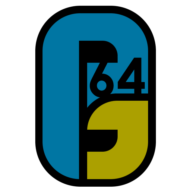
that's a p and a j  - but i'll make another one...

- but i'll make another one...
- but i'll make another one...
Okay, first, why does everyone here forget both 'O's when typing my name?Sorry, but I have to disagree with you, Iconclast. Yes, it's a nice icon and it is preferable in appearance to the old one but it is really just another Nintendo logo; albeit different colours.
If I had to choose this or the old one I would take the old one again and again not because I like it it but because it represents the concept of this great emulator: that it was made by the fans for the fans, not Nintendo. Yes it needs a major spruik up and I don't deny it doesn't look old and a little dated, but not to the extent Project's 64 identity is changed forever.
As you said most sites don't have a icon with their name on it and this is one of the many thousands of reasons why PJ64 stands alone from other emulators. It already has an identity, a reputation and performance to match. As reverant as I am to Nintendo, Project 64 is so much more than the original N64.
To change it to the default 'N' would be an insult to Zilmar and all the people who have made PJ64 what it is today. PJ64 deserves it's own icon, not a carbon copy of Nintendo's. And this means the logo DOES have to have 'Project 64' or 'PJ64' in it. Even 'PJ' would suffice. Take away PJ64's identity and Project 64 loses it's soul and I don't think it's makers would want that, do you?
And I know what you're going to say: does a emulator has a soul? Well religious discussion aside (I think we had enough of that lately!) what I'm trying to say is: they can take away Project 64's logo but they can't take away Project 64!
Nah, that's okay; I've seen worse instances. I was only saying, it's just so common. If my name were 'Iconclast'...well, that would be a compound word, there.Apologies for forgetting the 'o' in your name, IconOclast, but I really don't think it's such a big deal.
Hey guys, im new here, here is my try, not great but hey, its something.
Hey guys, im new here, here is my try, not great but hey, its something.
XD...don't worry; they're plotting down what to say.I wanna hear from the PJ64 creators. Dudes, how are the logos, uhh? Come on, don't be shy!