You are using an out of date browser. It may not display this or other websites correctly.
You should upgrade or use an alternative browser.
You should upgrade or use an alternative browser.
Project64 site redesign
- Thread starter zilmar
- Start date
Iconoclast
New member
highcog, don't worry about him. I'm pretty sure he's being overskeptical. Let me handle him.  I think yours is getting better and better each release, with a value of awesomeness multiplied by 1.5 each release.
I think yours is getting better and better each release, with a value of awesomeness multiplied by 1.5 each release.
Well, look at it this way: Look at the current Project64.exe icon. Says "PJ64." Would you want to use that for BOTH the application icon AND the website header image? I think it would look pretty silly in both of those areas. The application icon is a 16x16, 32x32 or 48x48 pixel image. The website header is supposed to be a banner. Do you see it now why this icon should be the executable icon and not the website header? And hey, you could use this suggested application icon inside of the current website header banner, but if you continued to use jahrah's suggested website header, wouldn't you have to use the N part in the application icon as well? Would that really say anything about Project64 or its name? And this is just some point you gave me earlier....Dude, you just said it yourself - you wouldn't use this icon for the website but as a shortcut it would do. Hmm...I wonder why? Is it because it's totally inapropiate as PJ64's official icon?
Why have two icons, one for the web header and one for the .exe? That's just stupid. If it's not good enough in the first place then it's not good enough period.
Yeah, you got a point there...logically, since the letter 'P' is the beginning of the word 'project', the 'P' should be larger than the 'J', unless you put a nice emphasis on the 'ject' part, which I suppose then again could work...it's inevitable due to the structure of an N64 controller, I'd say; I would just go with it anyway.All I can say is the only thing that grates me is the 'J', it just doesn't look right somehow. It takes your focus away from the whole design. Maybe because it overlaps the 'P' and doesn't look like part of the controller - rather a big 'J' on top.
Last edited:
Iconoclast
New member
It looks better, now. Could you export a PNG version with transparency, please? JPEG does not support background transparency.
Iconoclast
New member
Then I will make a PNG and ICO version for you. Will upload in next post after completion.
First, I must ask...do you think it would be okay if I removed the shadow on the right lobe of the controller? If I trimmed it off, I could change the canvas/background dimensions so the controller would appear centered as PJ64's icon, but if I leave it, it will appear left-aligned.
First, I must ask...do you think it would be okay if I removed the shadow on the right lobe of the controller? If I trimmed it off, I could change the canvas/background dimensions so the controller would appear centered as PJ64's icon, but if I leave it, it will appear left-aligned.
Actually, I have transparent 48/36/16 pixel psd's for icons with a 2 pixel transparent shadow (like in the pic i posted earlier).. I'll post those for you if you want to convert to ico/png etc...?
Just have to update to the current revision of the logo... i'll put 'em up a lil bit later.
Just have to update to the current revision of the logo... i'll put 'em up a lil bit later.
Iconoclast
New member
I know you can probably make 48x48, 32x32 and 16x16 pixel image revisions, but I am making an ICO version that alsu supports 24 bit versions for PCs choosing not to use 32 bit monitor color depth. Now, the shadow on the right lobe of the controller...imagine this image as the current Project64 icon. Wouldn't that shadow make the image appear left-aligned? If I removed the shadow, the image would become centered, after trimming off the empty pixels, but I'm wondering if I should...for now, I will keep them. All shadows removed from the 24 bit version, as shadows are unsupported there.
32 bit:

24 bit:

Application icon version attached to this post in a zip archive.
32 bit:
24 bit:
Application icon version attached to this post in a zip archive.
A.I.
Banned
Look at the current Project64.exe icon. Says "PJ64." Would you want to use that for BOTH the application icon AND the website header image? I think it would look pretty silly in both of those areas. The application icon is a 16x16, 32x32 or 48x48 pixel image. The website header is supposed to be a banner. Do you see it now why this icon should be the executable icon and not the website header? And hey, you could use this suggested application icon inside of the current website header banner, but if you continued to use jahrah's suggested website header, wouldn't you have to use the N part in the application icon as well?
Actually jahra!n's logo looks quite good as an icon, it doesn't loose any legibility. Not sure what you mean the 'N part'. The 'PJ' forms a subtle 'N' but you can still distinguish the 'P' and the 'J' apart - quite clever really.
On the other hand highcog's logo doesn't transfer well as an icon with 'PJ64' barely visible and looks like a ordinary N64 control pad in that resolution.
Iconoclast
New member
Then why did you say my suggested icon for the application I made was bad because it didn't have "PJ64" in it? Jahrah's would be bad for the same reason if used as Project64's application icon, since there would be no room for the text and, as you say, both the application and website should share the same image/logo.Actually jahra!n's logo looks quite good as an icon, it doesn't loose any legibility. Not sure what you mean the 'N part'. The 'PJ' forms a subtle 'N' but you can still distinguish the 'P' and the 'J' apart - quite clever really.
On the other hand highcog's logo doesn't transfer well as an icon with 'PJ64' barely visible and looks like a ordinary N64 control pad in that resolution.
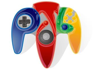
Honestly, is there just something personal here, or what? PJ64 may not be that visible in highcog's image, but it's visible enough and a creative representation of an N64 controller. I mean, try making something like "PS2" for a PSX controller, and it ain't gonna work out, but with "PJ64" on an N64 controller...he just did it. I think the creativity in his image more than makes up for the 'barely' legible text in his image.
None of these resolutions make it look like an ordinary N64 control pad. Did you know the thing has color in it?
Here's the 48, 32 and 16 pixel icons with a slight shadow, and a raw 138 x 138 non-shadowed image. Note that this isn't the same shadow as the full-size image, it's a 2-pixel right & bottom shadow which should remain on the blended icons for higher color depths. For the other color depths, they can be made off of the raw 138 pixel image.
Here's what they'll look like, and aside from the 16pixel one, I think they're quite legible. Especially considering that they'll be in a directory named after project64, and on an application called project 64, which people downloaded from the project 64 website. I'm confident people won't be unduly confused or frightened.

And here are the files:
Here's what they'll look like, and aside from the 16pixel one, I think they're quite legible. Especially considering that they'll be in a directory named after project64, and on an application called project 64, which people downloaded from the project 64 website. I'm confident people won't be unduly confused or frightened.
And here are the files:
Last edited:
Iconoclast
New member
Looks ready. What does the team think of this as the next Project64 icon? (Be honest; I'm not going to report anyone for emotional abuse just for saying it somehow doesn't look right, and I won't argue with any opinions since that's to keep between me and A.I.....)
squall_leonhart
The Great Gunblade Wielder
i hate it, thats what.
you can hardly see the PJ64.
this is, and always will be the pwnage in icons.

anything else is just second rate.
no offense highcog, but it doesn't look good as an icon, its much better as a banner image... but... i still prefer the that one.
you can hardly see the PJ64.
this is, and always will be the pwnage in icons.
anything else is just second rate.
no offense highcog, but it doesn't look good as an icon, its much better as a banner image... but... i still prefer the that one.
Iconoclast
New member
The PJ64 is just as illegible in that image as in highcog's, with the exception of the '4'. Perhaps that could be improved....
i hate it, thats what.
you can hardly see the PJ64.
this is, and always will be the pwnage in icons.
anything else is just second rate.
The problem with what you're saying is only the last two are actually icon sized, the other ones are way too big to be icons. The last two are not really any more legible at icon size..
Iconoclast
New member
If you people are really that desperate to find something to attack the image about, blame it on the fact that the version he posted is a JPEG if you really want to start making up excuses.
squall_leonhart
The Great Gunblade Wielder
there are people who use thumbnails you know, which the third 1 is.
i can see the 2nd one fine on my resolution.
i can see the 2nd one fine on my resolution.
Samurai Snack
PJ64 Cheat Master
Remember: Iconoclast said to post your opinions, not start a flame war.
I believe the 3D N/PJ icon would do great for a banner, not an icon. Highcog's image works better for an icon. I think it's legible and like Highcog said, the icon will be named "Project 64" in the "Project 64" folder which was downloaded from the "Project 64" site, so they won't get confused.
I believe the 3D N/PJ icon would do great for a banner, not an icon. Highcog's image works better for an icon. I think it's legible and like Highcog said, the icon will be named "Project 64" in the "Project 64" folder which was downloaded from the "Project 64" site, so they won't get confused.
Rapidgorgon
New member
Jahra!n logo isn't bad at all, I could never make the same thing. But it's not that great as a logo for a program. Most of the time the 32x32 logo is displayed. 16x16 in the Windows Start-menu, quickstart icons next to the start-button (default location). 96x96 is the thumbnail size in Windows. And I hate using thumbnails in a folder that doesn't contain images, I just find it a mess that way.
Anyway, as I am still participating in the race for the new logo (you might remember me as the swastika guy). I stumbled upon the Tango Desktop Project and just felt the need to apply their colour scheme to my logo and banner.
Anyway, as I am still participating in the race for the new logo (you might remember me as the swastika guy). I stumbled upon the Tango Desktop Project and just felt the need to apply their colour scheme to my logo and banner.
Iconoclast
New member
Squall, are you sure the 32x32 one on the right is more legible as an icon for the emulator? Again, as the samurai said, it is a better website logo, but at icon dimensions, it just doesn't look as good as the 32x32 one on the left. The only thing left to do, imo, is somehow fix that 4 in iconclog's image...the 6 is okay.
Actually, zilmar said that, but, can't you tell, that was directed to me when he suggested that.Remember: Iconoclast said to post your opinions, not start a flame war.