razius
MU-TH-UR
I intended to fix this pack and release it for Dolphin (Virtual Console SM64) because:
Super Mario 64 v1.0 (2015-01-11) 723.7MB (Mediafire, Single archive) - NEW LINK
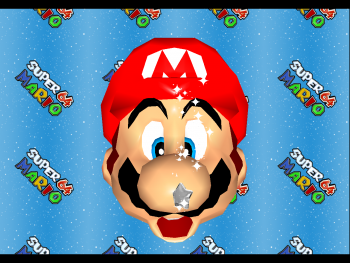
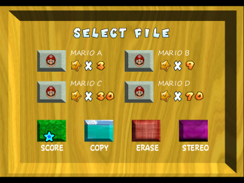
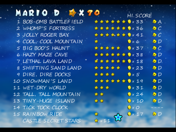
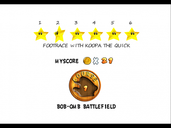
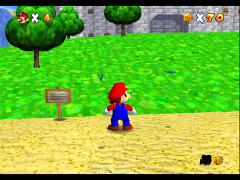
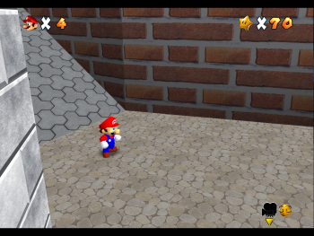
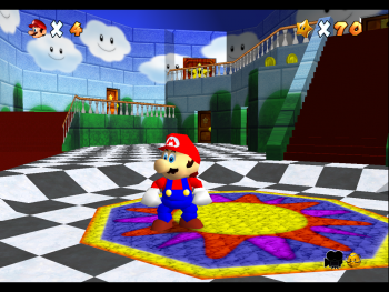
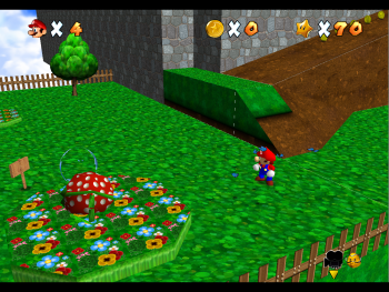
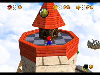
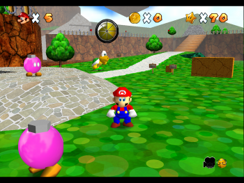
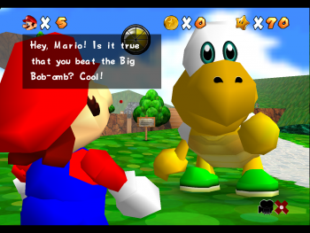
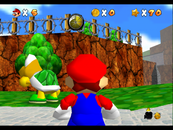
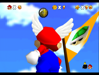
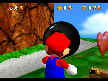
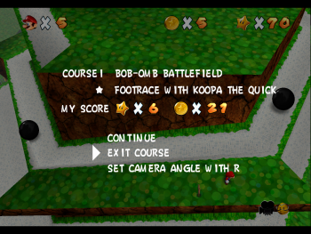
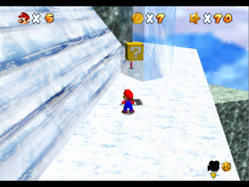
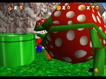
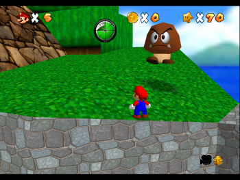
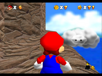
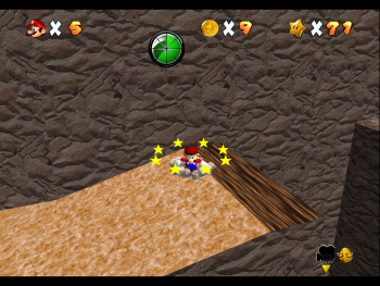
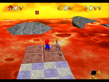
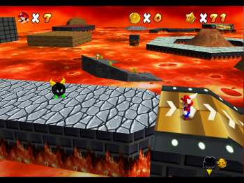
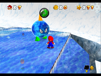
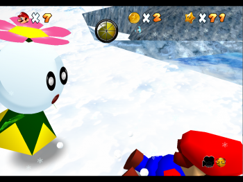
Screenshots Gallery (39 pictures @350x236)
 Spoiler:
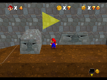
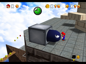
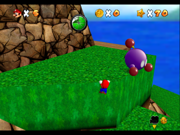
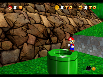
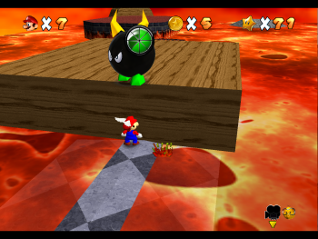
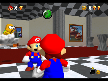
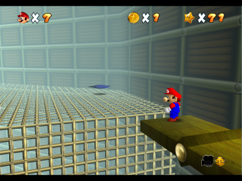
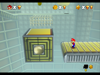
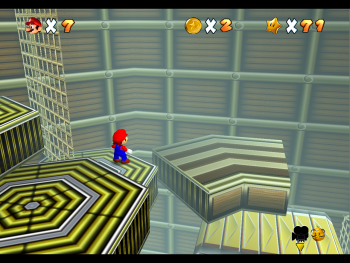
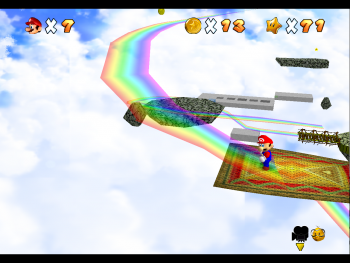
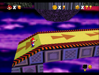
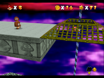
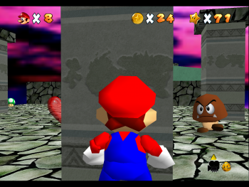
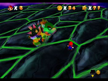
So much clipping!
- except for SM64 and Starfox64 there's really no reason for me to use PJ64 (Nelde is yet to release his pack and im not even a casual Zelda player)
- i had issues with Glide64's full transparency back in the day
- i'm so much more comfortable with Dolphin rather than the latest branch of PJ64
Super Mario 64 v1.0 (2015-01-11) 723.7MB (Mediafire, Single archive) - NEW LINK
Screenshots Gallery (39 pictures @350x236)
So much clipping!
Last edited by a moderator:
OP
razius
MU-TH-UR
- Thread Starter
- #2
Older screenshots
Original Message (April 19th, 2012 at 22:47) hidden as spoiler since the screenshots attached to it were replaced and now missing.
Spoiler:
These are a few textures from February, so some i replaced some of them meanwhile.
The Tall tall mountain textures are placeholders you won't find in the pack (they're textures from rayman origins).
This is an older Fortress version with textures from smss and smg... obsolete.
Original Message (April 19th, 2012 at 22:47) hidden as spoiler since the screenshots attached to it were replaced and now missing.
These are a few textures from February, so some i replaced some of them meanwhile.
The Tall tall mountain textures are placeholders you won't find in the pack (they're textures from rayman origins).
This is an older Fortress version with textures from smss and smg... obsolete.
Last edited:
OP
razius
MU-TH-UR
- Thread Starter
- #4
Looks pretty good so far, I especially like the Barb Wire fence texture, the only thing I don't really like is the Hud Power-bar it looks a bit unprofessional compared to other textures
Is this better?
http://www.emutalk.net/attachment.php?attachmentid=38245&stc=1&d=1334930260
http://www.emutalk.net/attachment.php?attachmentid=38246&stc=1&d=1334930265
http://www.emutalk.net/attachment.php?attachmentid=38247&stc=1&d=1334930268
http://www.emutalk.net/attachment.php?attachmentid=38248&stc=1&d=1334930277
http://www.emutalk.net/attachment.php?attachmentid=38249&stc=1&d=1334930282
http://www.emutalk.net/attachment.php?attachmentid=38250&stc=1&d=1334930286
http://www.emutalk.net/attachment.php?attachmentid=38251&stc=1&d=1334930290
http://www.emutalk.net/attachment.php?attachmentid=38252&stc=1&d=1334930293
http://www.emutalk.net/attachment.php?attachmentid=38253&stc=1&d=1334930298
http://www.emutalk.net/attachment.php?attachmentid=38254&stc=1&d=1334930302
Alternate gallery in JPG format with blue (#0173b1) background
Can you give me a reference as to how it should look like? I tried to keep it as close to the original as possible but i had to replace the wooden mario head border since there was no way that was going to fly without full transparency. Also, due to the transparency issue, the border has to be black or else it would look really horrible on darker backgrounds (thus the black, not the silver metallic SMG style of the powerhud/health meter).
As for the "POWER" word (it's there just because the original had it)...it can be simply removed by replacing the two textures with two empty ones, that's the way i like it.
I like minimal stuff a lot, from music (be it classical, electronic, rock) to design and video games controls. That's what i like about halo, gears of war: everything's as simple as possible but not simpler than that... and that's also the reason mario 64 is still better than smg1/2 imho (control wise because the level design it's breathtaking in smg): the spinning ruins the fluidity of the platforming acrobatics. Opposed to the crappy spinning, mario sunshine's fludd enhanced the acrobatics by giving you speed, height, floating (and smss also introduced the wall slide which is a great addition but some walls that would not allow you to slide would b welcomed, so you'll have to wall jump the sm64 style)... worked way better than the spinning but that's all fludd shoud have been used for (enhancing acrobatics), not force you to use it most of the game... That's one of the main reasons i never got addicted to smss, it was all about the fludd. That's also why i enjoyed the fluddless levels a lot: platforming at its best.
Last edited:
OP
razius
MU-TH-UR
- Thread Starter
- #6
Update 1 progress (this far)
Wallpaper (model from smg2, textures from the upcoming update). The wallpaper is 1080 native cinemascope (2592x1080).
Replaced the SMG textures (stones and ground) with brand new ones made from scratch, more detailed but as close to them as possible.
Spoiler:
Spoiler:
Update 1
Content: Whomp's Fortress (complete), Shifting Sand Land (complete)
Release date: TBA
Content: Whomp's Fortress (complete), Shifting Sand Land (complete)
Release date: TBA
Wallpaper (model from smg2, textures from the upcoming update). The wallpaper is 1080 native cinemascope (2592x1080).
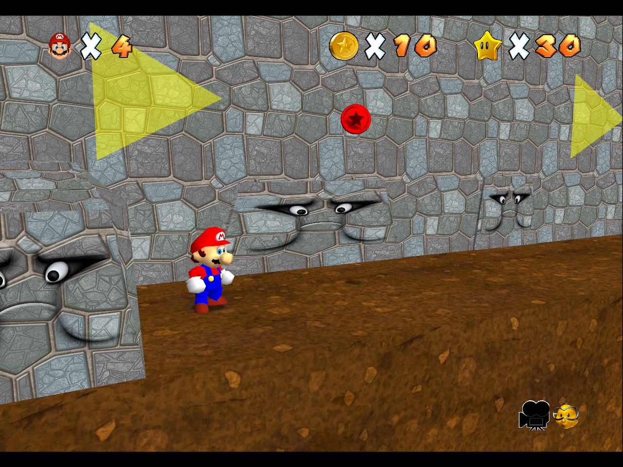
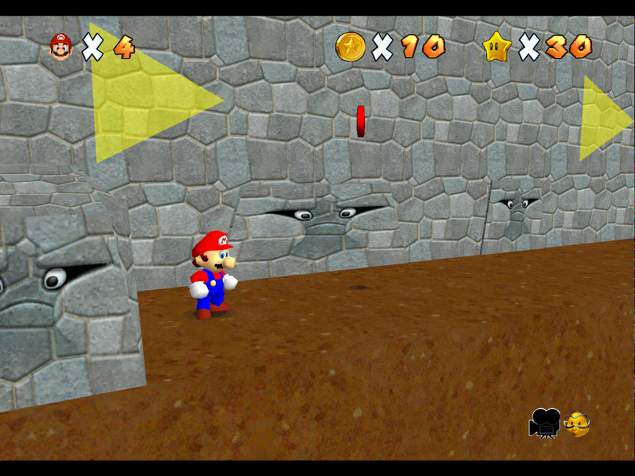
Replaced the SMG textures (stones and ground) with brand new ones made from scratch, more detailed but as close to them as possible.
New textures
SMG textures
Last edited:
OP
razius
MU-TH-UR
- Thread Starter
- #8
The pack is quite messy because some textures went through 5-6 iterations and still looked s#itty so i had to remove them completely but this mod was pretty much my training ground retexture wise.
I updated the OP with the latest version of the pack (contains the files i fixed for the Virtual Console version as well).
Enjoy!
I updated the OP with the latest version of the pack (contains the files i fixed for the Virtual Console version as well).
Enjoy!
Last edited:
The pack is quite messy because some textures went through 5-6 iterations and still looked s#itty so i had to remove them completely but this mod was pretty much my training ground retexture wise.
I updated the OP with the latest version of the pack (contains the files i fixed for the Virtual Console version as well).
Enjoy!
I encountered a runtime error during texture installation.
The file is no longer available, can someone re-upload it?