You are using an out of date browser. It may not display this or other websites correctly.
You should upgrade or use an alternative browser.
You should upgrade or use an alternative browser.
EmuTalk.msstyles
- Thread starter Miretank
- Start date
ScottJC
At your service, dood!
well, it has its high-points, the Minimize, Maximize and Close buttons do look like Vistas, I don't really like the Emutalk start button, it doesn't seem to flow nicely onto the rest of the task bar... i.e. if it was blue backgrounded with "Emutalk" it might look better.
The Toolbar + Statusbar background definitely should not be blue like that, it makes the UI very confusing to look at, makes text harder to read, plus it would look better if it were grey or some other colour than the titlebar, allowing the blueness to be exclusive to the titlebar and taskbar.
Nice job though. [/opinion]
OP
Miretank
Lurking
- Thread Starter
- #3
Thanks for replying =)
The task bar seems strange with all that blue, I might a grey background with blue flash buttons (smth like the EmuFanatics theme for ET). Also I need to find a better start button =\
Ah, but i think it was decent for my first visual style.
The task bar seems strange with all that blue, I might a grey background with blue flash buttons (smth like the EmuFanatics theme for ET). Also I need to find a better start button =\
Ah, but i think it was decent for my first visual style.
OP
Miretank
Lurking
- Thread Starter
- #5
*new Vs*
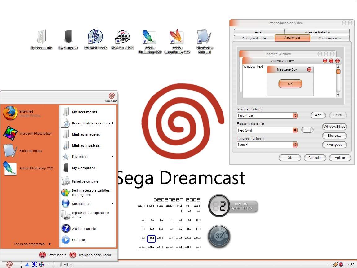
Lasts days I was working in a new mod to my desktop, then I have made this. It still have some bugs, when I get some free time I'll remake then.
Dedicated to all Dreamcasts Fans around the world =)
And hope all you guys like it.
Constructive comments are very welcome.
Lasts days I was working in a new mod to my desktop, then I have made this. It still have some bugs, when I get some free time I'll remake then.
Dedicated to all Dreamcasts Fans around the world =)
And hope all you guys like it.
Constructive comments are very welcome.
raksmey1309
New member
I love light blue and orange.